
Clean Food,
Clear Menu.
Guilt Free Kitchen cooks everything from scratch: baked, raw or poached, gluten and wheat free. They needed print that made a long, changing menu easy to read across the counter and through the letterbox. We designed their tri-fold daytime menu, kept it up to date through each change, and made the flyer that launched their evening takeaway.
- WHO — Guilt Free Kitchen, clean-eating café and takeaway
- WHAT — Tri-fold Menu, A5 Flyer, Logo Files, Brand Palette, Packaging Concept, Print Preparation
- WHEN — 2017 – 2018
- WHERE — South Shields, Tyne and Wear
- HOW — One menu layout, updated round by round as the business grew, then packaged for the printer
A Lot to Say,
One Sheet of Paper.
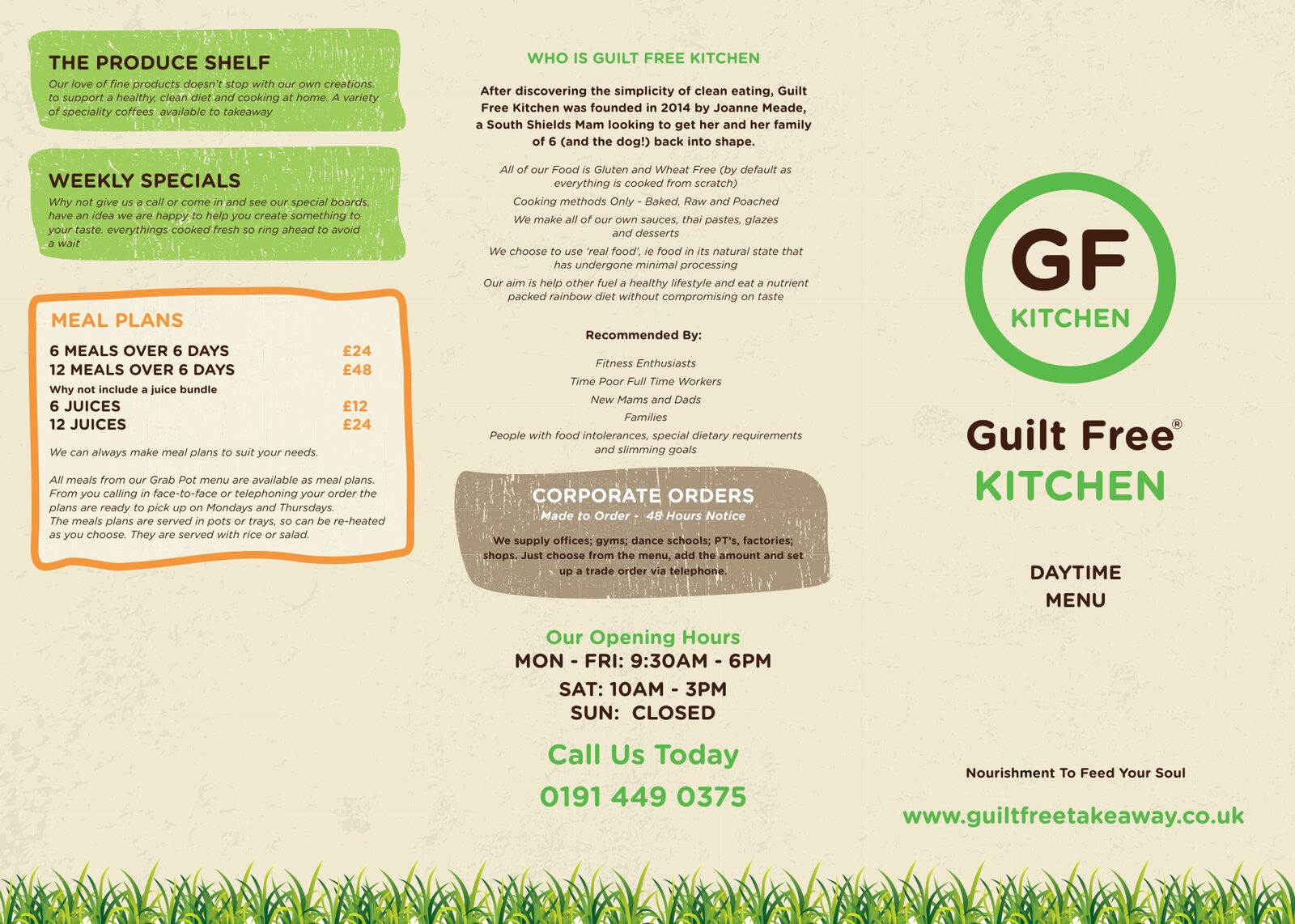
Guilt Free Kitchen started in 2014 when a South Shields mam set out to get her family of six back into shape with clean eating. By 2017 it was a daytime café and takeaway with breakfasts, lunches, juices, meal plans, corporate orders and a shelf of healthy produce. All of that had to fit on one folded menu that people could read at a glance and take home.
- Daytime menu for the counter and for customers to take away
- Clear sections for food, drinks, meal plans and trade orders
- Their story and values told on the menu itself
Green Roundel,
Every Size.
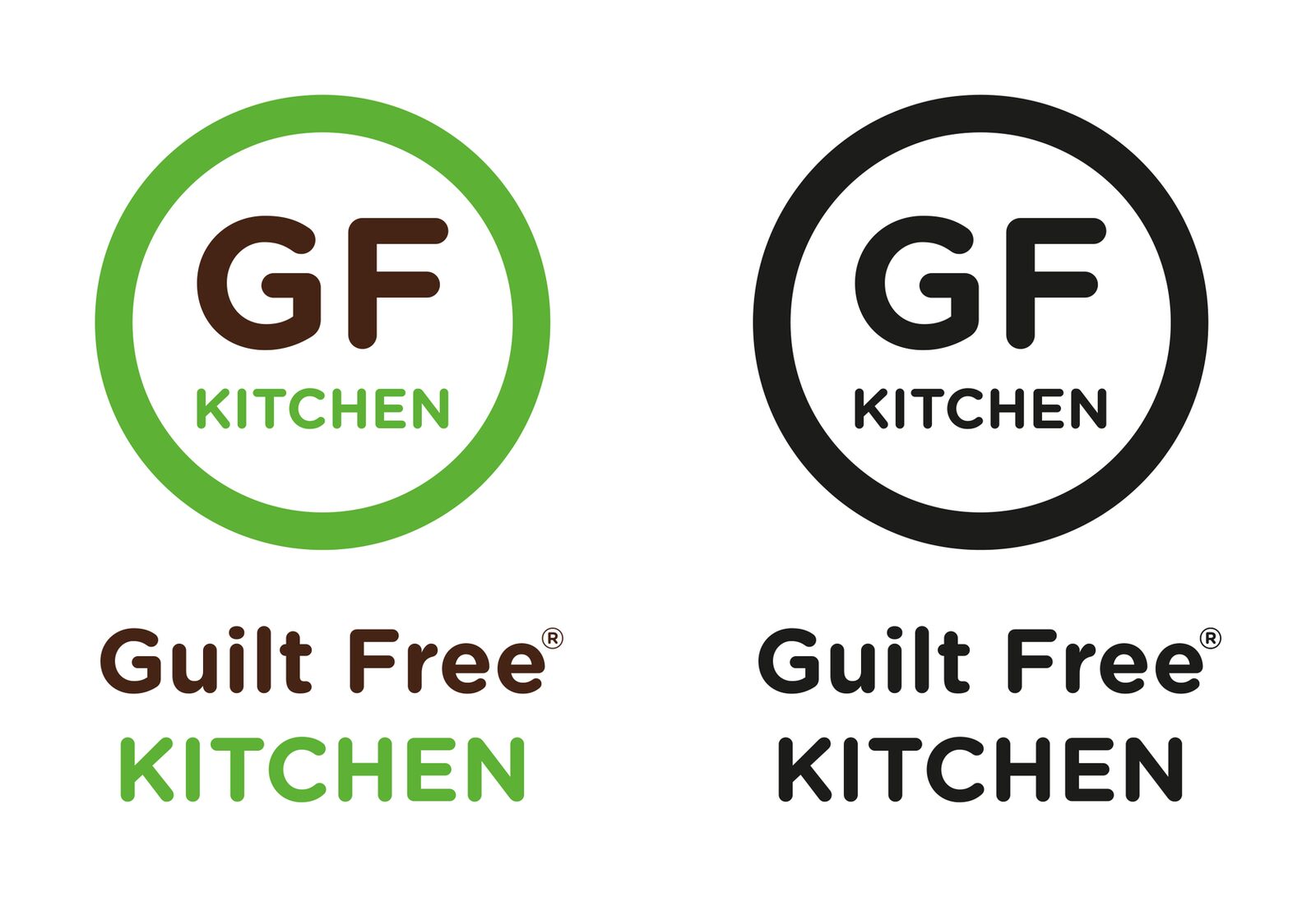
The green and brown GF Kitchen roundel sits at the front of everything. We set it up in full colour and in black, so it works on a cream menu cover, a sticker or a black and white print.
- Full colour and one-colour versions
- Roundel and stacked name used together or apart
- Print-ready vector files
Fresh Greens,
Warm Browns.
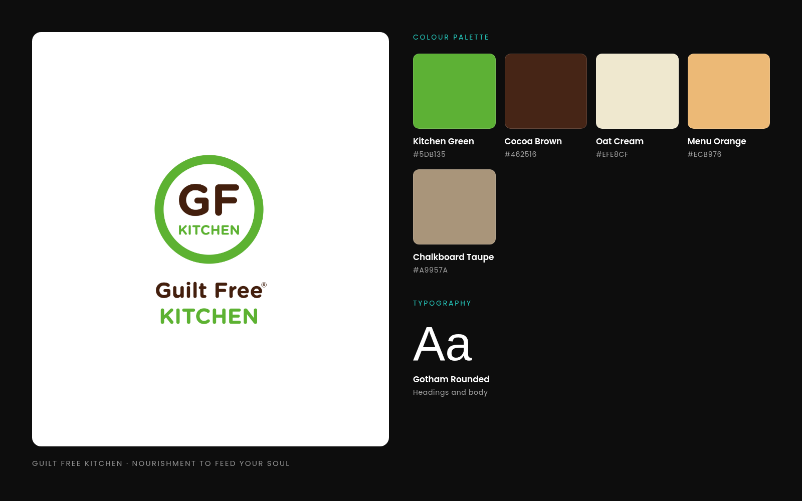
The colours come from the food. Kitchen green and cocoa brown from the logo, an oat-cream paper texture behind everything, and soft orange and chalkboard panels to split the menu into easy chunks. Gotham Rounded keeps every word friendly and easy to read.
- Five colours taken from the logo and menu
- Gotham Rounded for headings and body copy
- Paper texture and a grass strip along the foot of each page
Find Your Lunch
in Seconds.
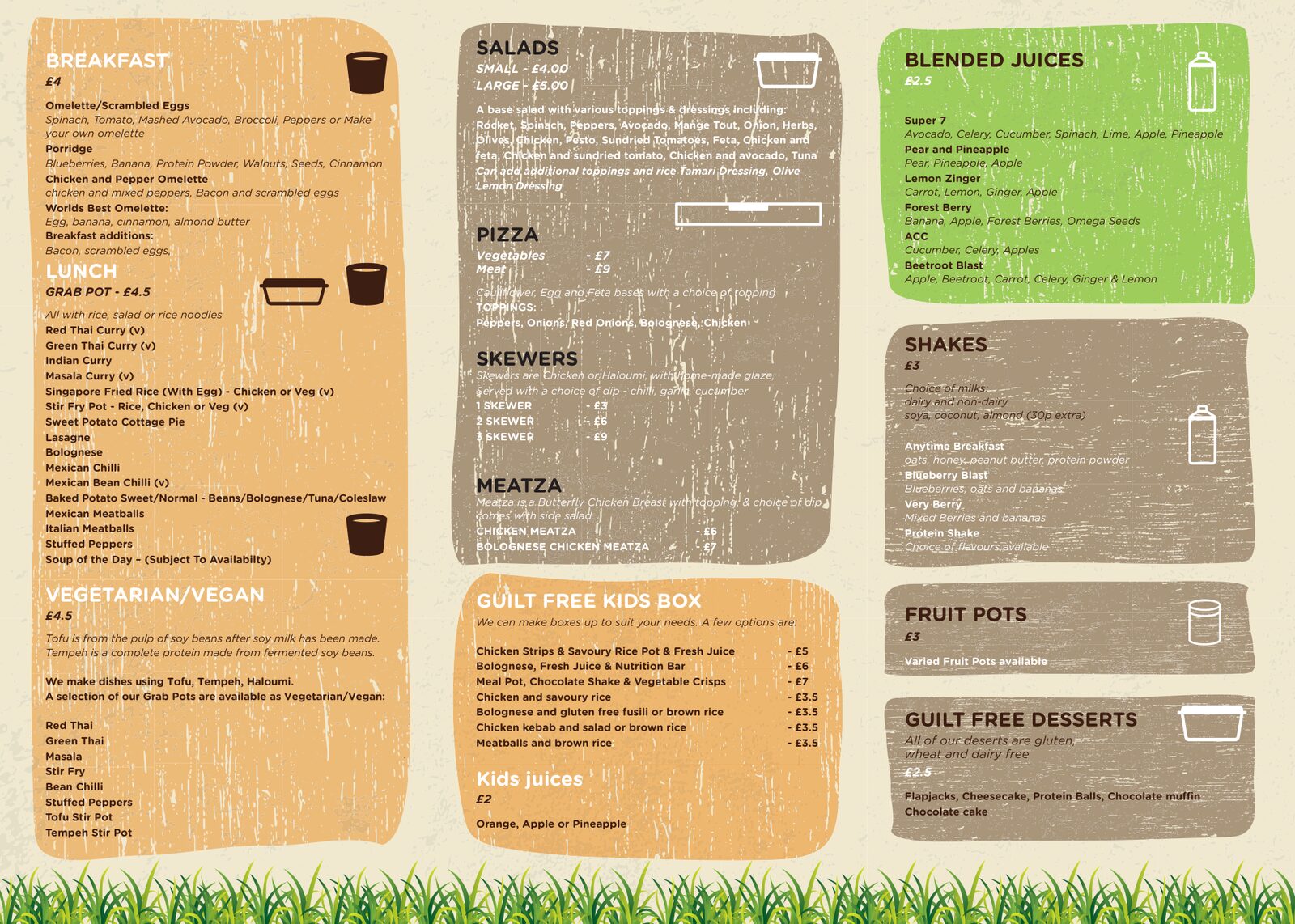
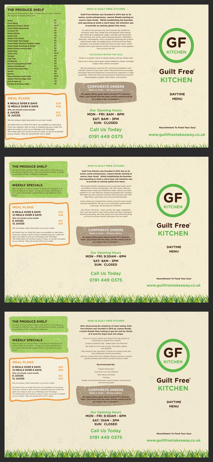
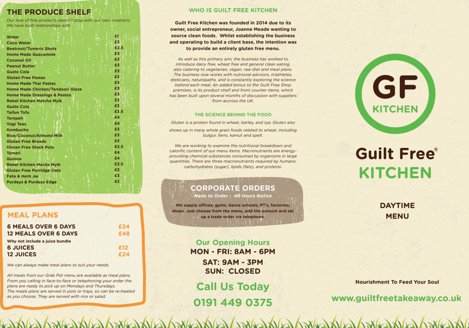
Inside, the menu reads like the chalkboards in the shop. Each part of the day has its own coloured panel: breakfast, lunch and vegetarian or vegan on the left, salads, pizza and skewers in the middle, juices, shakes, fruit pots and desserts on the right. Small icons mark the boxes and bottles, so you can spot drinks and pots without reading every line.
- Colour-coded panels for each part of the day
- Icons for boxes, bottles and pots
- Meal plans, weekly specials and corporate orders on the cover panels
The Menu Changed,
So Did the Print.
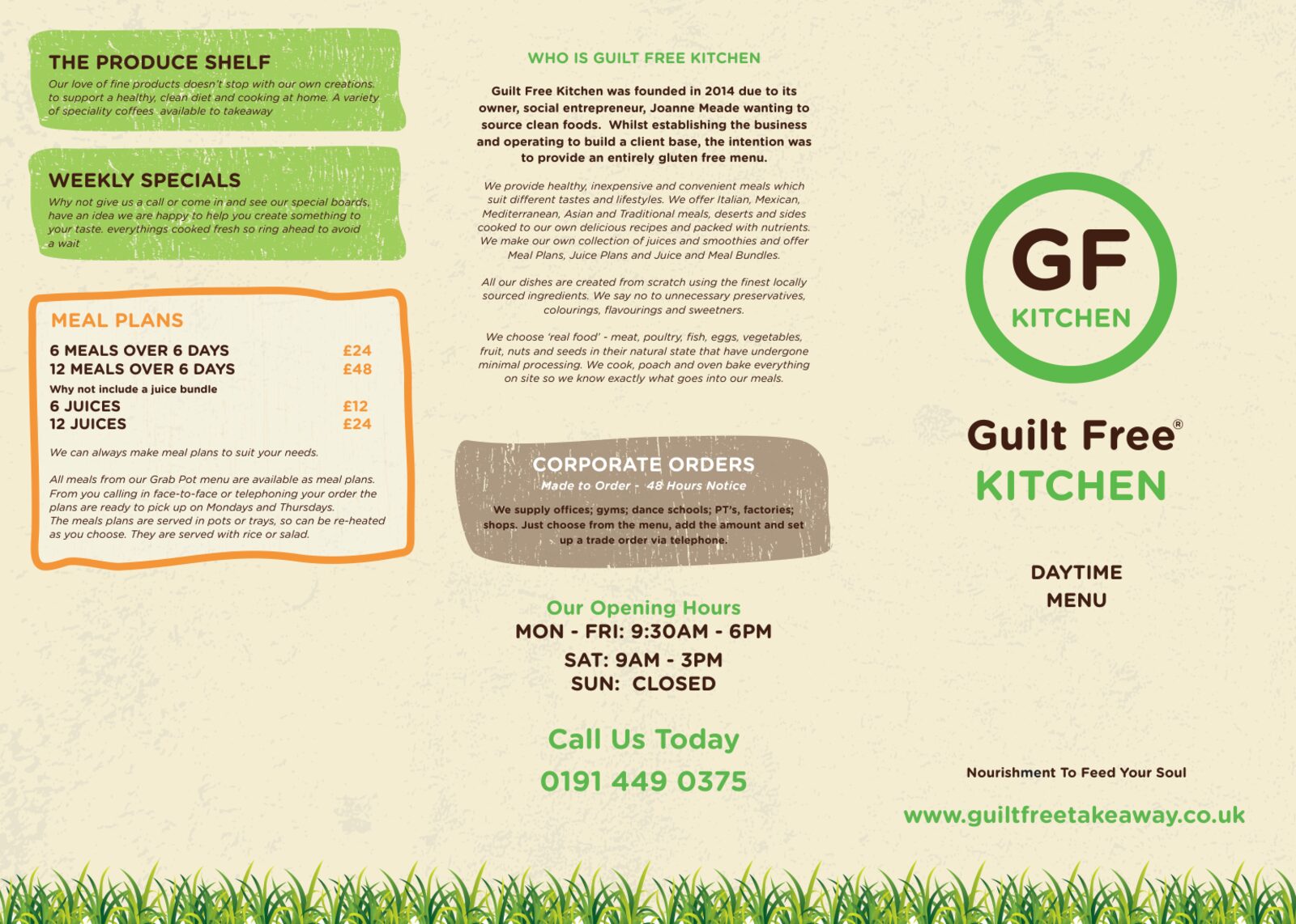
A small kitchen’s menu never stands still. The files show the tri-fold going through versions in July, October and November 2017 and a final print file in January 2018. Opening hours moved, the produce shelf price list became a weekly specials panel, and the story on the cover was rewritten in the owner’s own words. Each time we updated the same layout rather than starting again.
- Versions from July 2017 to January 2018
- Hours, prices and sections updated each round
- Same layout kept, so the menu stayed familiar to regulars
Takeaway,
Now Open.
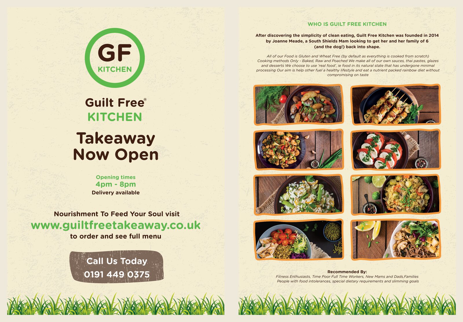
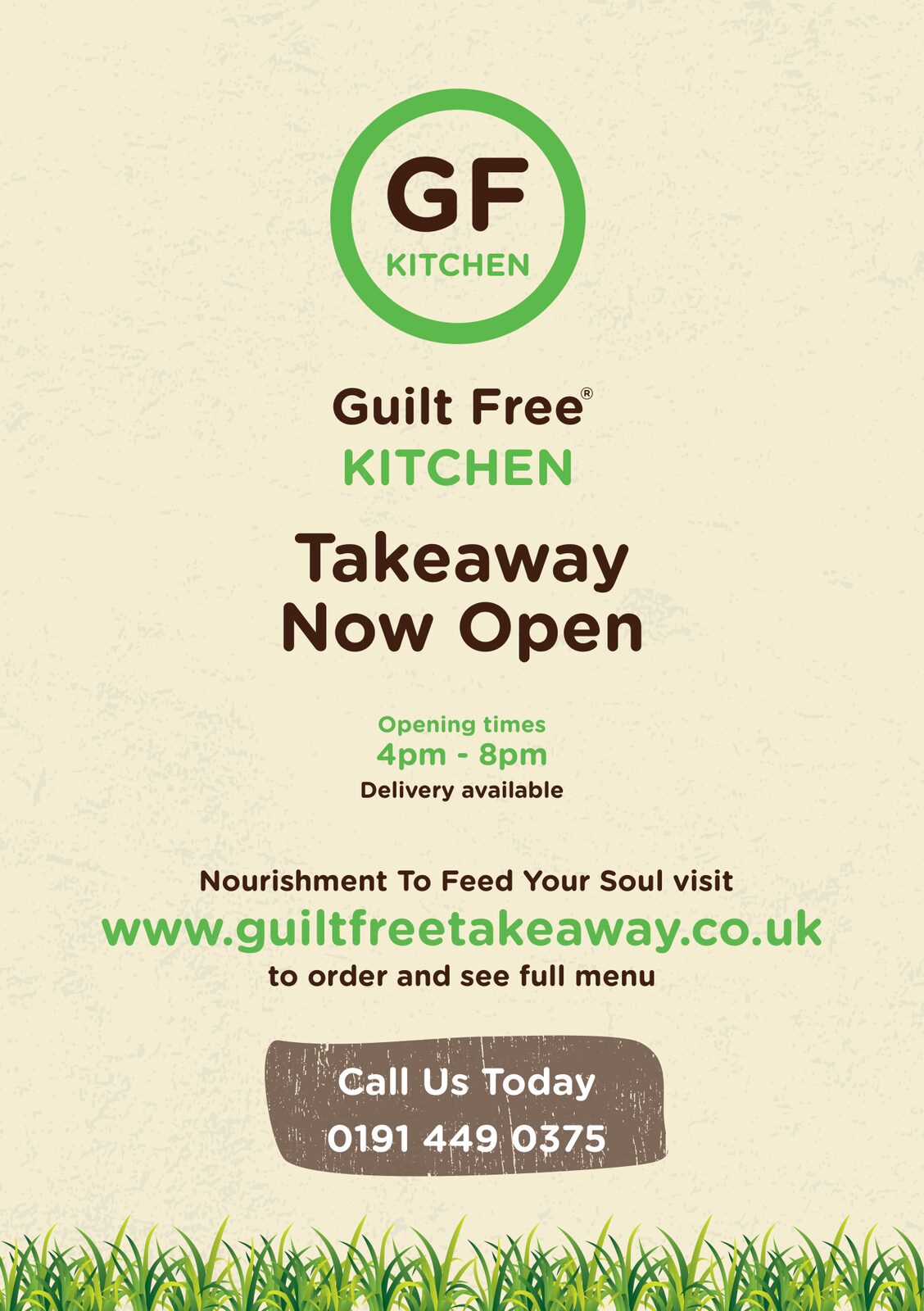
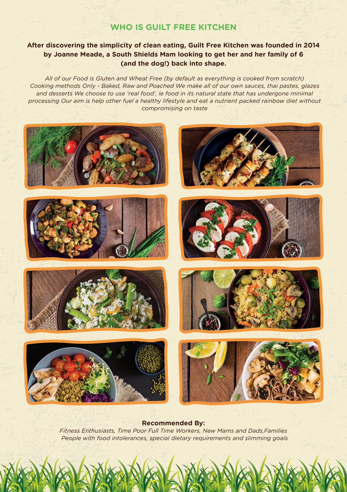
When Guilt Free Kitchen started an evening takeaway with delivery, they needed to tell the neighbourhood. We designed a double-sided A5 flyer: a bold “Takeaway Now Open” front with the hours, web address and phone number, and a back that tells their story over a grid of colourful dishes. In April 2018 we packaged it with its fonts and images, ready for the printer.
- Double-sided A5 flyer for door drops and the counter
- Opening hours, delivery, web address and phone up front
- Packaged print file with fonts and links for the printer
A Box Worth
Keeping.
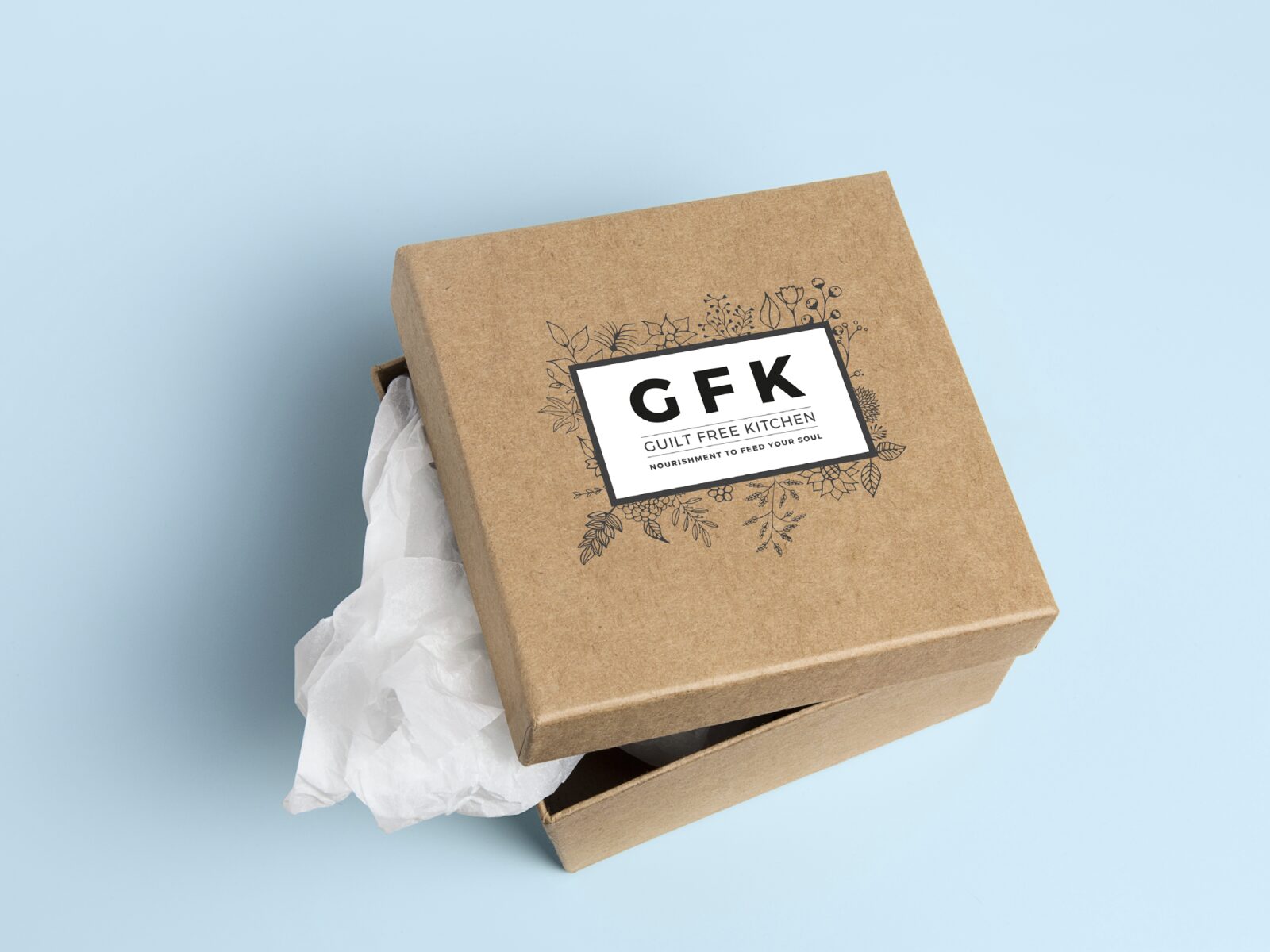
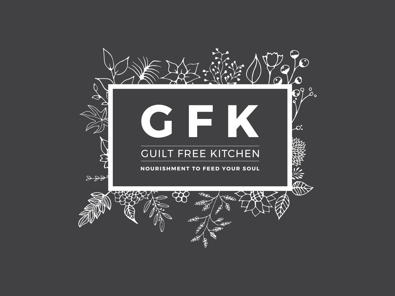
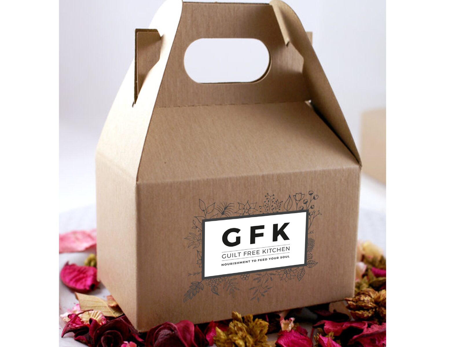
We also explored a calmer, more premium look for takeaway boxes: a GFK monogram in a frame of hand-drawn herbs and flowers, with the line “Nourishment to feed your soul”. We showed it on kraft boxes so the owner could see how it would feel in a customer’s hands. This one stayed a concept.
- GFK monogram with a hand-drawn botanical frame
- Shown on kraft gift and carry boxes
- Light and dark versions
Guilt Free Kitchen
A busy menu made easy to read, and kept up to date.
Need a menu or flyer people actually read?
Screenshots
& Photography
Menu, flyer, logo artwork, brand board and packaging concept shown were produced by Northern Digital for Guilt Free Kitchen. The packaging designs are concepts shown on stock box mock-ups. Food photography on the flyer is licensed stock. Menu content and the Guilt Free Kitchen name belong to Guilt Free Kitchen. Presented to demonstrate capability.
More from the Northern portfolio.
What clients say about our work
Real reviews from real businesses.
Had a website made from scratch was done within 4 days and turn around was great.
Great service overall. It's been a real pleasure working with Dave and his team. They've helped strengthen our business presence and brand identity through our website and are always on hand to offer support and go the extra mile. We're looking forward to continuing to work with Dave and the Northern Digital team on future projects as our business grows.
Very good experience, very knowledgable and trustworthy. Highly recommend.
What's costing you growth?
Let's find out. For free.
Book a free 30-minute strategy audit with Dave. We'll look at your marketing, find what's not working, and tell you exactly where to focus. No waffle. Just a canny plan you can act on.
Request Your Free Audit
Takes 30 seconds. No jargon, just results.