Make the U
Mean Something.
IRECKONU builds software that joins up the systems inside hotels, casinos and cruise ships. They asked us for a brand that looked as good as their product. We took their red U, gave it depth and turned it into a full identity, from business cards to casino chips.
- WHO — IRECKONU, hospitality software, based at the Olympic Stadium in Amsterdam
- WHAT — Research, Logo Concepts, Logo Design, Brand Book, Stationery, Brochure, Event Print, Brand Films, Website Design
- WHEN — 2015–2016
- WHERE — Amsterdam, the Netherlands
- HOW — Four concepts, one refined mark, then every piece of print and film built from it
A Good Product,
A Plain Logo.
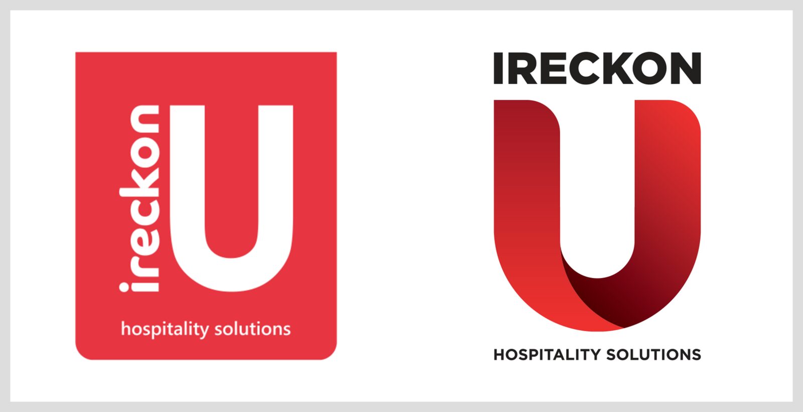
IRECKONU connect the software a hotel already runs, from bookings and tills to door locks and room controls, so staff can see each guest as a person, not a room number. Their logo was a flat red box with a white U. They wanted a brand worth the product: one that showed they build around the customer, not around a piece of tech.
- Hospitality software for hotels, casinos and cruise lines
- Existing red U logo to build on
- Signed design contract with Northern Designers
Look at the Rivals
First.
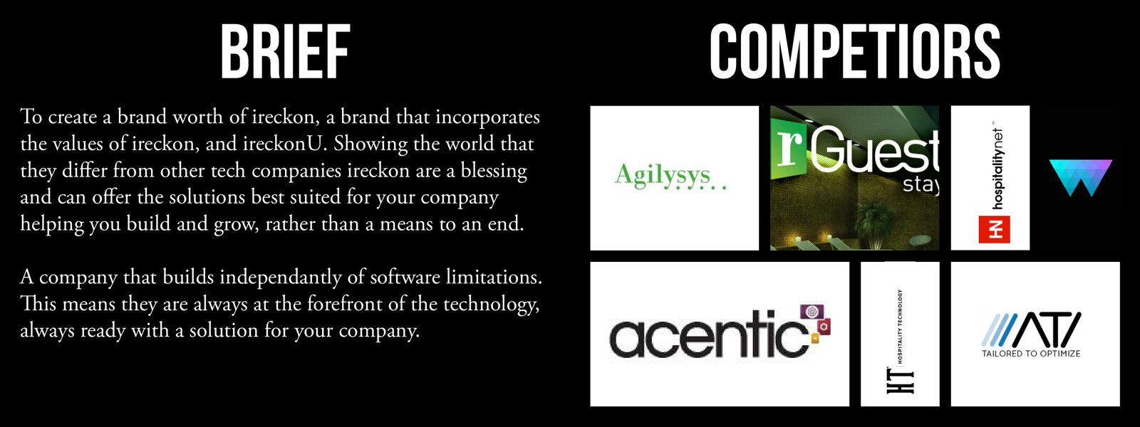
Before drawing anything we wrote down who IRECKONU are, what they make and where they work, then looked at other hospitality tech brands. Most were blue or green, leaned on obvious tech references and looked like just another software company. That told us what to avoid and gave us room to stand out.
- Brief, who, what and where written up and agreed
- Competitor brands reviewed: what works, what doesn’t
- A clear gap: bold, simple and not blue
Four Routes,
All About U.
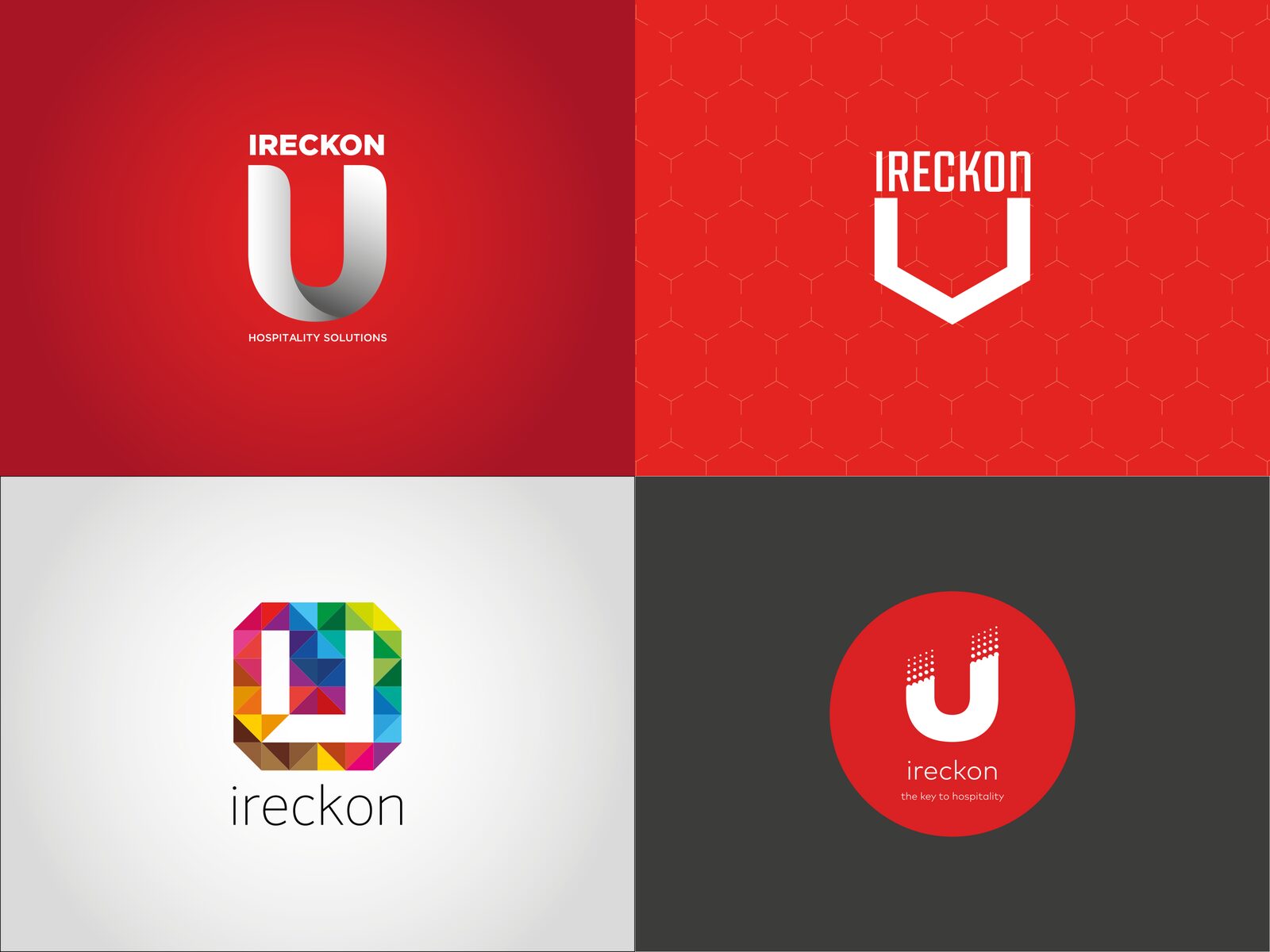
We presented four concepts, each with its own idea, type and stationery mock-ups. “U” built on the mark they already had. “Connecting U” used a hexagon for software built from linked blocks. “Targeting U” went bright and colourful for a wider market. “Building on U” stacked the U from small parts. IRECKONU chose the first route.
- Four complete concepts in one presentation
- Each shown on cards, letterheads and screens
- The client picked the route that kept their recognition
Same U,
Real Depth.
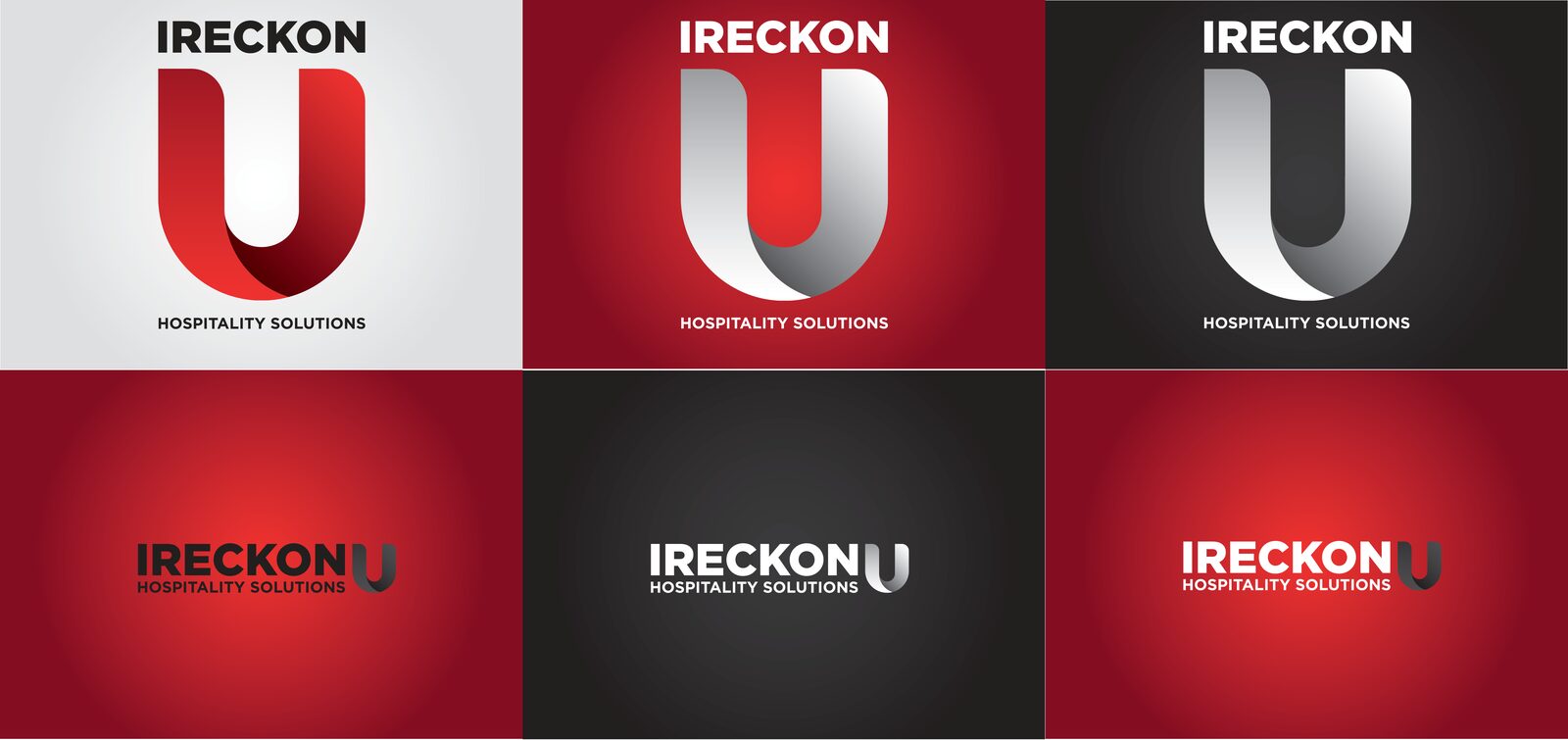
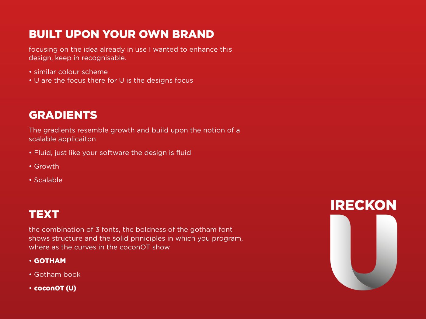
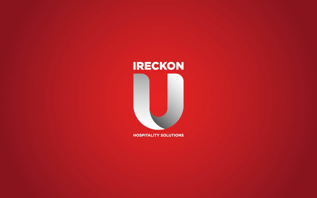
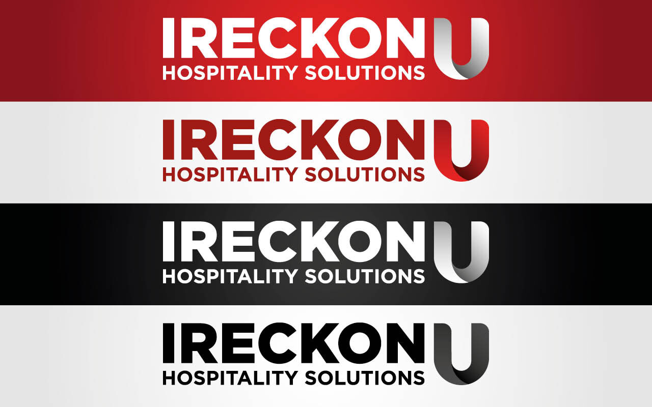
We kept the U because people already knew it. Then we gave it a fold, so it reads like a ribbon turning back on itself, and a gradient that suggests growth and software that flexes to fit. The name sits above in a heavy Gotham, with “Hospitality Solutions” below. We drew stacked and landscape versions for red, white and black backgrounds.
- Folded U mark with red and silver gradients
- Stacked and landscape lockups
- Versions for red, white and black backgrounds
- Final logo files in AI, EPS, PDF, PNG and JPG
Rules Anyone
Can Follow.
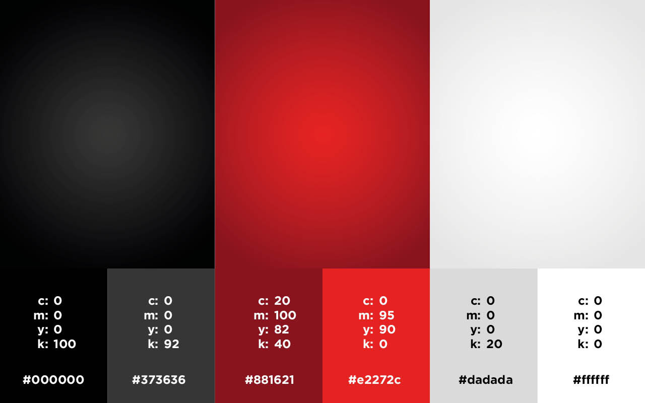
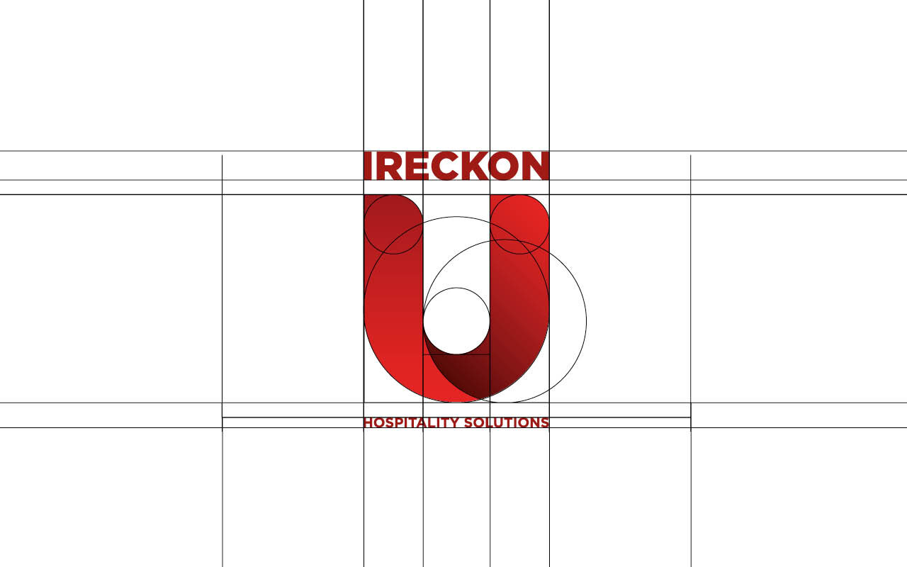
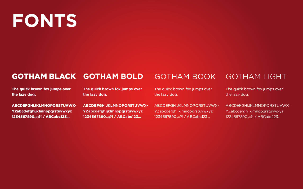
A brand only stays consistent if the rules are written down. The brand book sets out the construction grid behind the U, the lockups, the Gotham type family from Black to Light, and a palette of two reds, two greys, black and white with CMYK and hex values for print and screen.
- Logo construction grid
- Gotham Black, Bold, Book and Light
- Red #e2272c and deep red #881621 with greys
- CMYK and hex values for every colour
One Brand,
Three Markets.
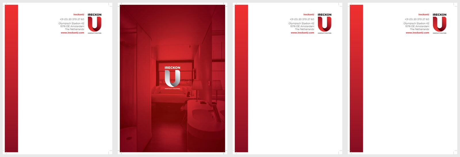
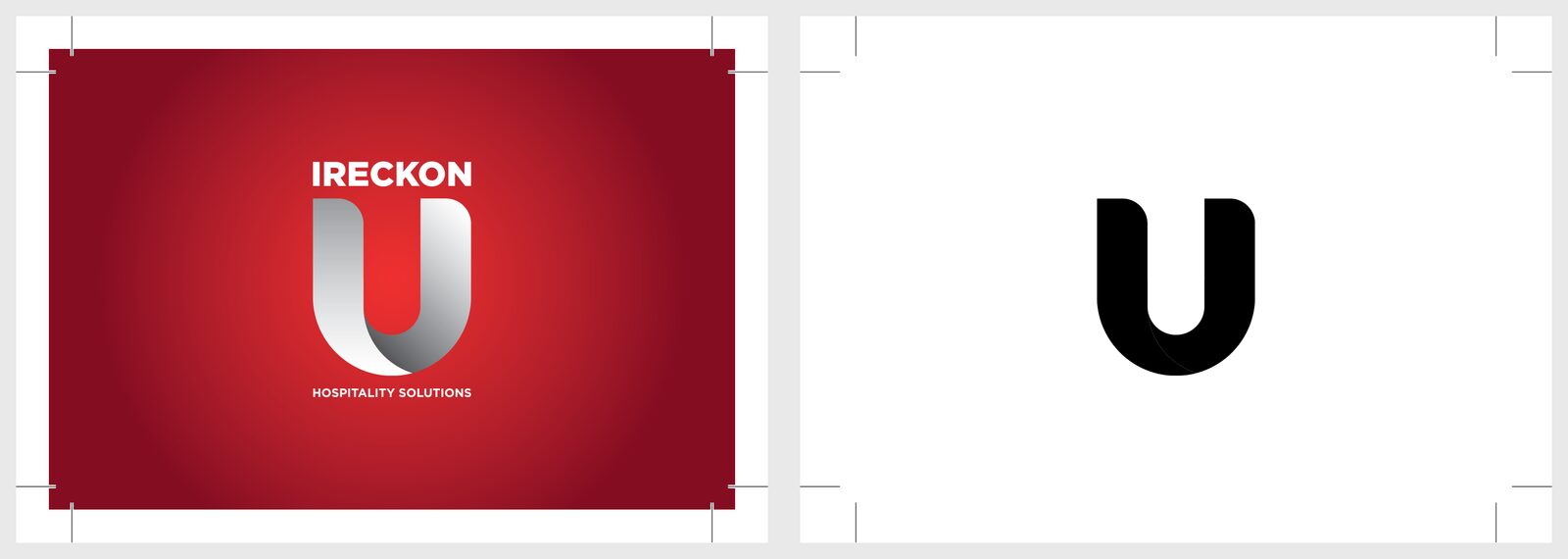
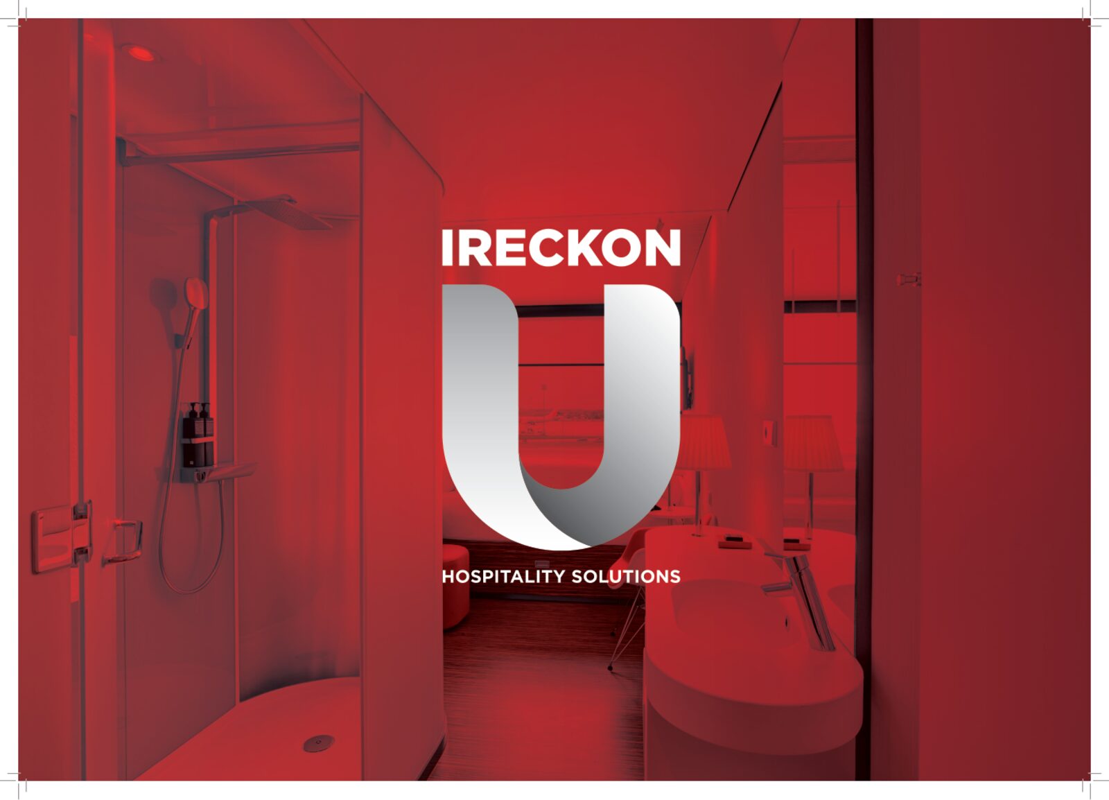
IRECKONU sell to hotels, casinos and cruise lines, so we made letterhead sets for each, with a red-washed photo on the cover sheet and a clean letter page behind it. Business cards came in a red front with the U and a white back for each member of the team, plus HTML email signatures and a presentation template.
- Hotel, casino and cruise letterhead sets
- Team business cards, including a spot UV version
- HTML email signatures for the team
- Presentation template
A Brochure
Worth Unfolding.
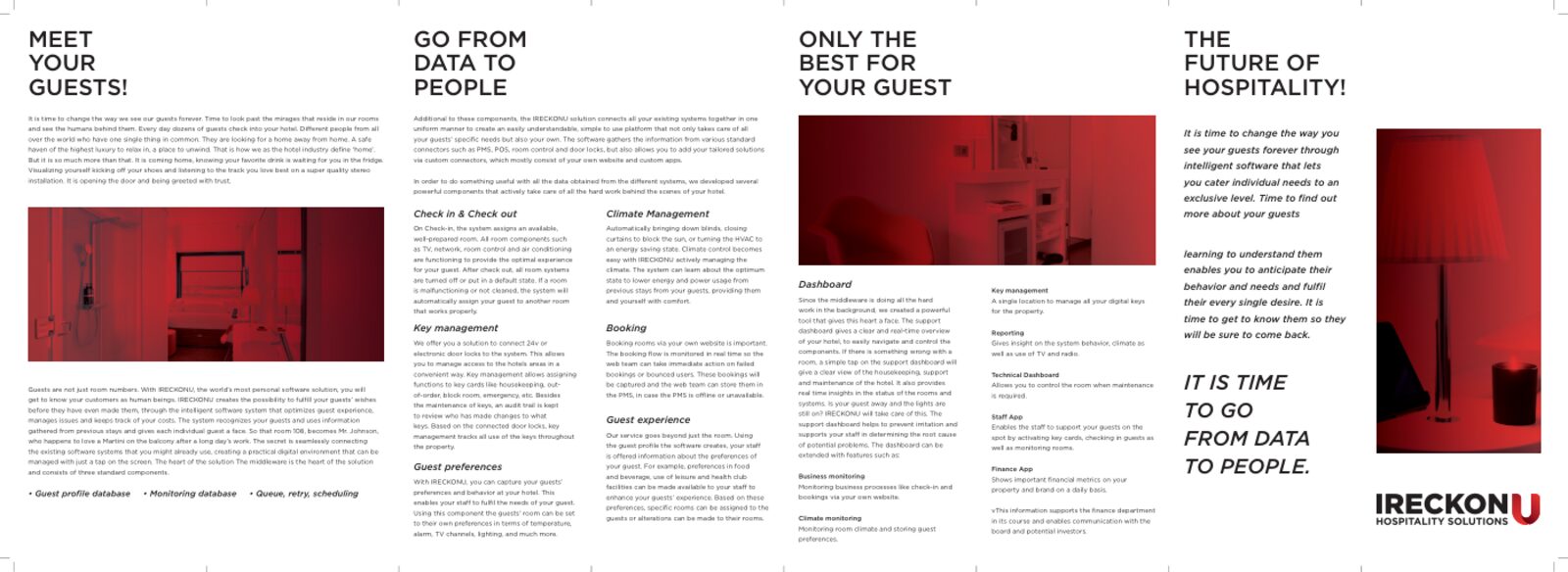
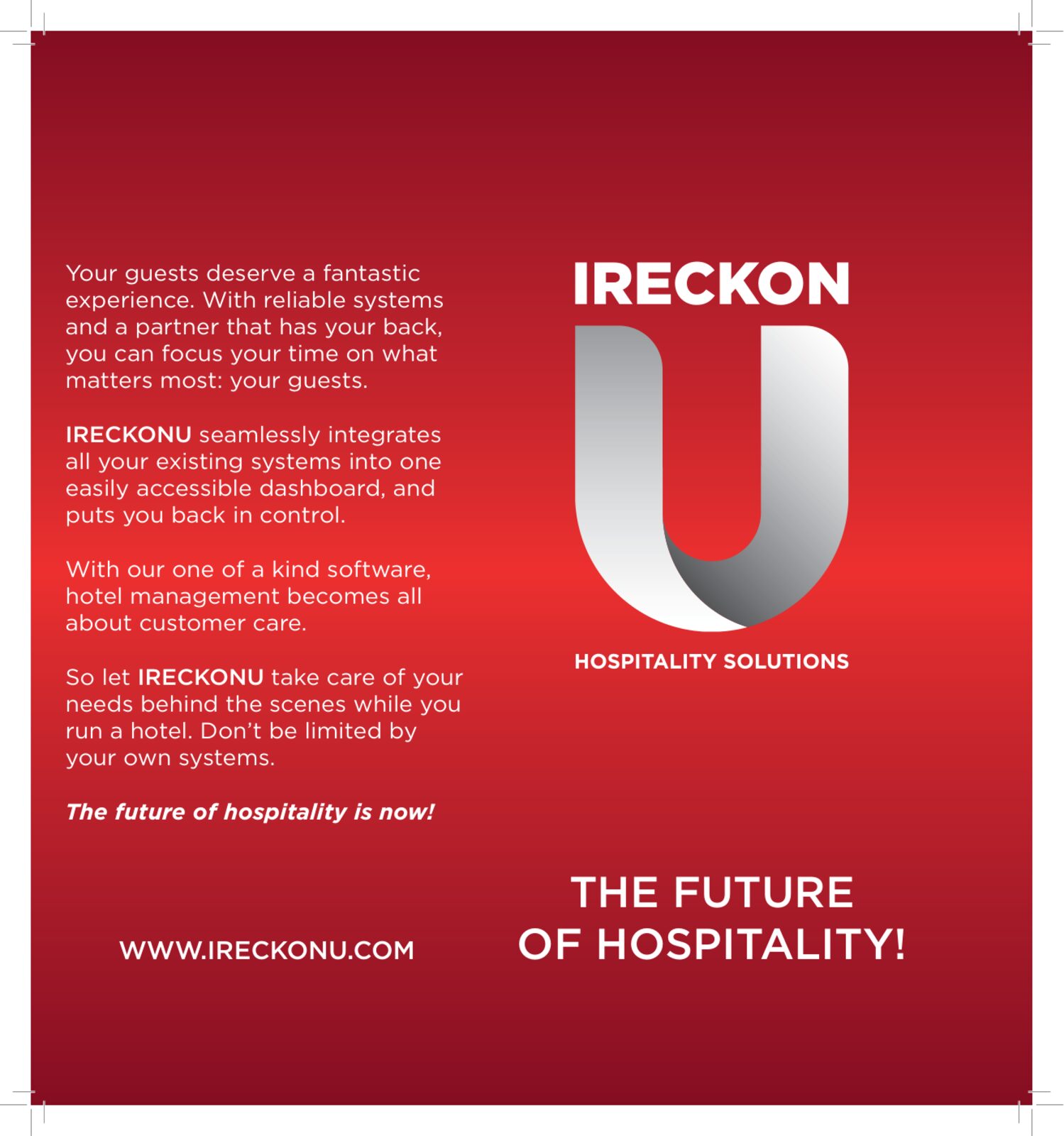
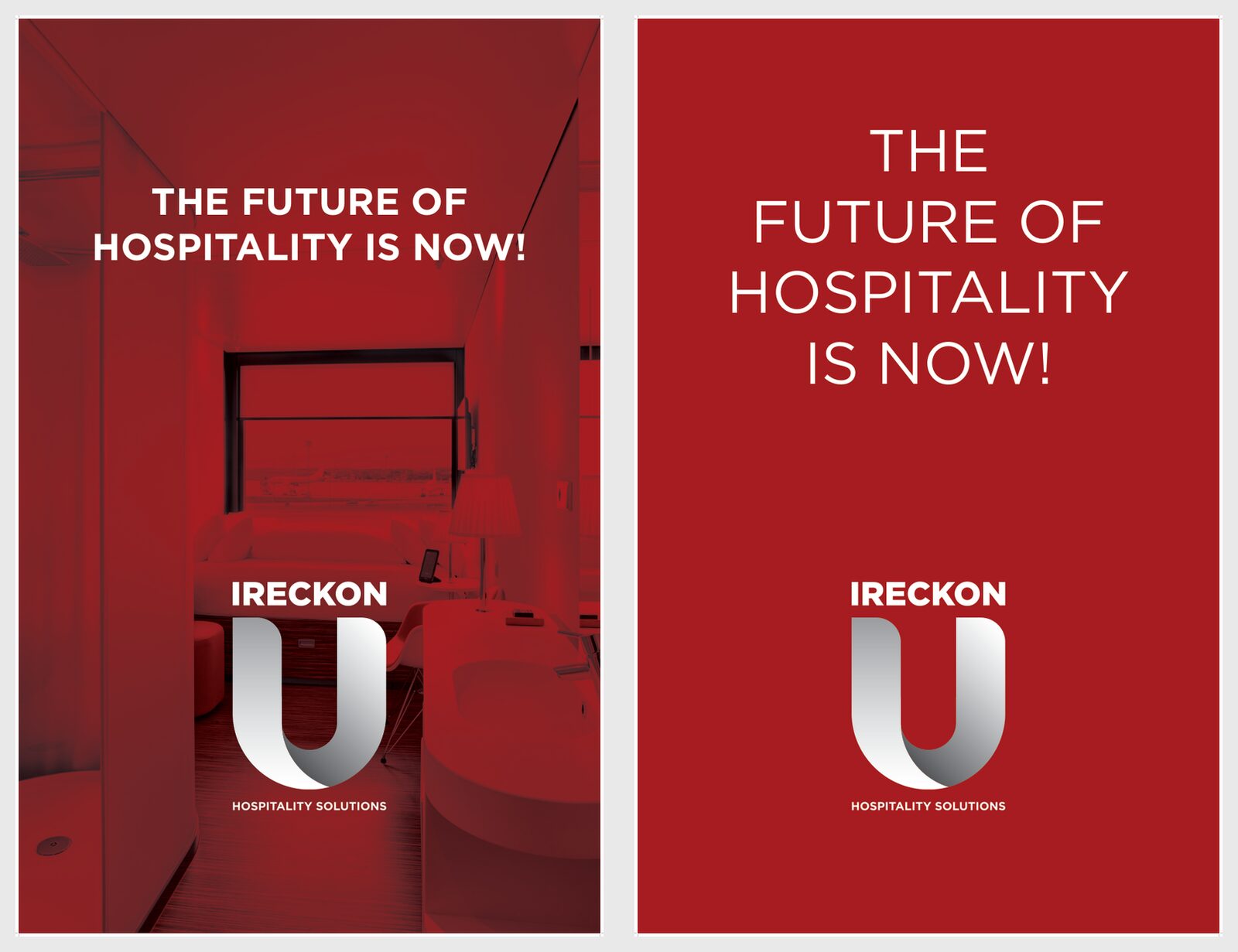
We briefed a copywriter on each product, then laid the finished words into an A3 four-fold brochure: “Meet your guests”, “Go from data to people” and “The future of hospitality”. A printed band wraps it, and banner artwork carries the same line.
- Copywriter briefs written by us
- A3 four-fold printed brochure
- Brochure band and presentation folder
- “The future of hospitality is now!” banner artwork
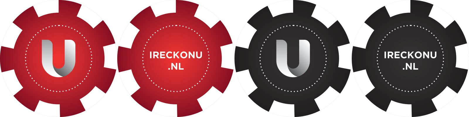
Casino Chips
With a U.
Casinos are one of IRECKONU’s markets, so we designed branded casino chips in red and black, with the U on one side and the web address on the other. A small, memorable piece of the brand in a form that market already knows.
- Red and black chip designs
- Logo face and web address face
Red Light,
Real Places.
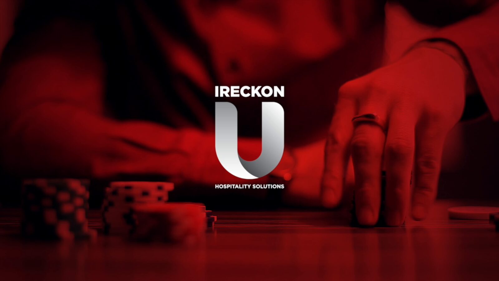
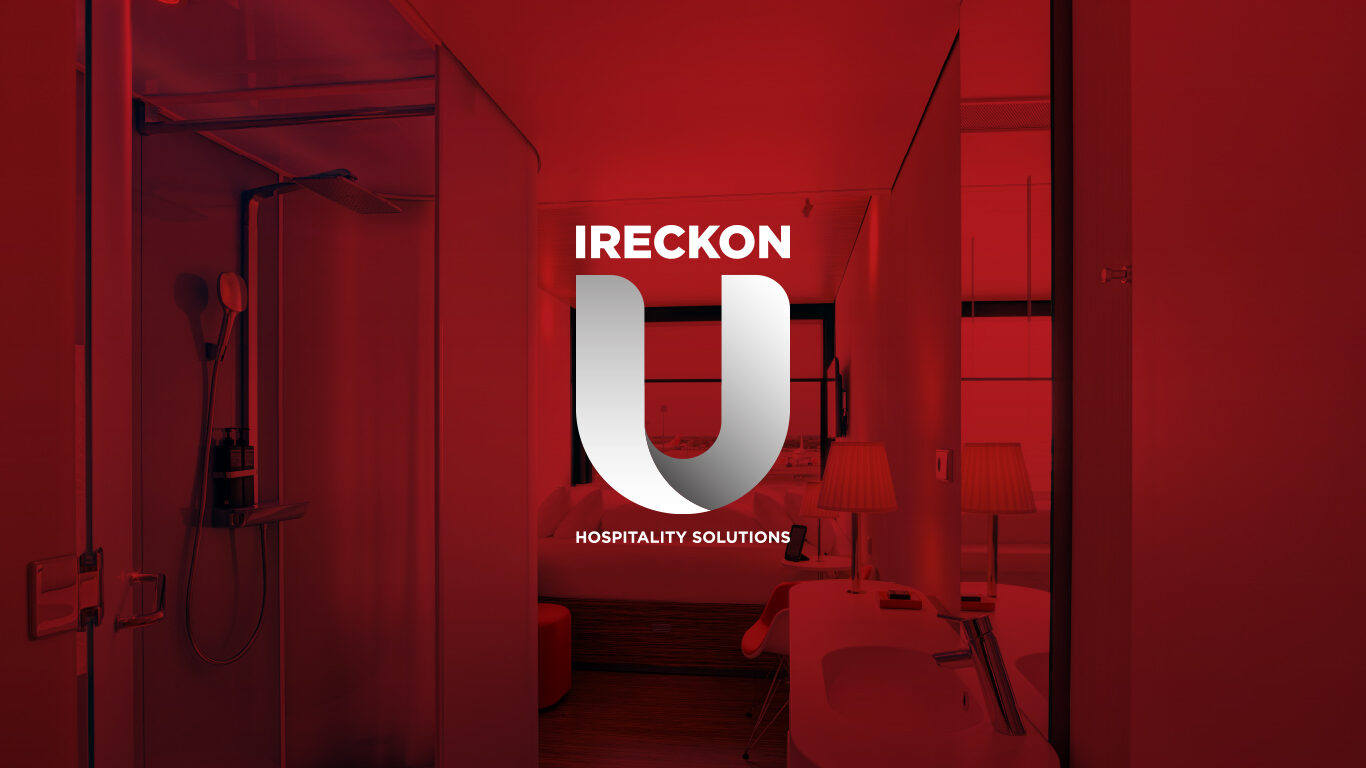
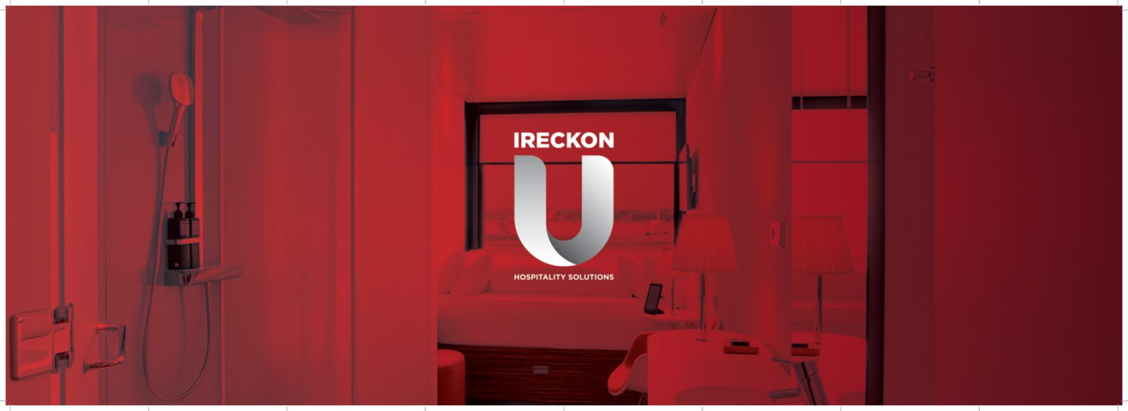
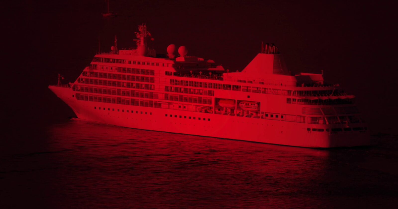
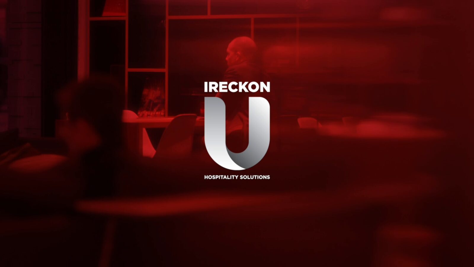
We cut short brand films for each market, hotel, casino and cruise, plus a montage, with footage washed in IRECKONU red and the U resolving over the top. The same look carried into the website design, with the logo over a red hotel room on the home page.
- Hotel, casino and cruise brand films
- Montage edit with and without music
- Website home page design in the same style
IRECKONU
Four concepts, one mark and a brand that ran from cards to casino chips.
Need a brand that matches your product?
Screenshots
& Photography
Logo concepts, final logo, brand book, stationery, brochure, event print, brand films and website design shown were produced by Northern Designers (now Northern Digital) for IRECKONU in 2015–2016. Brand copy was written by a copywriter from our briefs. IRECKONU has since updated its brand. Footage and photography in the films and layouts are licensed stock. Presented to demonstrate capability.
More from the Northern portfolio.
What clients say about our work
Real reviews from real businesses.
Had a website made from scratch was done within 4 days and turn around was great.
Great service overall. It's been a real pleasure working with Dave and his team. They've helped strengthen our business presence and brand identity through our website and are always on hand to offer support and go the extra mile. We're looking forward to continuing to work with Dave and the Northern Digital team on future projects as our business grows.
Very good experience, very knowledgable and trustworthy. Highly recommend.
What's costing you growth?
Let's find out. For free.
Book a free 30-minute strategy audit with Dave. We'll look at your marketing, find what's not working, and tell you exactly where to focus. No waffle. Just a canny plan you can act on.
Request Your Free Audit
Takes 30 seconds. No jargon, just results.