
Tea, anchors
and a lighthouse.
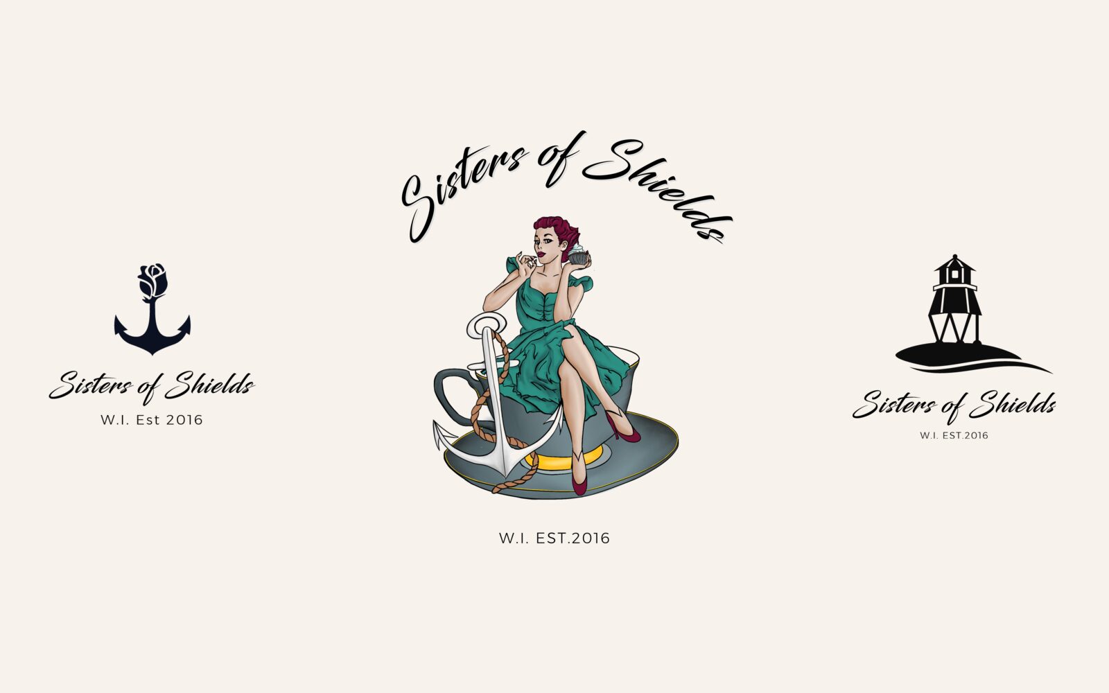
Sisters of Shields is a Women’s Institute group founded in 2016. We gave them a script wordmark, a family of coastal icons and badge lockups that carry the group’s spirit.
- WHO — Sisters of Shields, a Women’s Institute group (est. 2016)
- WHAT — Logo Concepts, Script Wordmark, Icon Set, Badge Lockups, Brand Colours
- WHEN — 2017 – 2018
- WHERE — North East England
- HOW — Several icon routes explored side by side, then built into a flexible set of lockups
Not Your Gran’s
Jam and Jerusalem.
A WI group is about friendship, tea and getting things done together. The name Sisters of Shields already said a lot: sisterhood, and a place by the sea. The brand had to carry both, feel warm and a little playful, and still work small and in one colour.
- A name with a strong sense of place
- Warm and playful, not stuffy
- Works large and small, in colour and black
Three Ideas
From the Harbour.
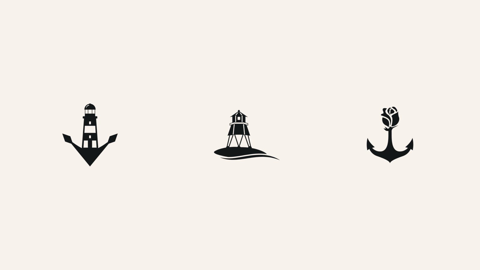
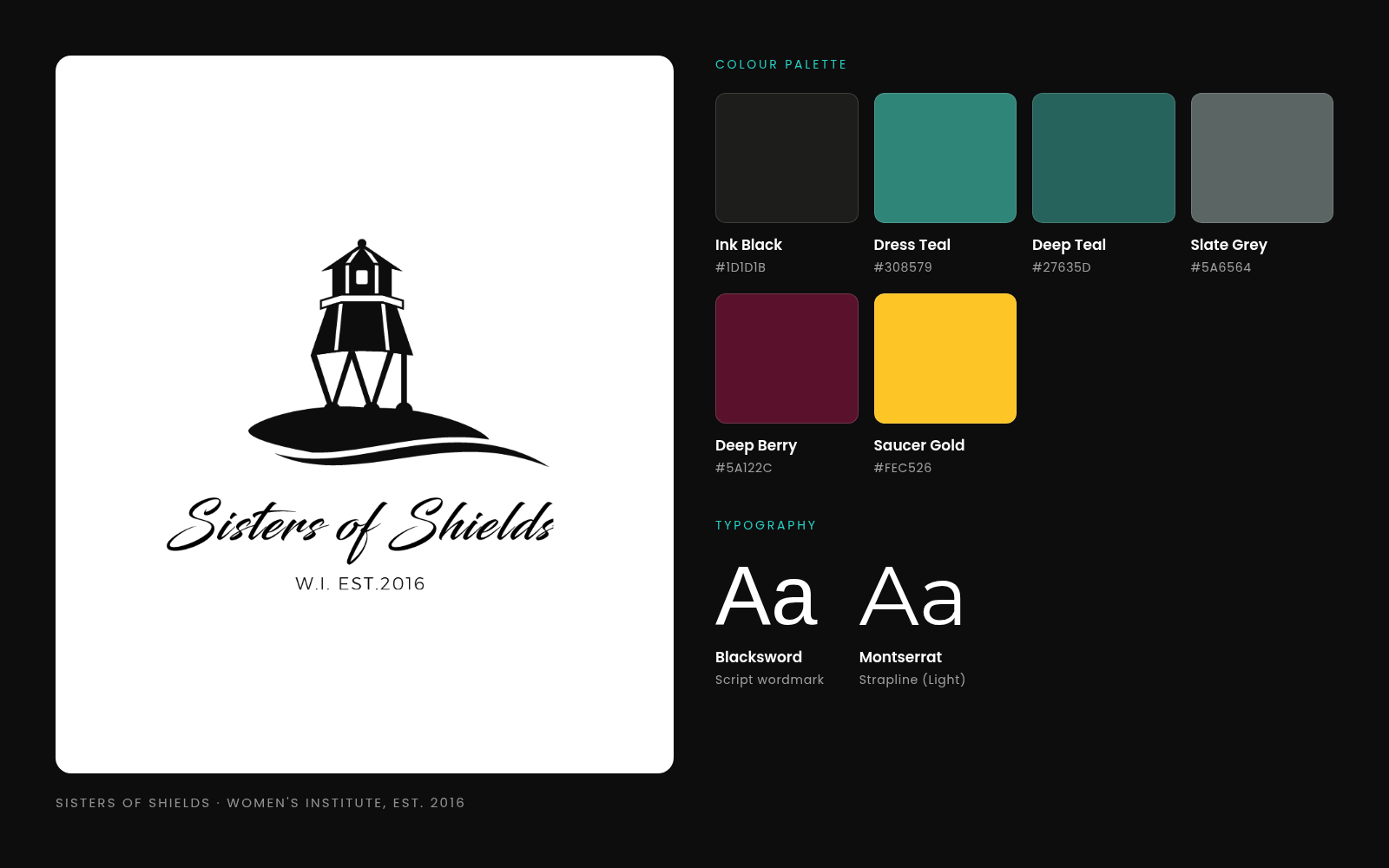
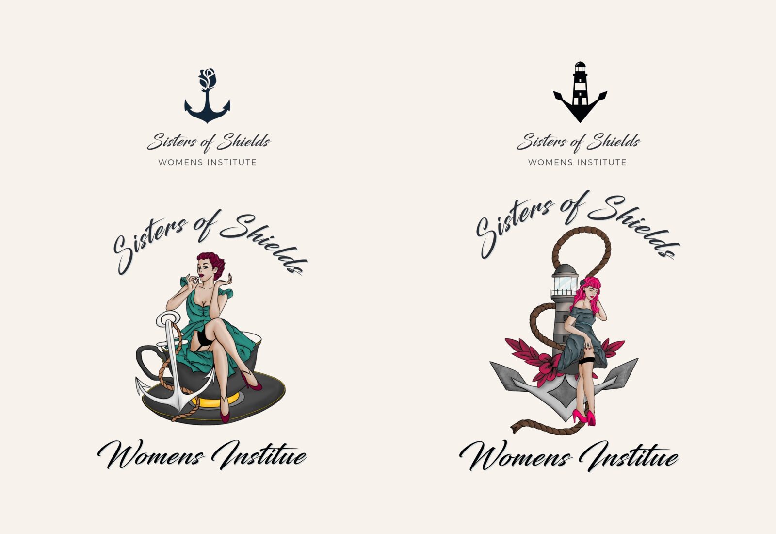
We looked to the coast for symbols. One route set a lighthouse inside an anchor. Another drew a lighthouse on legs standing on its own small island, with a wave beneath. A third grew a rose out of the top of an anchor: the sea and the sisterhood in one shape. Each one is a solid silhouette, so it holds up at any size.
- Lighthouse and anchor
- Lighthouse on an island with a wave
- Rose rising from an anchor
Written by Hand,
Set with Care.
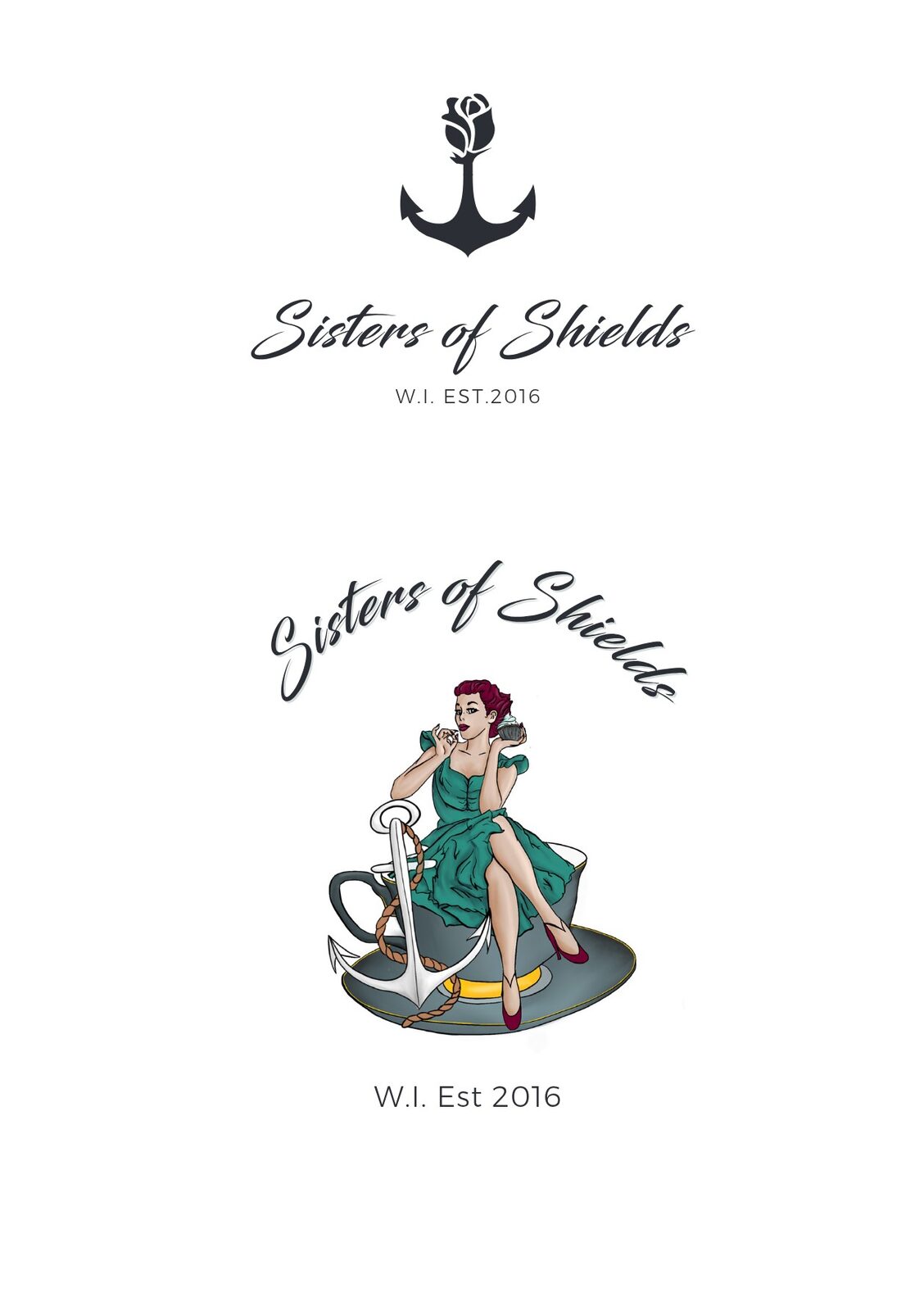
Sisters of Shields is set in a flowing brush script, which gives the name the friendly, personal feel of a handwritten note. Underneath, a light, widely spaced Montserrat line reads Womens Institute or W.I. Est 2016. The contrast keeps the script readable and makes the whole thing feel considered.
- Brush script for the group’s name
- Light spaced capitals for the strapline
- Versions with and without the founding year
Tea Time,
With an Anchor.
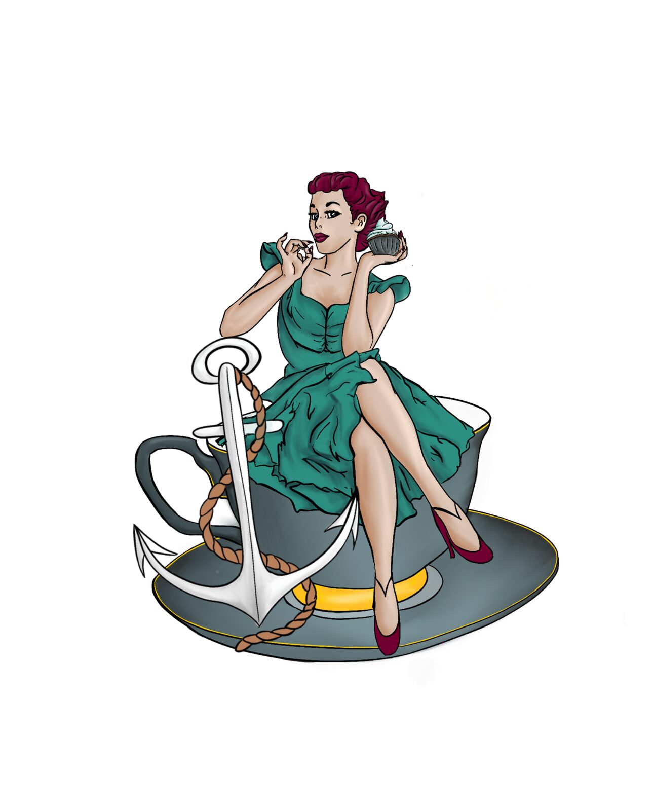
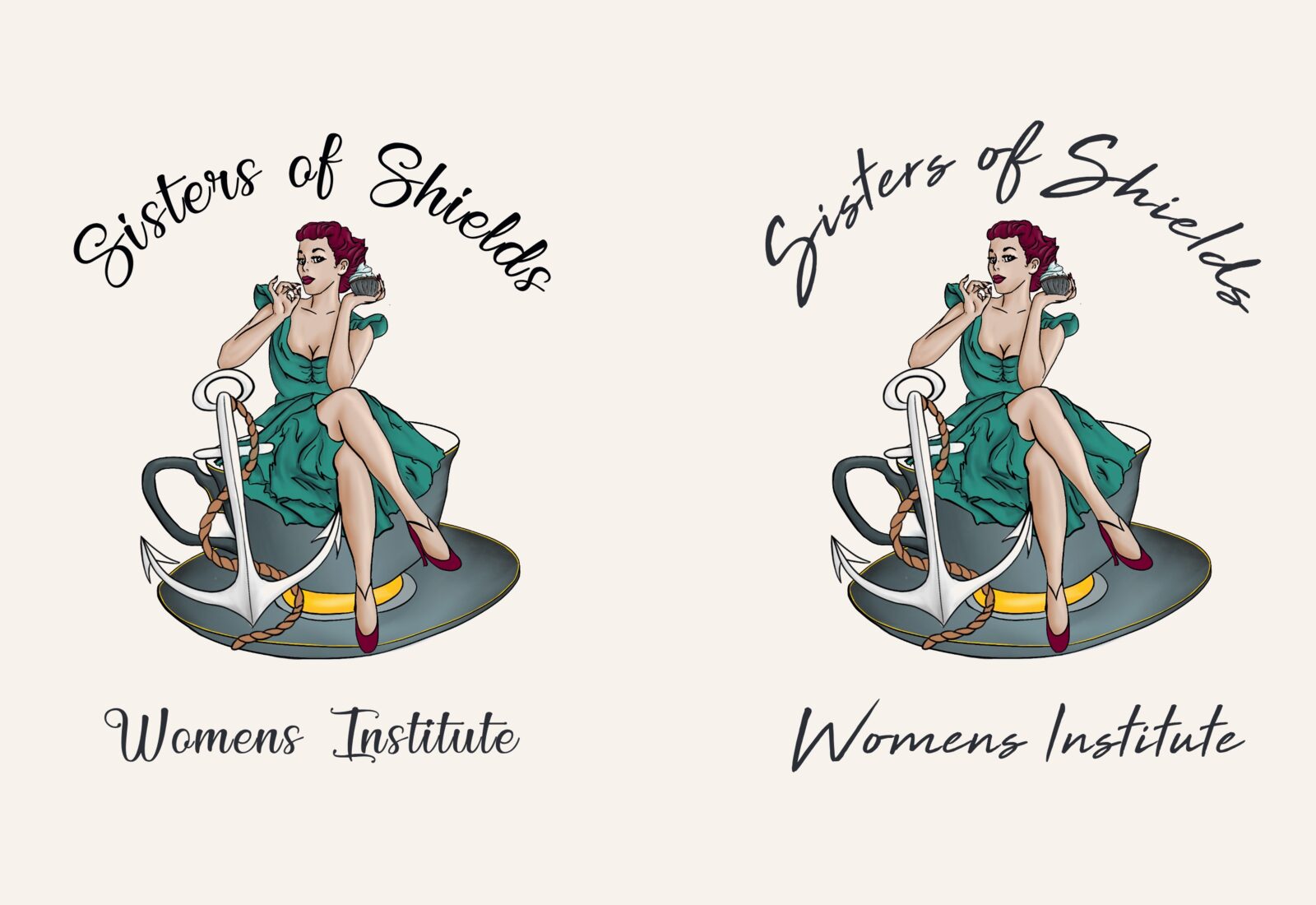
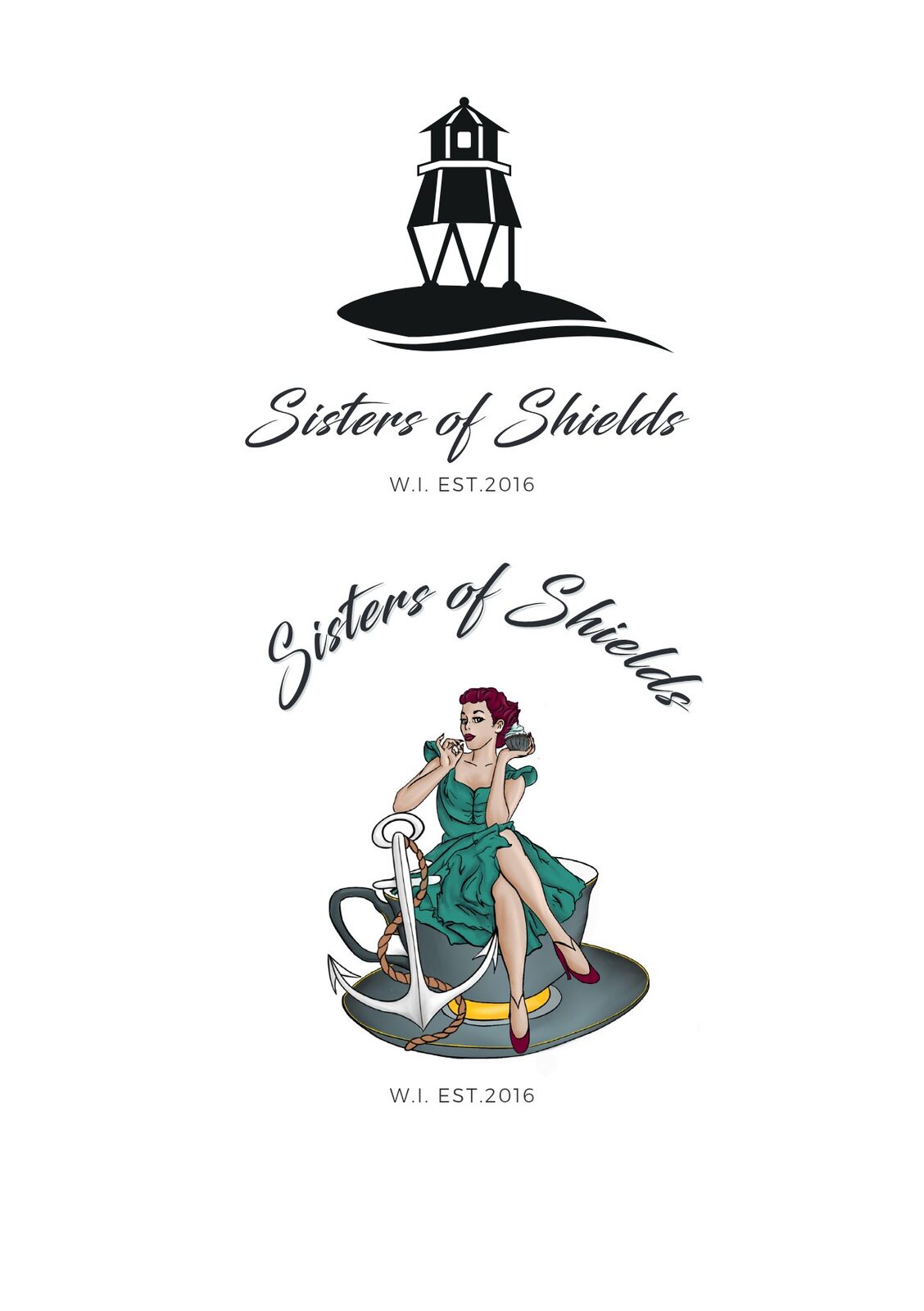
The showpiece is an illustrated pin-up character in a teal dress, perched on a giant teacup with an anchor and rope at her side. It sums up the group in one picture: tea, cake, the sea and a lot of confidence. A second version swaps the teacup for a lighthouse wrapped in rope.
- Full-colour illustrated character
- Teacup and anchor version
- Lighthouse and rope version
Script on Top,
Story Underneath.
We combined the illustration with the wordmark into badge lockups: Sisters of Shields arching over the character, with Womens Institute in script or W.I. Est 2016 in capitals below. They are the version to use when there’s room for colour and the group wants to show its personality.
- Arched script over the illustration
- Script and capital strapline options
- Full-colour badges for larger pieces
One Family,
Many Sizes.
The finished logo sheets pair each icon with the wordmark, alongside the illustrated badges, so the group can pick the right version for the job. The simple black icons suit small spaces and one-colour printing. The illustrated badges take over when there’s room for colour. Teal, slate, deep berry and saucer gold come straight from the illustration.
- Icon-and-wordmark logos for small spaces
- Illustrated badges for colour pieces
- Palette taken from the illustration
We couldn’t be happier with the branding support we received from Northern. From the start, they truly understood what we needed and delivered a design which is both professional and engaging.
Sisters of Shields WI
A seaside brand with personality for a local WI.
Need a brand for your group or club?
Screenshots
& Photography
Logo concepts, wordmark, icons, badge lockups and illustration shown were produced by Northern Digital for Sisters of Shields WI. Presented to demonstrate capability.
More from the Northern portfolio.
What clients say about our work
Real reviews from real businesses.
Had a website made from scratch was done within 4 days and turn around was great.
Great service overall. It's been a real pleasure working with Dave and his team. They've helped strengthen our business presence and brand identity through our website and are always on hand to offer support and go the extra mile. We're looking forward to continuing to work with Dave and the Northern Digital team on future projects as our business grows.
Very good experience, very knowledgable and trustworthy. Highly recommend.
What's costing you growth?
Let's find out. For free.
Book a free 30-minute strategy audit with Dave. We'll look at your marketing, find what's not working, and tell you exactly where to focus. No waffle. Just a canny plan you can act on.
Request Your Free Audit
Takes 30 seconds. No jargon, just results.