Slip Somewhere
Else, Not Here.
Slipless treat floors so people don’t fall on them. It’s a serious job in a dull-looking industry. We gave them a loud yellow brand with a hand-brushed logo, then carried it across cards, brochures and email flyers in Dutch and English.
- WHO — Slipless, anti-slip floor treatments for businesses and homes
- WHAT — Logo Concepts, Logo Design, Colour Palette, Imagery Style, Business Cards, Tri-fold Brochures, Email Flyers, Social Images, Email Signatures
- WHEN — 2014–2015
- WHERE — Amstelveen, the Netherlands
- HOW — Five logo routes, one bold brush script, and every piece of print in two languages
Safety Doesn’t
Have to Be Dull.
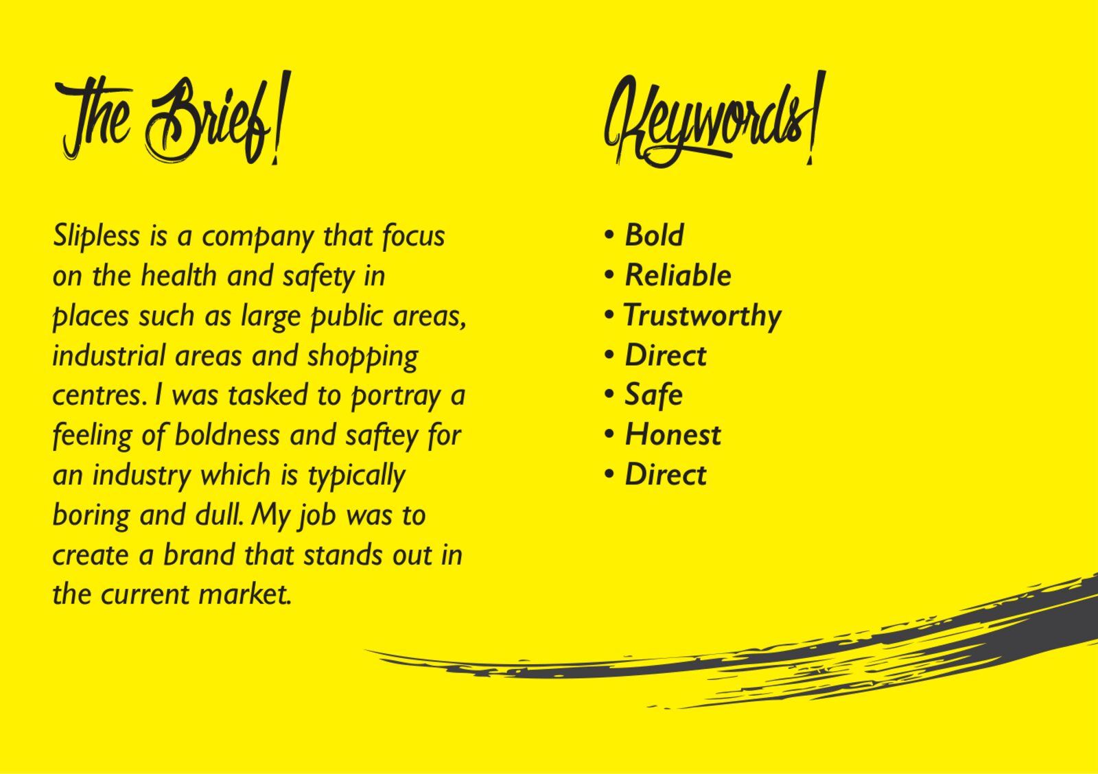
Slipless apply an invisible treatment that makes floors grip, in shopping centres, hotels, hospitals, factories and homes. Health and safety brands tend to look grey and forgettable. The brief was to make Slipless feel bold and safe at the same time, and stand out from everyone else in the market.
- Keywords: bold, reliable, trustworthy, direct, safe, honest
- Two audiences: businesses (B2B) and homeowners (B2C)
- Two languages: Dutch and English
Five Routes
on the Table.
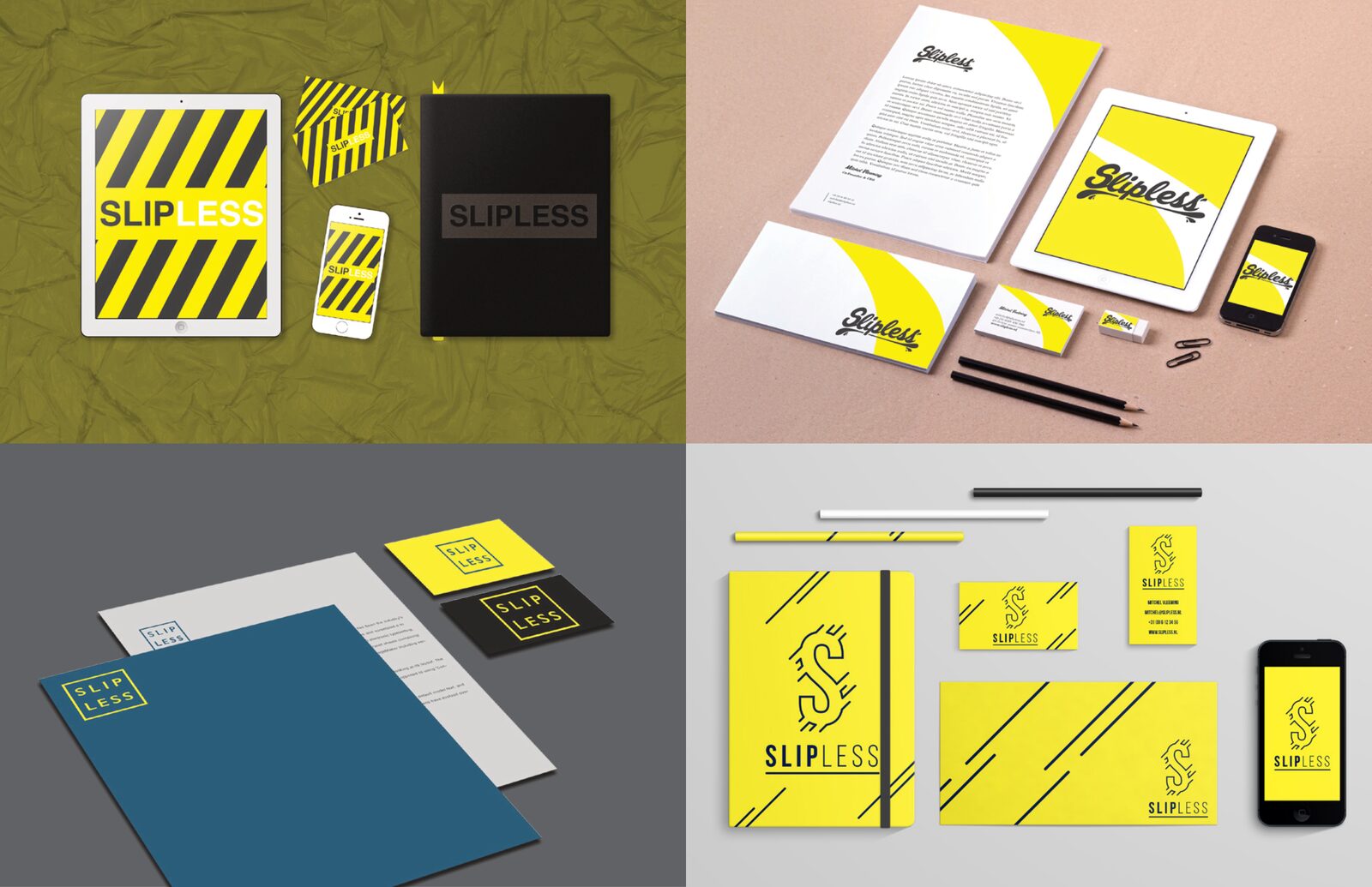
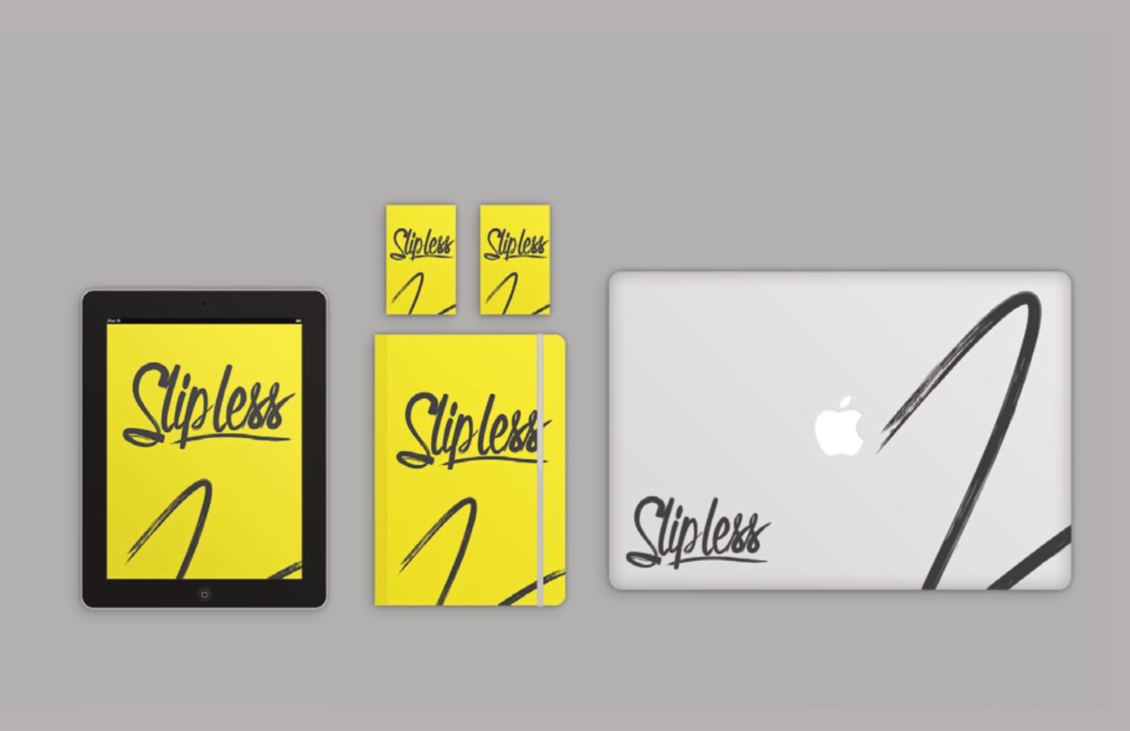
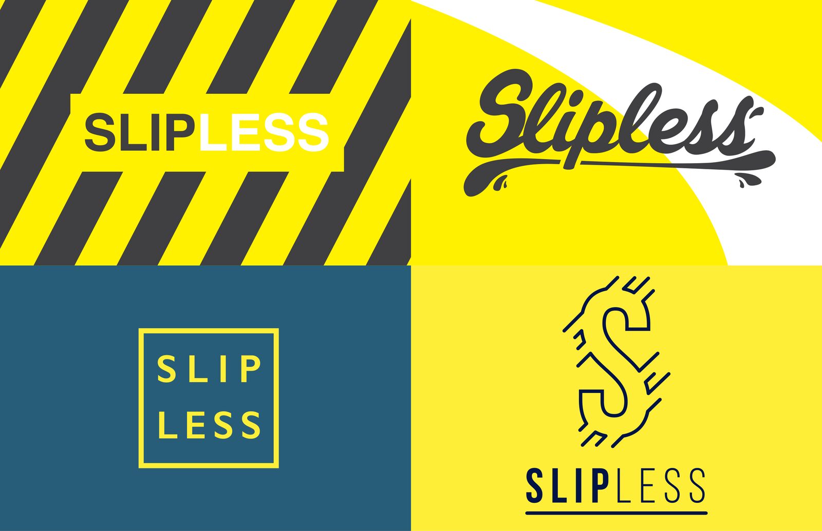
We presented five logo directions, each shown on stationery and screens. Hazard stripes took the obvious safety route. A boxed SLIP LESS wordmark went calm and corporate. A broken S icon showed the slip itself. A swooping script and a hand-brushed script went the other way: human, energetic and nothing like a safety sign. Slipless picked the brush script.
- Five logo concepts in one presentation
- Each mocked up on cards, letterheads and devices
- Safety-sign and friendly routes side by side
A Brush Stroke
That Doesn’t Slip.
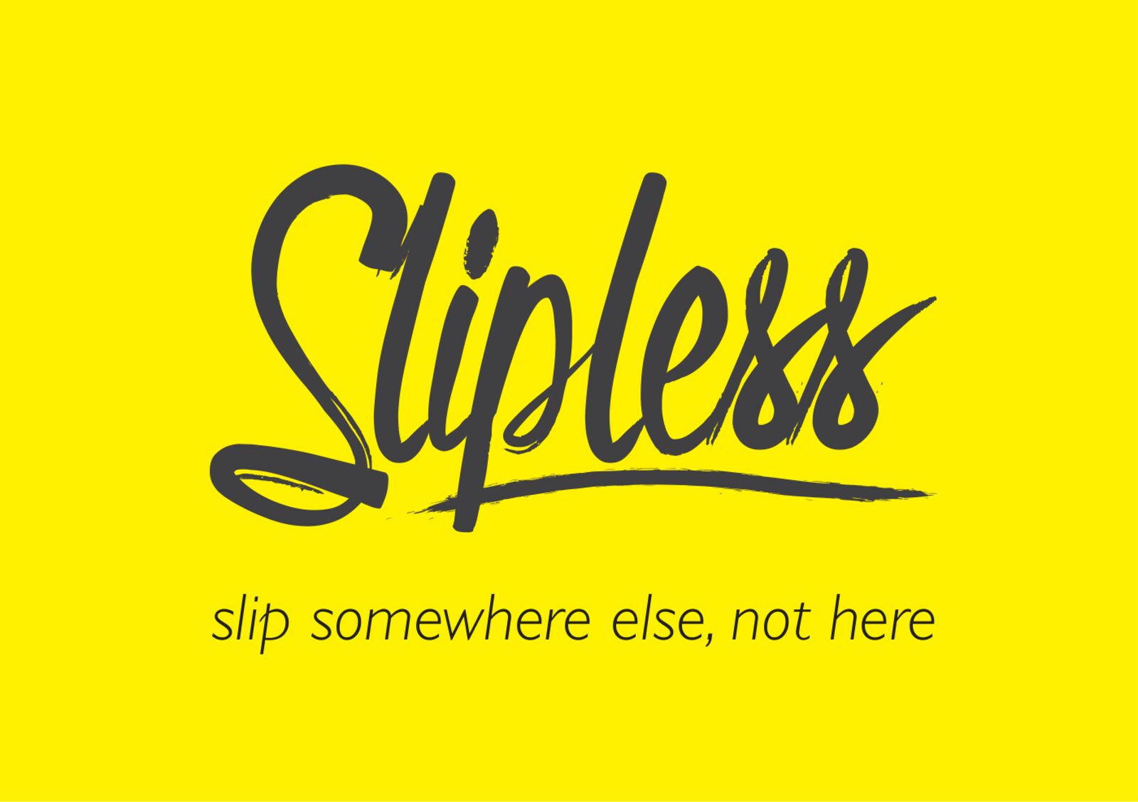
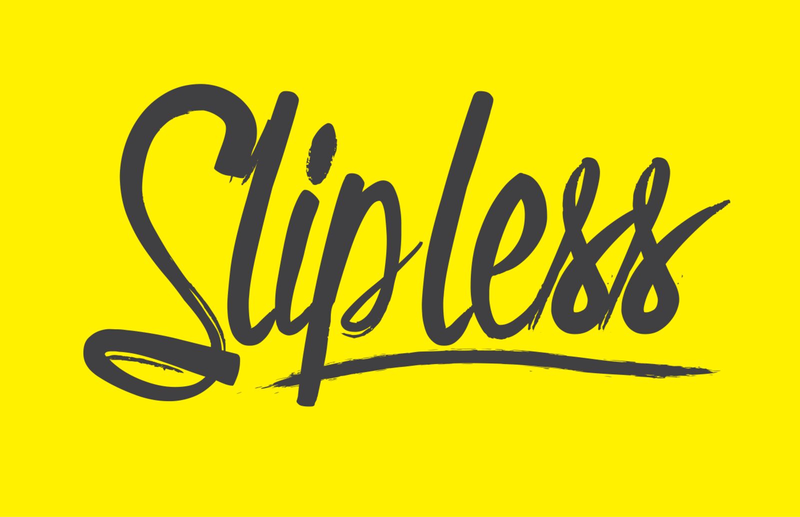
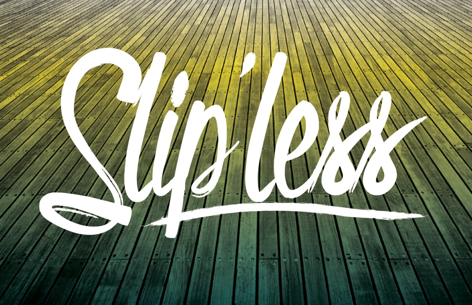
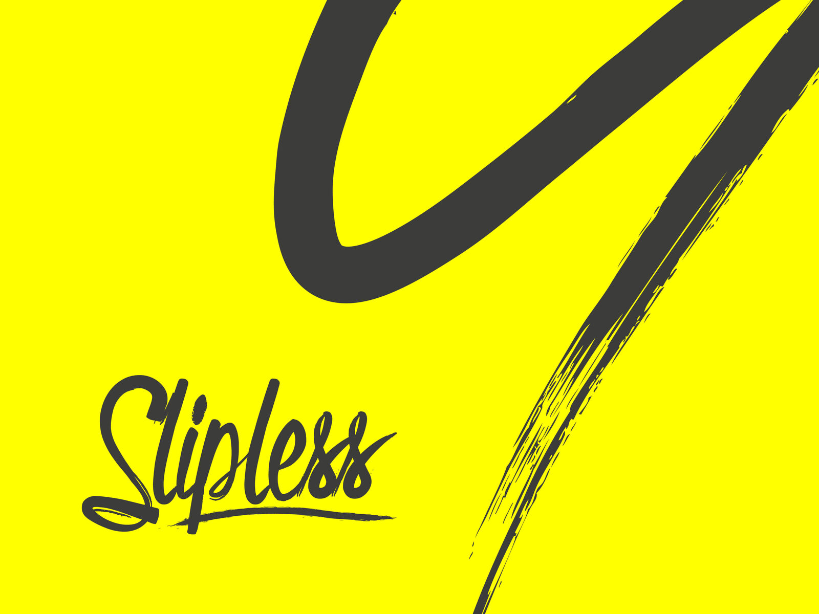
The final mark is a confident, hand-brushed script with a long underline that grounds it, like a stroke across a floor. The line “slip somewhere else, not here” sits underneath in a light italic. It works dark on yellow, white over photography, and as a single brush-stroke “S” graphic on the back of the cards.
- Hand-brushed script logo with grounding underline
- Strapline: “slip somewhere else, not here”
- Yellow, white and dark versions
- Brush-stroke graphic used across print
Hazard Yellow,
Calm Teal.
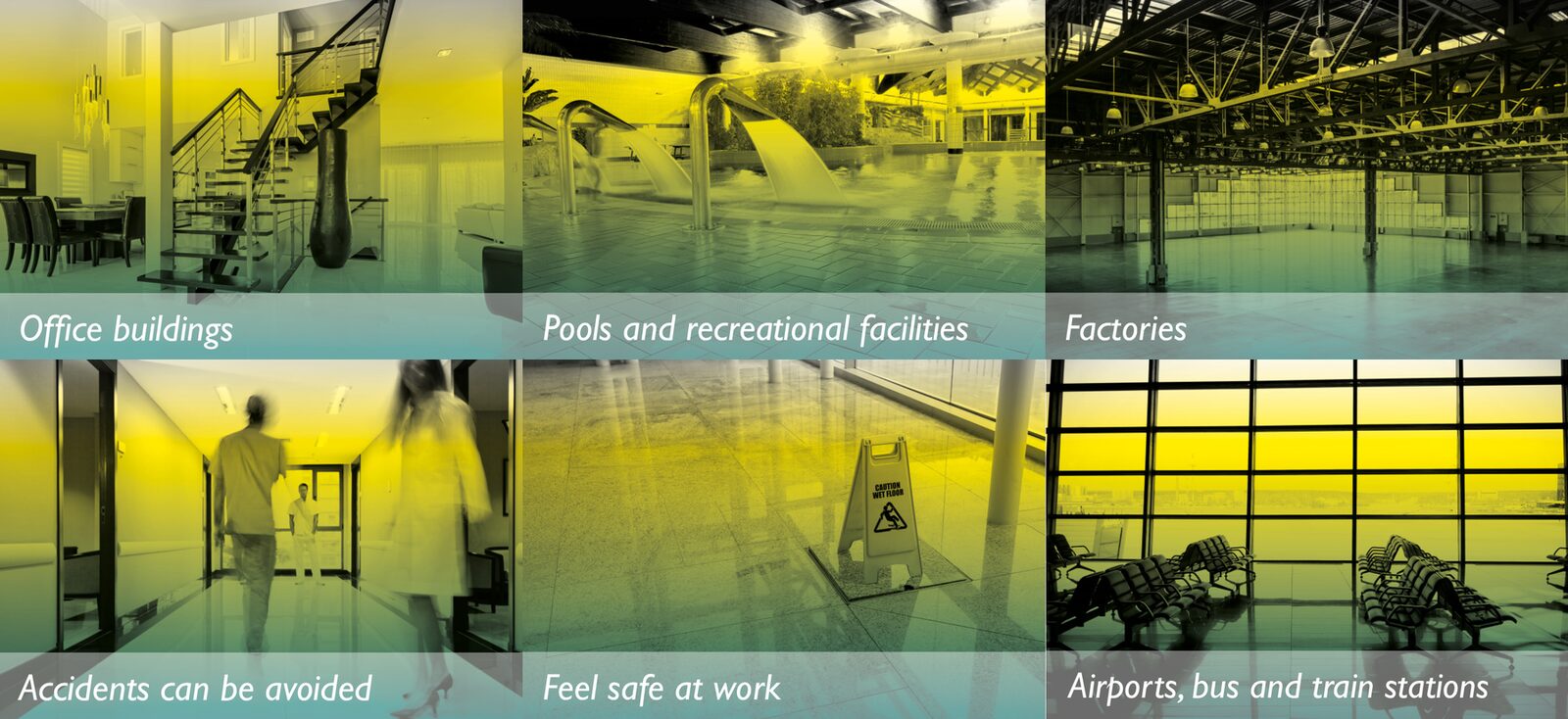
Pure yellow does the shouting, the way a warning sign does. A deep teal and a dark grey calm it down and keep it trustworthy. For photography we set one rule: black and white images with a teal-to-yellow gradient over the top, so every photo of a floor, pool or corridor looks like Slipless.
- Yellow C0 M0 Y100 K0
- Teal C100 M44 Y56 K0
- Grey K90
- Black and white photos with a teal-to-yellow overlay
Yellow on One Side,
Clean on the Other.
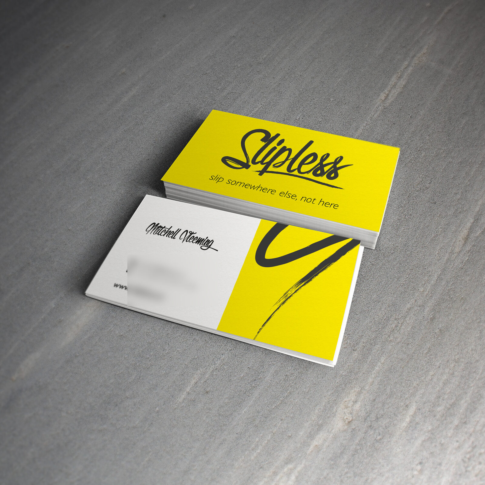
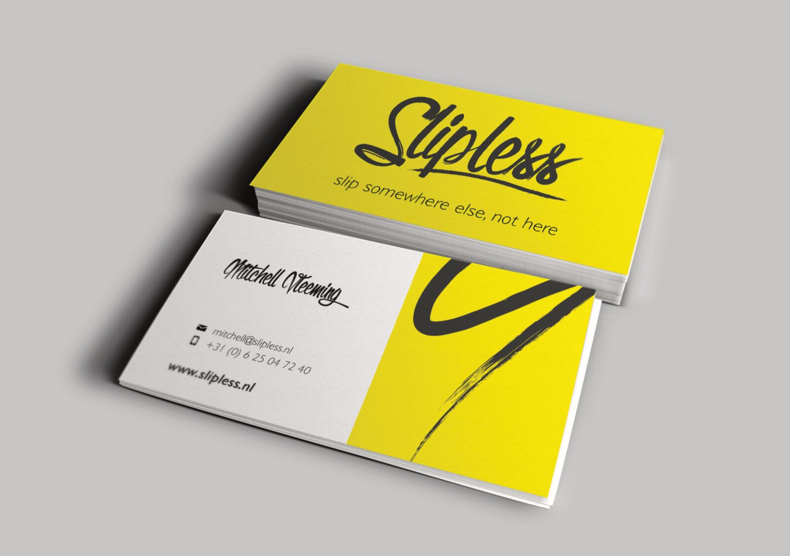
The cards put the logo and strapline on a full yellow face. The back is split: white for the name and contact details, set in the same brush script, and a yellow panel with the big brush stroke running off the edge. We also built HTML email signatures for the team to match.
- Full yellow logo face
- Name in brush script on a white panel
- Matching HTML email signatures
Why, How,
Where.
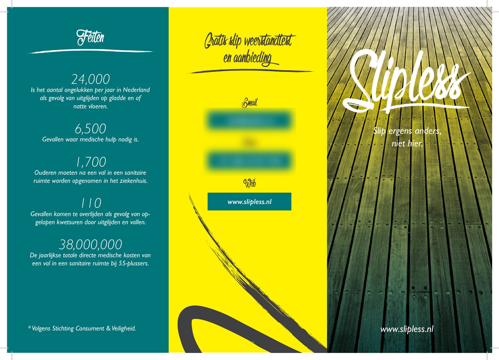
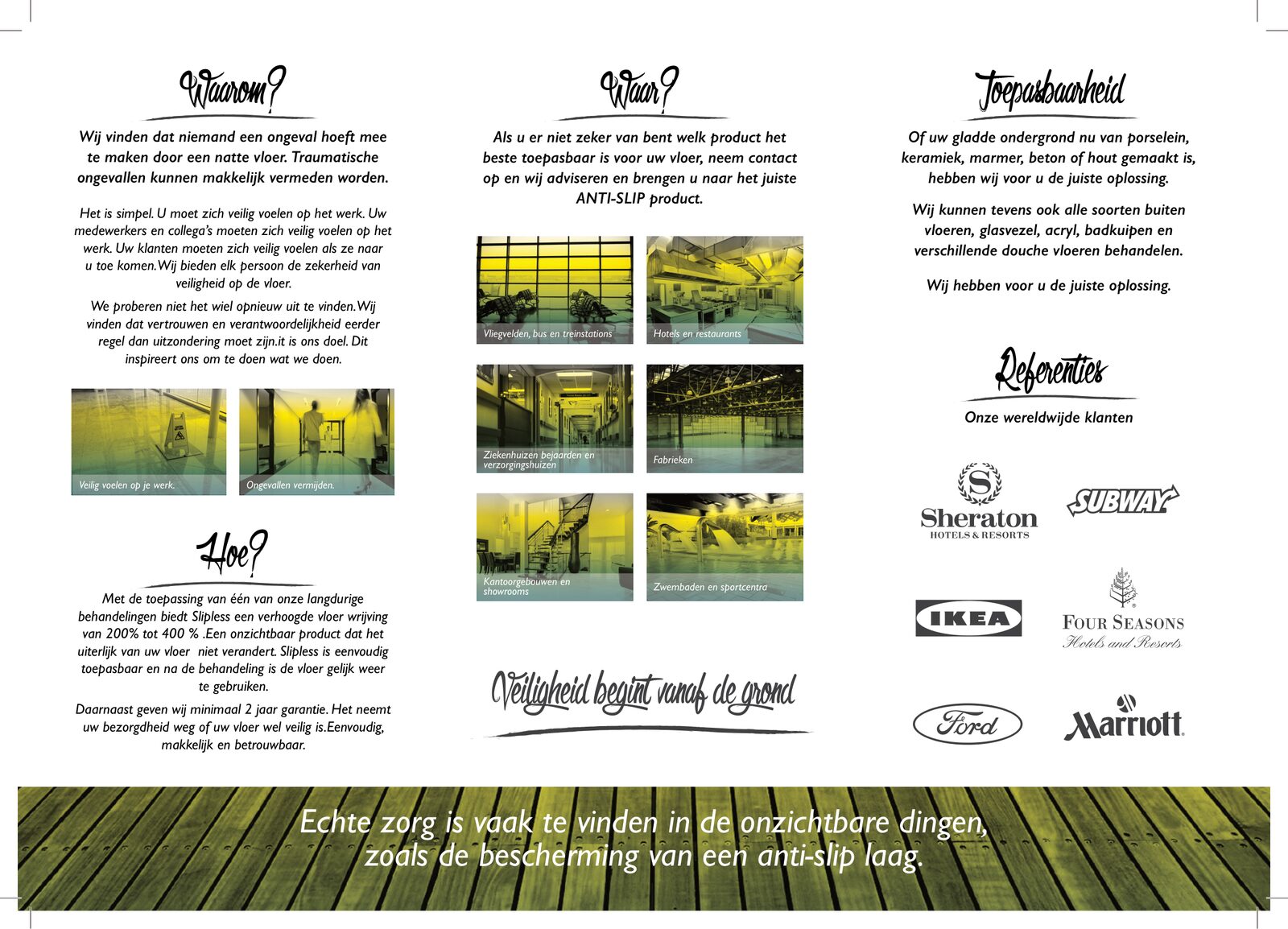
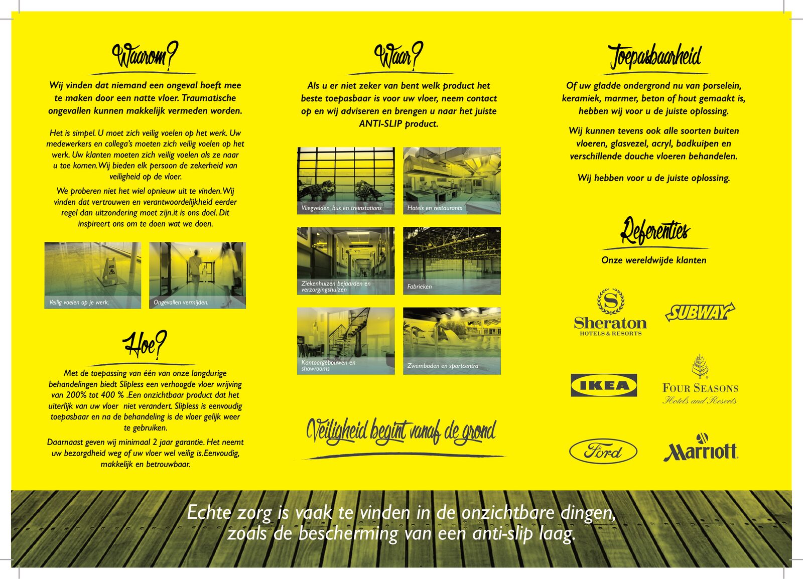
The tri-fold brochure answers the questions a buyer asks: why it matters, how the treatment works, where it can go and which surfaces it suits. The cover is the logo on a gradient wooden floor, and a contact panel offers a free slip-resistance test. We laid it out in Dutch for businesses, in white and yellow versions, with the copy edited by a copywriter.
- Tri-fold print brochure, Dutch B2B
- White and yellow versions
- Free slip test offer on the contact panel
- Copy edited by a professional copywriter
Long Scroll,
Short Posts.
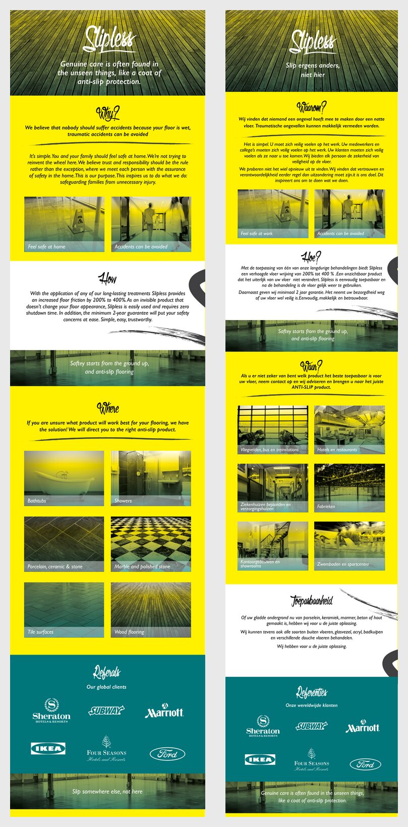
For email we turned the brochure into long, single-column flyers: one for businesses and one for homes, in English and Dutch. The home version swaps factories and airports for bathtubs, showers and wooden floors. Short image posts pull single messages out, like “Feel safe at work” and “Accidents can be avoided”, each in the gradient photo style.
- B2B and B2C email flyers
- English and Dutch versions
- Captioned image posts in the brand photo style
- Branded desktop wallpaper
Slipless
A loud, friendly brand for a safety product, in two languages.
Is your industry dull-looking? Let’s change that.
Screenshots
& Photography
Logo concepts, final logo, colour palette, imagery style, business cards, brochures, email flyers, social images and email signatures shown were produced by Northern Designers (now Northern Digital) for Slipless in 2014–2015. Brochure copy was edited by an outside copywriter. Photography is licensed stock. Contact details have been blurred. Presented to demonstrate capability.
More from the Northern portfolio.
What clients say about our work
Real reviews from real businesses.
Had a website made from scratch was done within 4 days and turn around was great.
Great service overall. It's been a real pleasure working with Dave and his team. They've helped strengthen our business presence and brand identity through our website and are always on hand to offer support and go the extra mile. We're looking forward to continuing to work with Dave and the Northern Digital team on future projects as our business grows.
Very good experience, very knowledgable and trustworthy. Highly recommend.
What's costing you growth?
Let's find out. For free.
Book a free 30-minute strategy audit with Dave. We'll look at your marketing, find what's not working, and tell you exactly where to focus. No waffle. Just a canny plan you can act on.
Request Your Free Audit
Takes 30 seconds. No jargon, just results.