Same S,
Built Properly.
SurgoTech build custom software, automate business processes and connect the tools companies already use. Their old logo didn’t say any of that. We rebuilt the S mark from a squircle, gave the brand a palette, a typeface and a voice, and wrote it all down in an online guidelines document the founders can hand to anyone.
- WHO — SurgoTech Solutions, founded by Jack Sheriff and Tom Charlton
- WHAT — Logo Redesign, Brand Identity, Brand Guidelines, Tone of Voice, Pull-up Banner, Business Cards, LinkedIn Artwork, Logo Packs
- WHEN — April 2026
- WHERE — North East England
- HOW — One shape, one typeface and five colours, documented in a living web page instead of a PDF nobody opens
A Logo That
Fits the Work.
Jack Sheriff and Tom Charlton started SurgoTech after watching businesses fight clunky processes and software that didn’t fit. They offer three things: bespoke software, process automation and third-party integration. The existing logo was a pixelated S in red and orange with heavy capitals underneath. It didn’t say software, automation or integration. They had an event on 20 April and needed a brand that was ready for it.
- Rebrand for a software, automation and integration company
- Keep the S, lose the pixel effect
- Print ready for an event on 20 April

Three Strokes
in a Squircle.
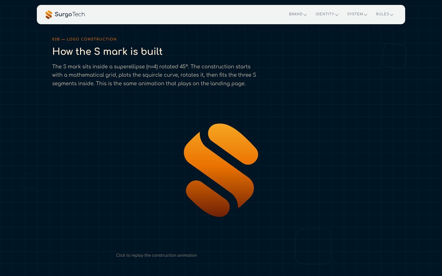
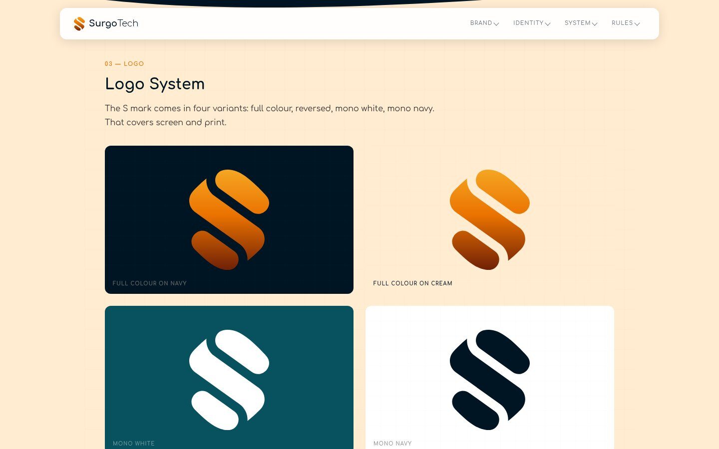
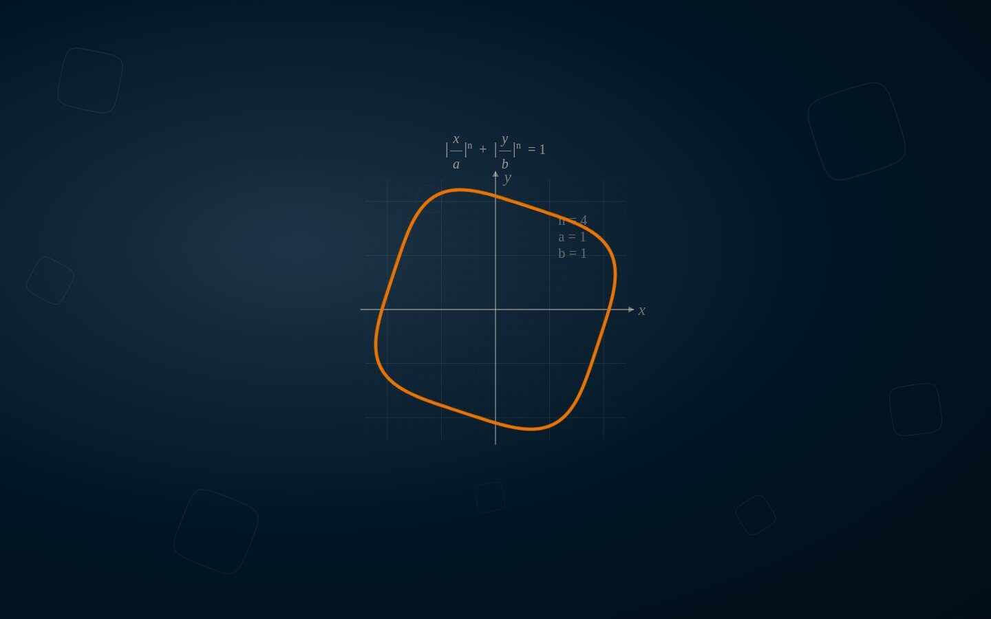
We kept the idea of an S, because it was already theirs, and rebuilt it from geometry. The mark sits inside a superellipse, a squircle with n=4, rotated 45 degrees. Three rounded segments fit inside it, filled with a warm gradient from gold to orange to deep cider. The guidelines play the construction as an animation, so anyone can see the logo wasn’t drawn freehand.
- S mark rebuilt on a superellipse grid
- Gold to orange to cider gradient, plus solid and mono versions
- Animated construction you can replay
- Same S used as app icon and favicon
Every Version
Ready to Download.
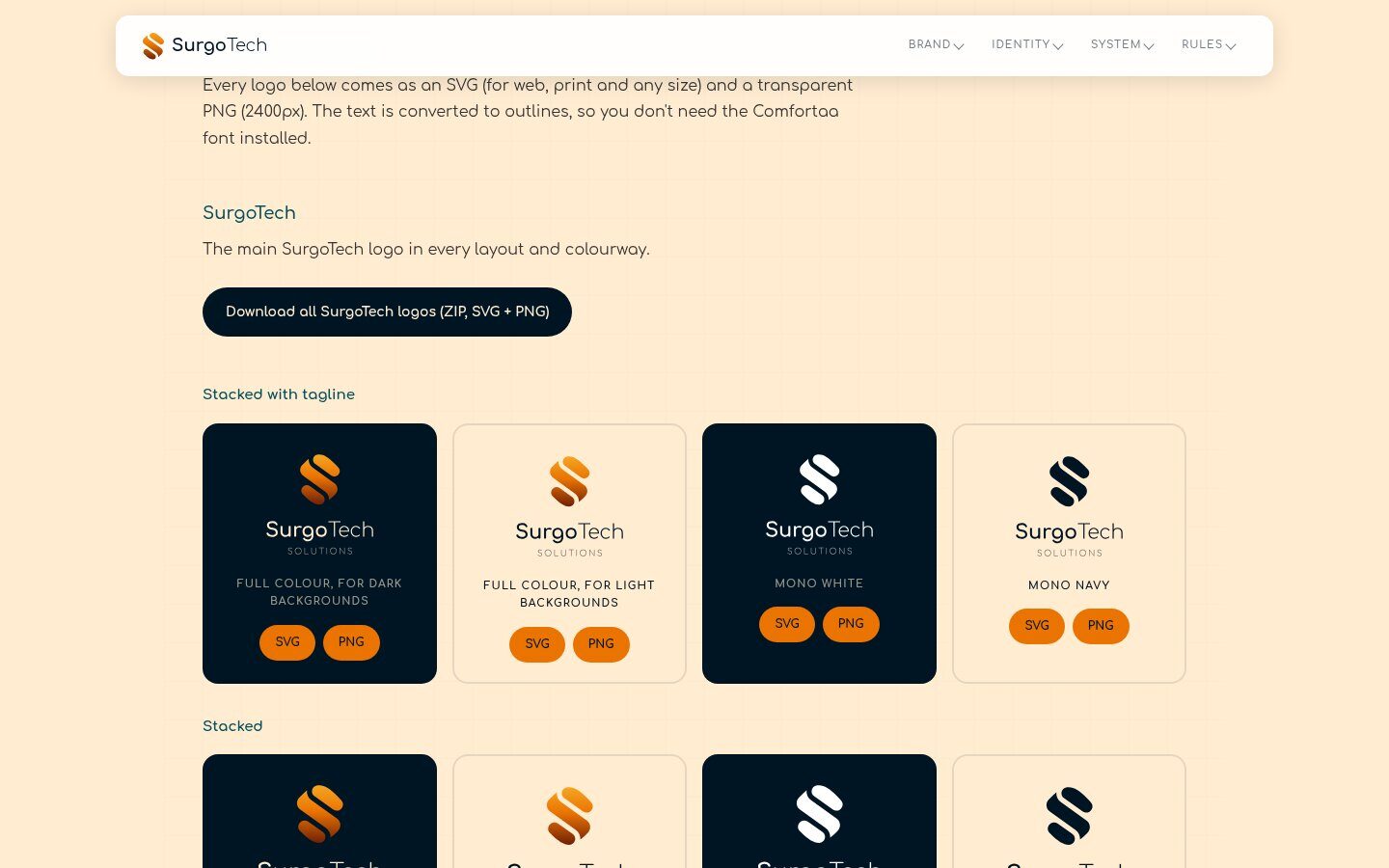
The wordmark is set in Comfortaa with a bold and light split, Surgo heavy and Tech light, with SOLUTIONS spaced out underneath. We drew it stacked, horizontal and on two lines, each in full colour for dark and light backgrounds, mono white and mono navy. Every version is outlined SVG plus a 2400px PNG, zipped up and linked straight from the guidelines. We also made a matching logo for Startup Launchpad, a SurgoTech offer, so it sits in the same family.
- Stacked, horizontal and two-line lockups
- Full colour, reversed, mono white and mono navy
- SVG and PNG packs, no font install needed
- Startup Launchpad logo in the same family

Navy Does
Most of the Work.
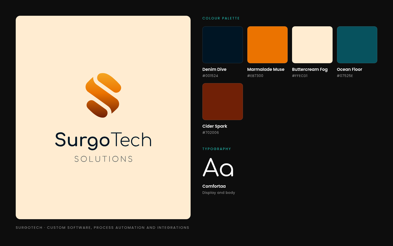
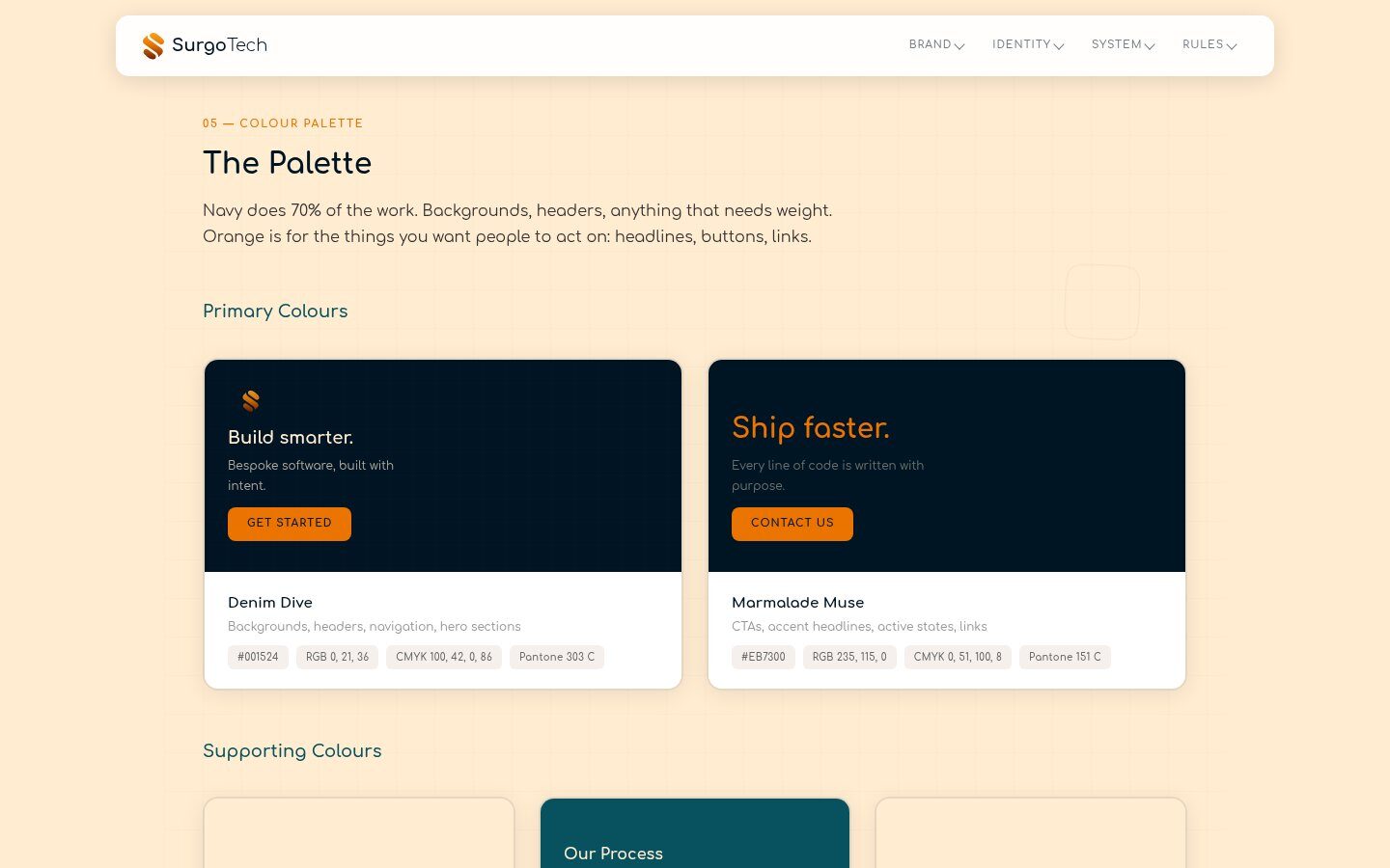
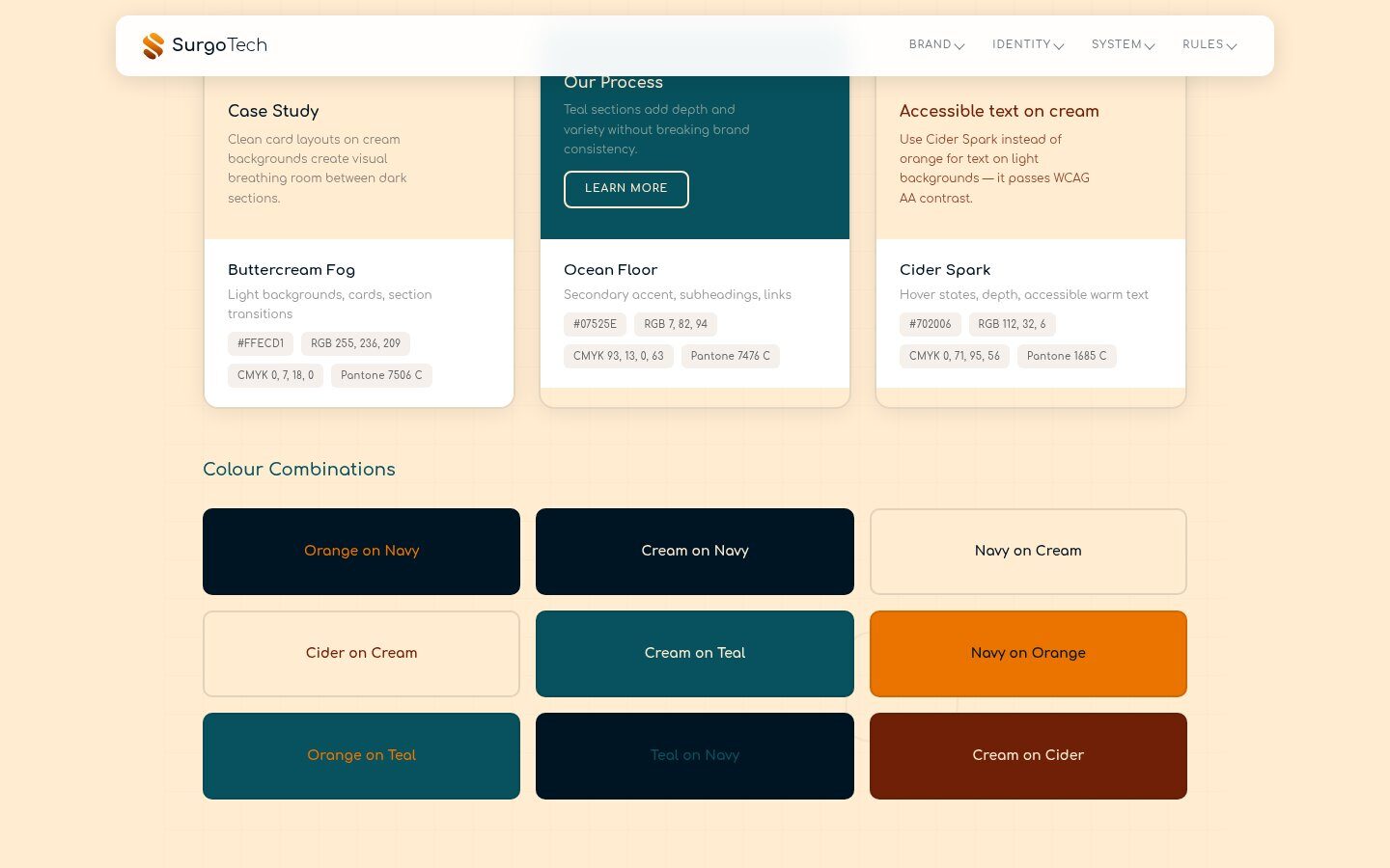
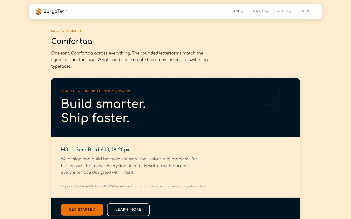
Denim Dive navy carries about 70% of any layout. Marmalade Muse orange is kept for the things you want people to act on. Buttercream Fog replaces pure white, Ocean Floor teal adds depth, and Cider Spark is the warm colour for text on cream because it passes contrast checks where orange doesn’t. Each colour has hex, RGB, CMYK and Pantone values. One typeface, Comfortaa, does everything; its rounded letters echo the squircle.
- Five named colours with print and screen values
- Colour pairings shown, good and bad
- Comfortaa only, hierarchy by weight and size
- Accessible text colour chosen for cream backgrounds
A Web Page,
Not a Dead PDF.
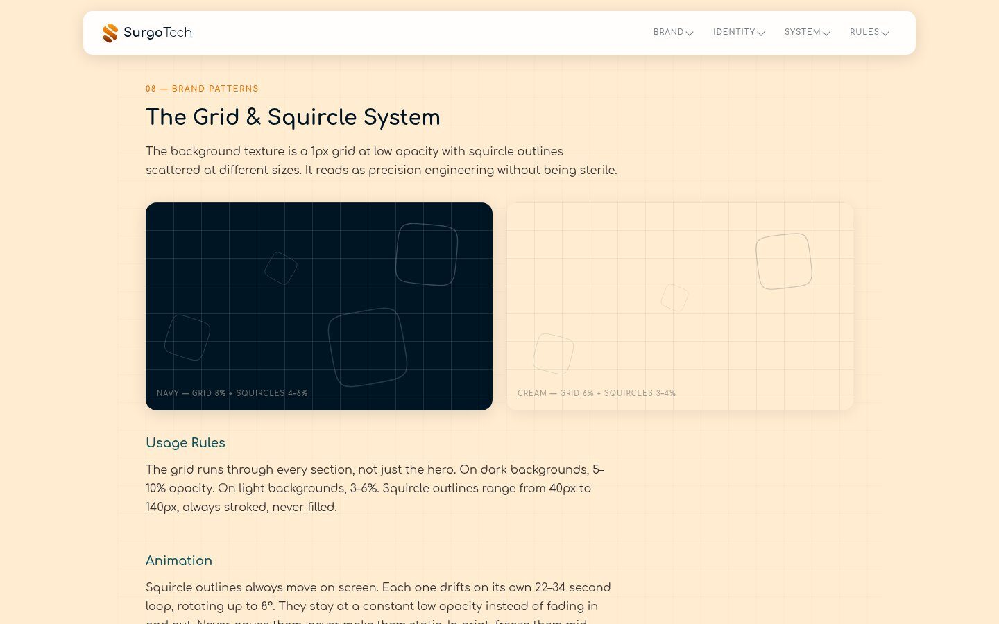
The guidelines live online as one long page. It covers the story, five personality sliders, the logo system and downloads, construction, the squircle, colour, type, imagery, patterns, tone of voice, real mockups, digital and print specs, and dos and don’ts. The background system of a faint engineering grid and drifting squircle outlines runs through every section. There’s a PDF export for anyone who wants one.
- Online brand guidelines in 14 sections
- Personality sliders to settle design arguments
- Grid and squircle pattern system, animated
- PDF export for printing and sharing
Talk Like
a Smart Colleague.
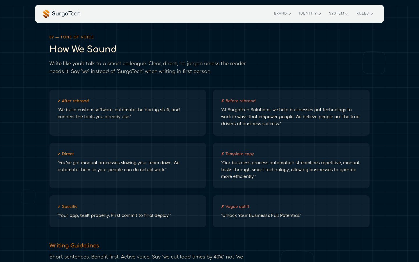
We used SurgoTech’s old website copy as the “before” example, so the change is obvious at a glance. The new voice is short and specific: benefit first, say “we”, and give real detail instead of big promises. There’s a kill list of words to stop using, including empower, streamline, leverage and unlock.
- Before and after examples from their own copy
- Plain writing rules for the whole team
- A banned words list
Banner Up,
Cards Out.
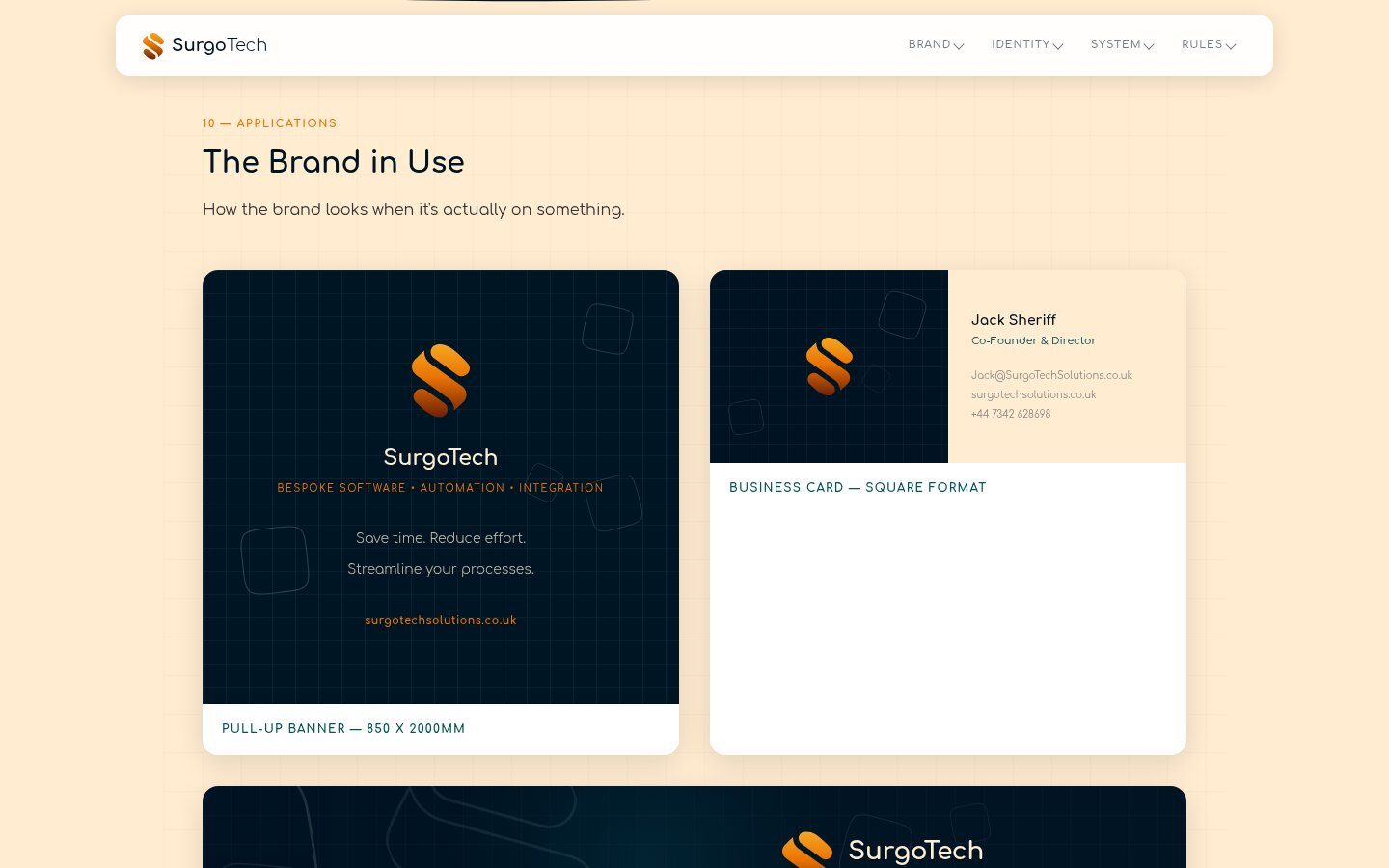
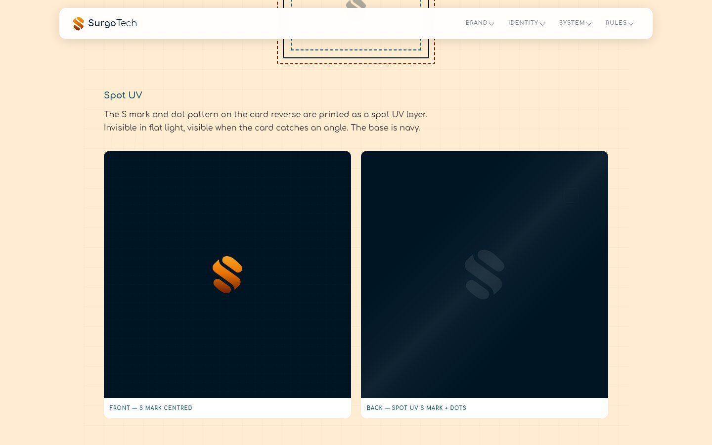
For the April event we designed an 850 x 2000mm pull-up banner and supplied the print-ready file. The business cards are square, with the S mark on the front and the S and a dot pattern on the back printed in spot UV, so the pattern only shows when the card catches the light. The guidelines set out bleed, trim, safe zones and stock so any printer can get it right.
- Pull-up banner, 850 x 2000mm, print-ready
- Square business cards with spot UV
- Bleed, trim and safe zone diagram

On LinkedIn
and Beyond.
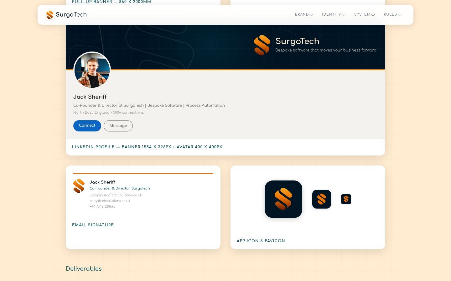
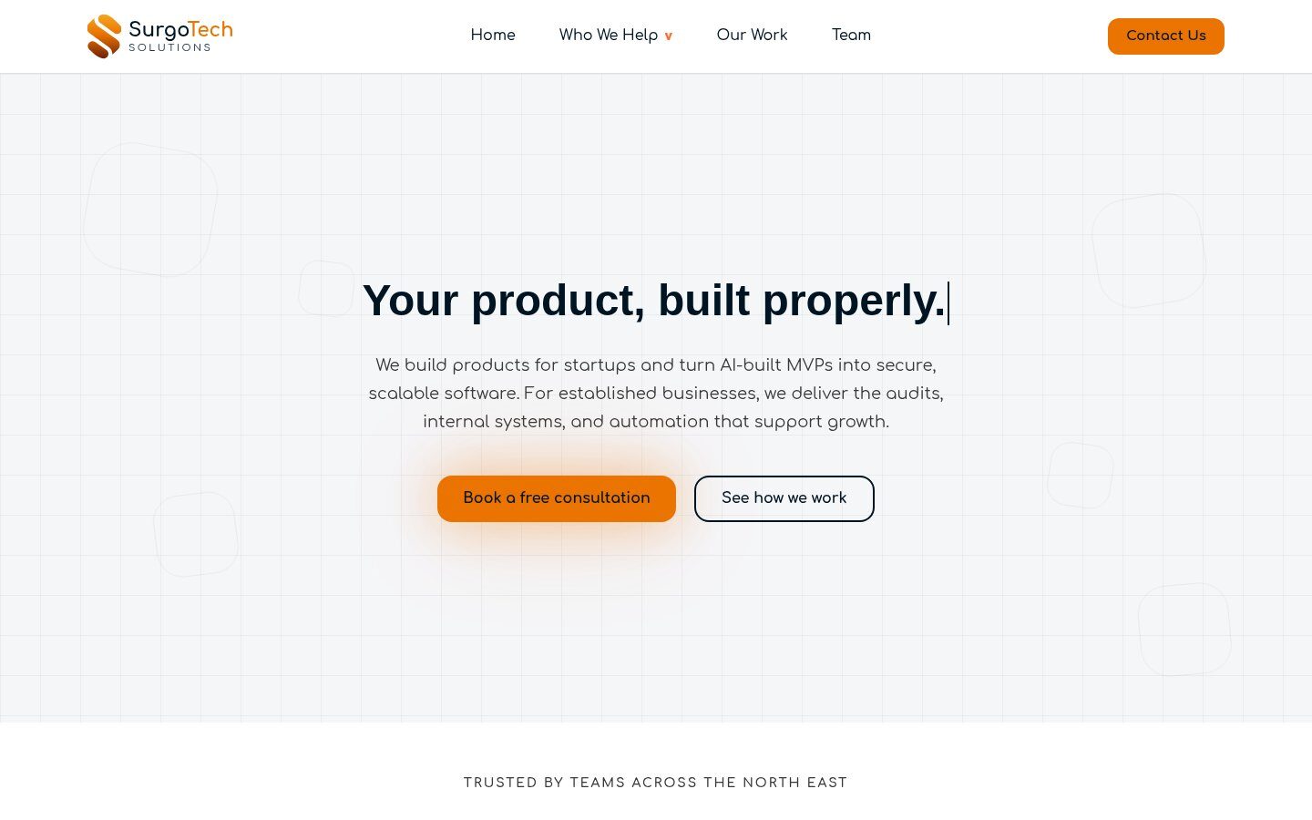
We designed the LinkedIn banner with the outlined S and squircles, and mocked it up on Jack’s profile with his own headshot. The guidelines also include an email signature, app icon sizes and a favicon. The brand now carries through to SurgoTech’s own website, with the same S, Comfortaa and orange calls to action.
- LinkedIn banner, 1584 x 396px
- Email signature and app icon set
- Brand now used on surgotechsolutions.co.uk
SurgoTech Solutions
A rebuilt logo and a brand written down properly.
Does your brand need the same?
Screenshots
& Photography
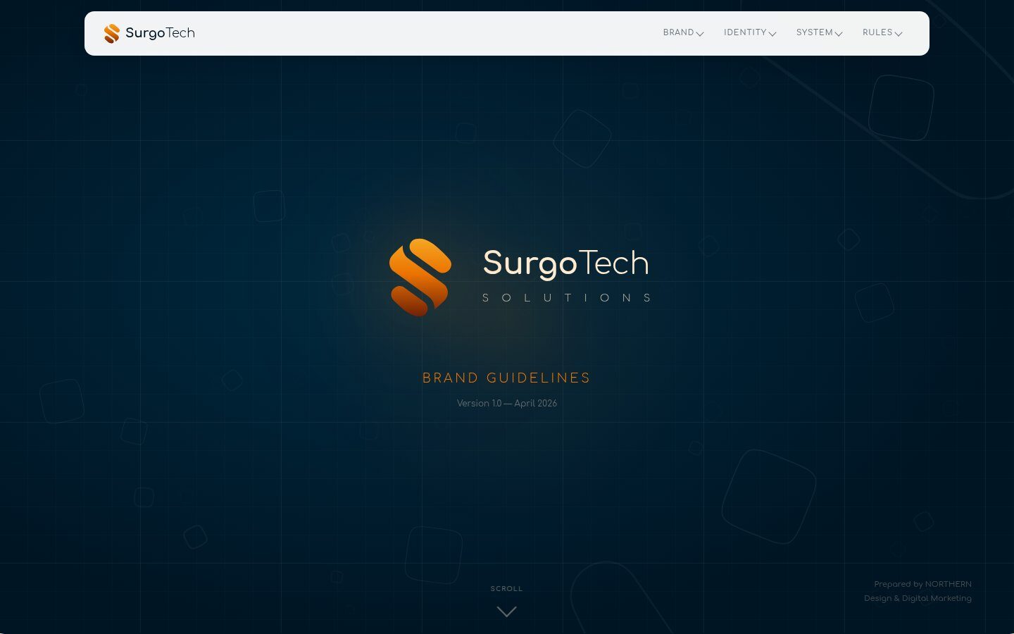

Logo, brand identity, brand guidelines, print and LinkedIn artwork shown were produced by Northern Digital for SurgoTech Solutions. The SurgoTech website screenshot is shown to illustrate the brand in use. The original logo is shown for comparison only. Presented to demonstrate capability.
More from the Northern portfolio.
What clients say about our work
Real reviews from real businesses.
Had a website made from scratch was done within 4 days and turn around was great.
Great service overall. It's been a real pleasure working with Dave and his team. They've helped strengthen our business presence and brand identity through our website and are always on hand to offer support and go the extra mile. We're looking forward to continuing to work with Dave and the Northern Digital team on future projects as our business grows.
Very good experience, very knowledgable and trustworthy. Highly recommend.
What's costing you growth?
Let's find out. For free.
Book a free 30-minute strategy audit with Dave. We'll look at your marketing, find what's not working, and tell you exactly where to focus. No waffle. Just a canny plan you can act on.
Request Your Free Audit
Takes 30 seconds. No jargon, just results.