
Serious Work,
Friendly Face.
Morrell Will Services writes wills and lasting powers of attorney for families around Sunderland. Digital consultant Caroline Hagan asked us to design their new homepage in Figma. We gave them two directions, worked through Helen Morrell’s feedback, and the design is now their live website.
- WHO — Morrell Will Services, via Caroline Hagan Consultancy
- WHAT — Homepage UI Design, Figma Design Concepts, Mobile Layout
- WHEN — 2025
- WHERE — Shiney Row, Sunderland
- HOW — A design-only project in Figma, handed to Caroline Hagan to build in WordPress
Design It,
We’ll Build It.
Caroline Hagan, a digital consultant, was building a new website for Morrell Will Services. She asked us to design the homepage. The job was design only: one homepage in Figma, built from blocks that could be reused across the rest of the site. The tone was agreed at the start: serious, but approachable. People don’t look forward to writing a will, so the page had to feel calm and kind.
- Design-only project in Figma
- One homepage, made of reusable blocks
- Tone: serious, but approachable
- Covers Wills, Lasting Power of Attorney and Probate
Working With
an Existing Brand.
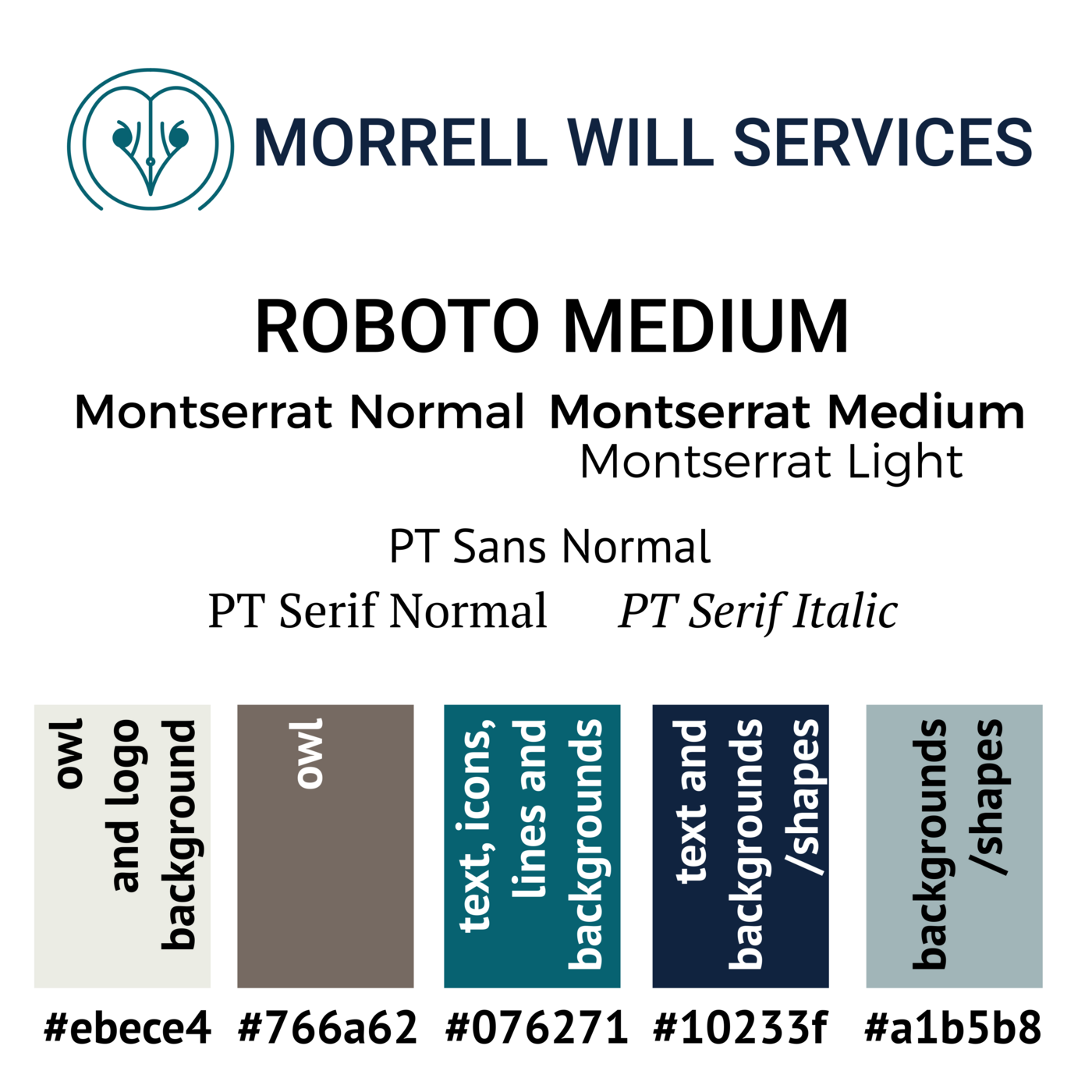
Morrell already had a brand: an owl logo, a teal and navy palette and a set of fonts. Helen had developed it with another designer, and we didn’t change it. Our job was to make the brand work on a web page. We used the brand guide for colour and type and treated the owl as a character, not just a logo.
- Owl logo and palette kept exactly as supplied
- Teal, navy, warm grey and stone from the brand guide
- Montserrat, PT Sans and PT Serif from the brand fonts
Soft or Formal?
We Showed Both.
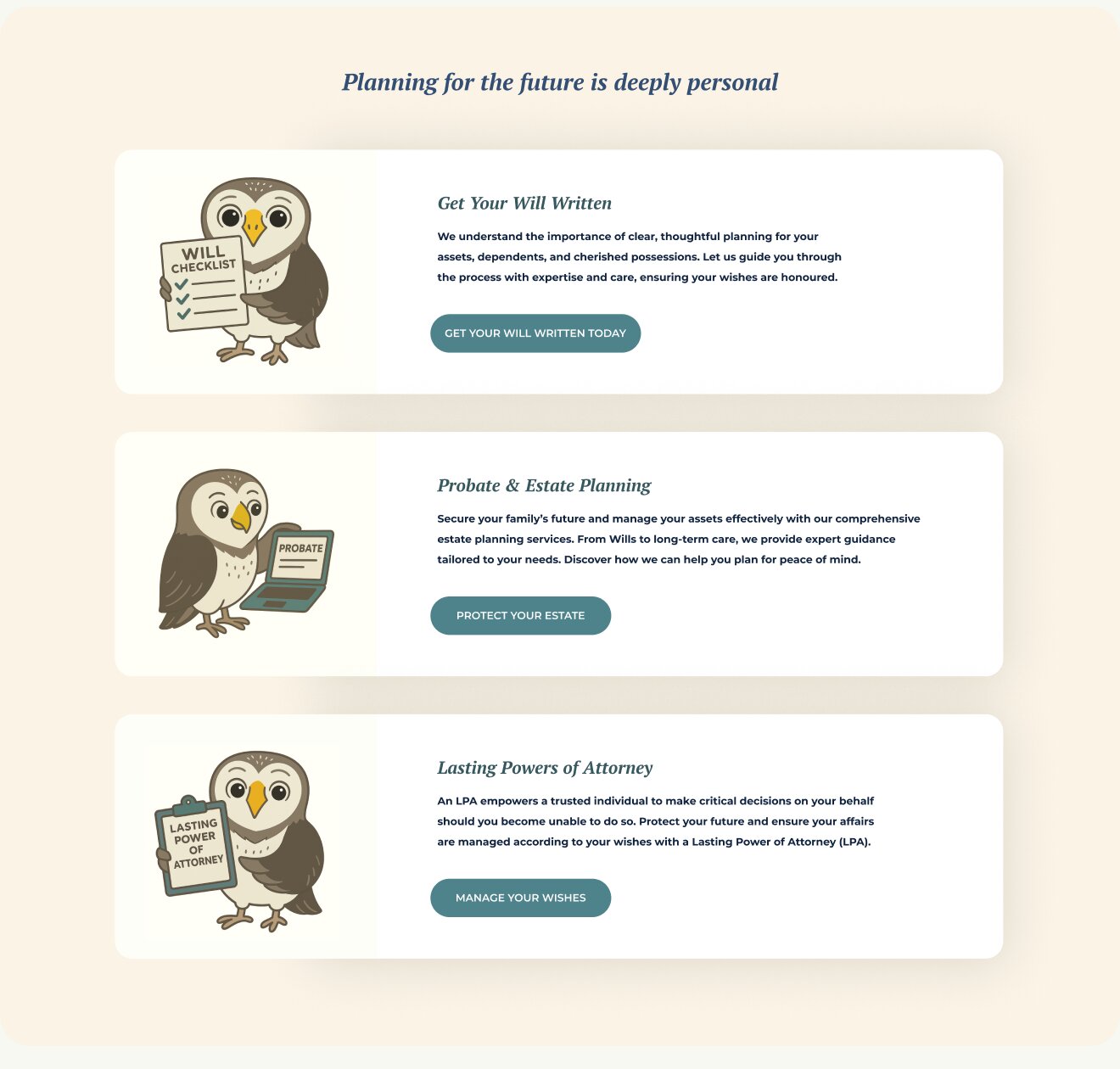
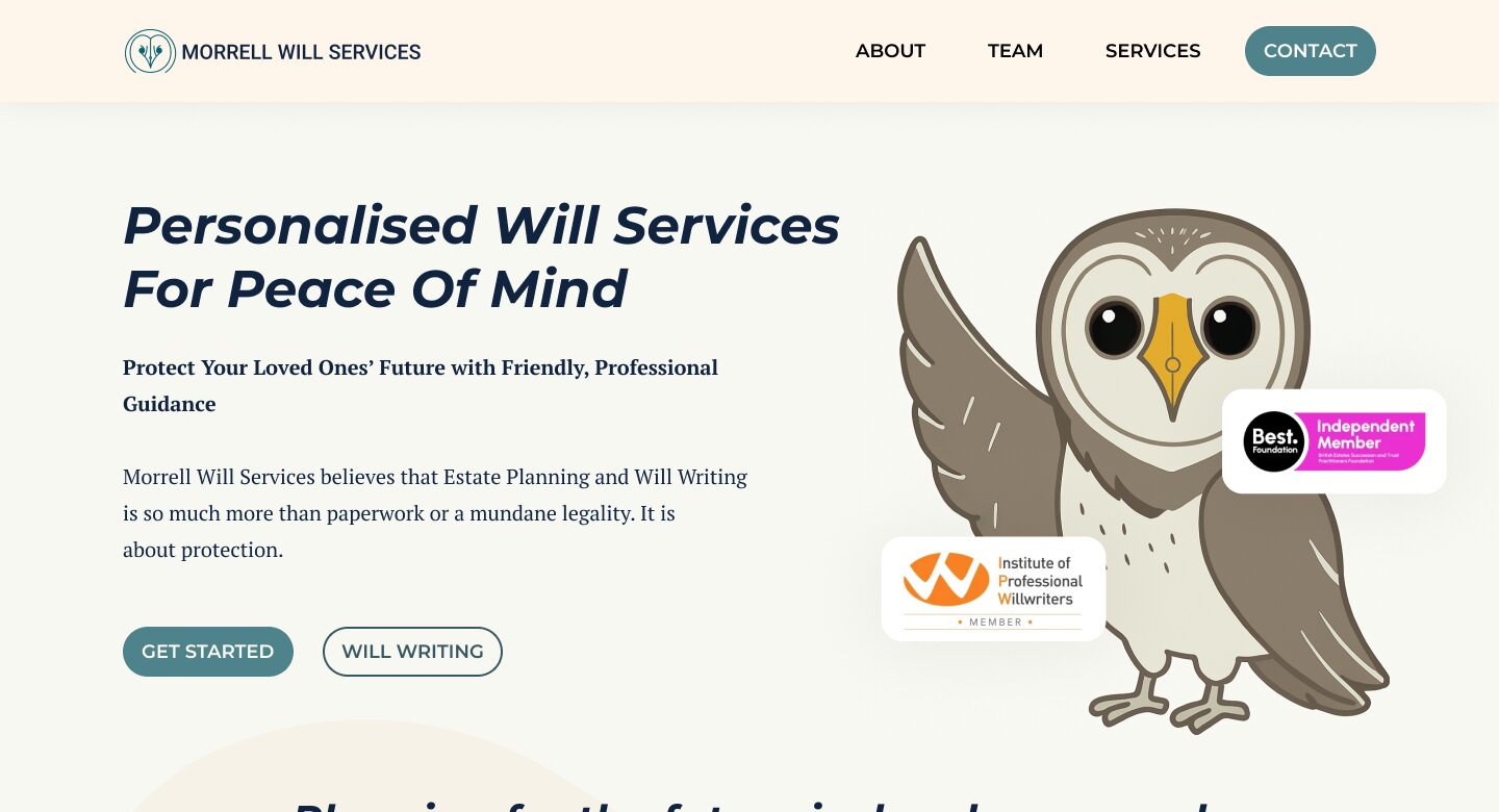
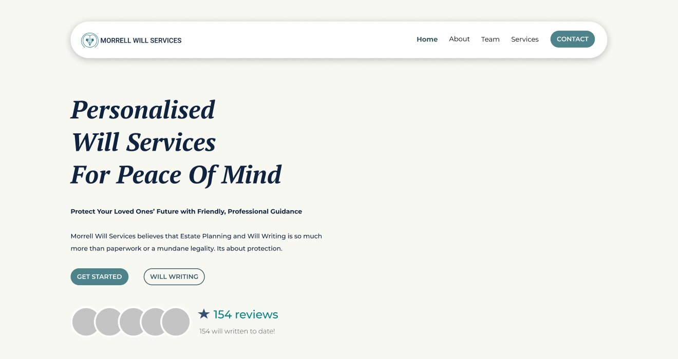
We sent two homepage concepts. Version 1 was soft and character-led, with a playful owl, curved shapes and bold coloured service boxes. Version 2 was more formal, with the owl holding each service, plus space for badges and reviews to build trust. Caroline shared the Figma link with Helen so she could react to the real thing, not a sketch.
- V1: soft and character-led, with wavy shapes
- V2: trust-led, with badges and reviews
- Both built in Figma so the client could click through
Her Owl,
Her Words.
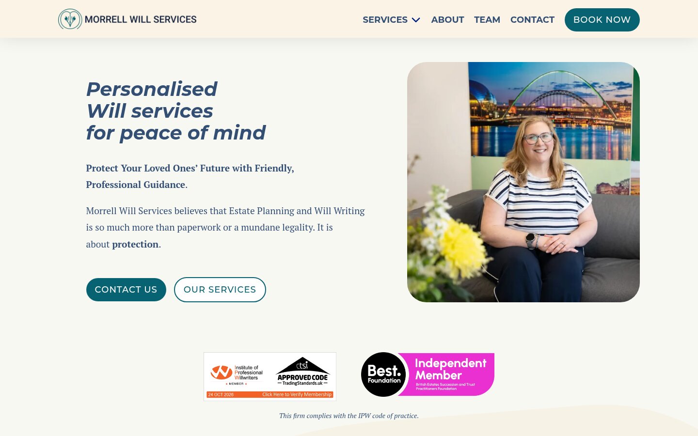
Helen liked the coloured service boxes and the wavy lines in Version 1. She wanted the owl from Version 2, because to her he speaks for the client: he asks the questions and she gives the answers. She also asked for her headshot in the hero. We blended the two versions. On fonts, we suggested not pairing Roboto and Montserrat, as they look too alike, and used one heading font with PT Sans for body text.
- Version 1 layout with the Version 2 owl
- Owl used as the voice of the client
- Headshot placeholder ready for new photography
- Simpler font stack so headings and body text don’t clash
A Colour
for Each Service.
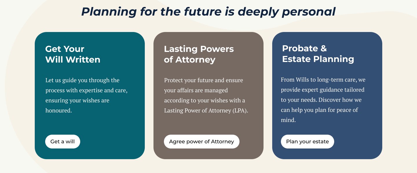
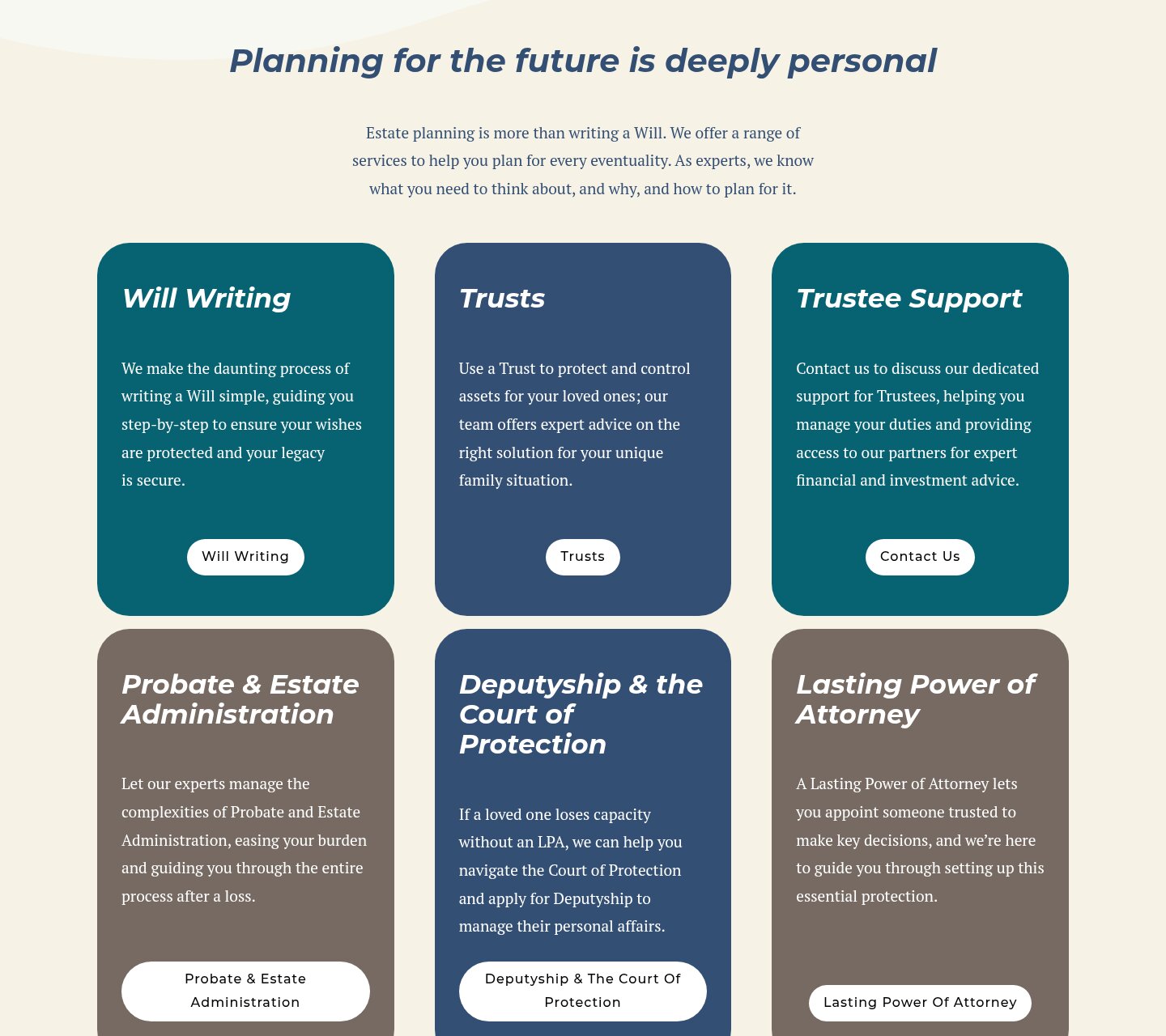
Each service gets its own coloured card, a short plain-English line and one clear button. Helen said she might add more services later, so we kept the layout flexible. More cards can drop in without a redesign. The live site now runs six of them.
- One card per service, each in a brand colour
- Short copy and a single button on every card
- Grid that takes more services without a redesign
Answers Before
They Ask.
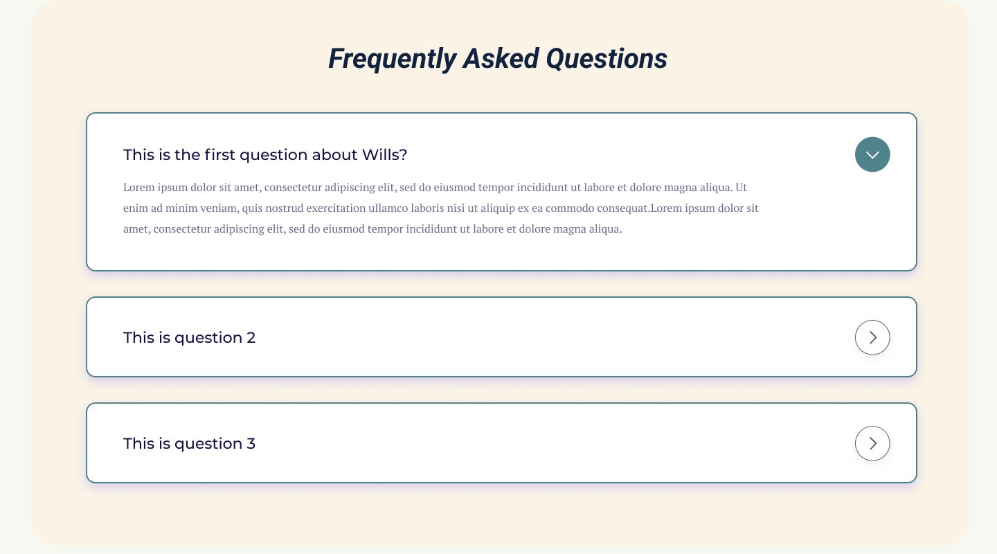
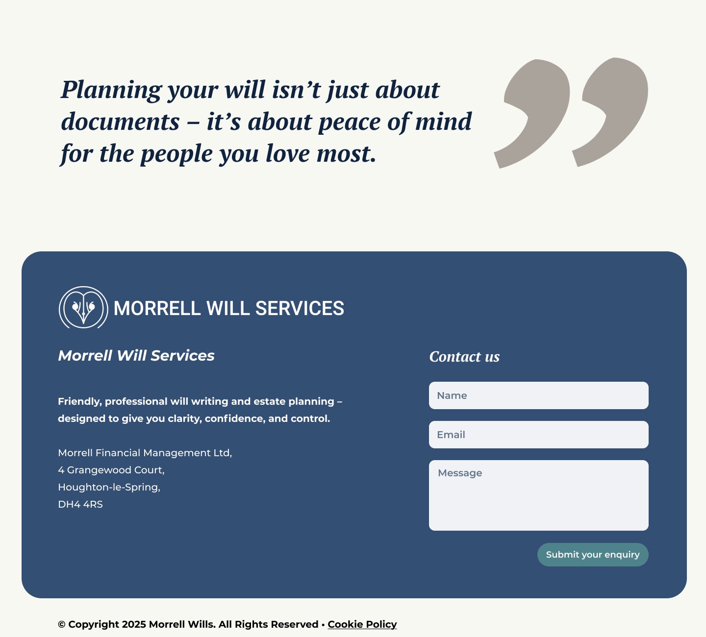
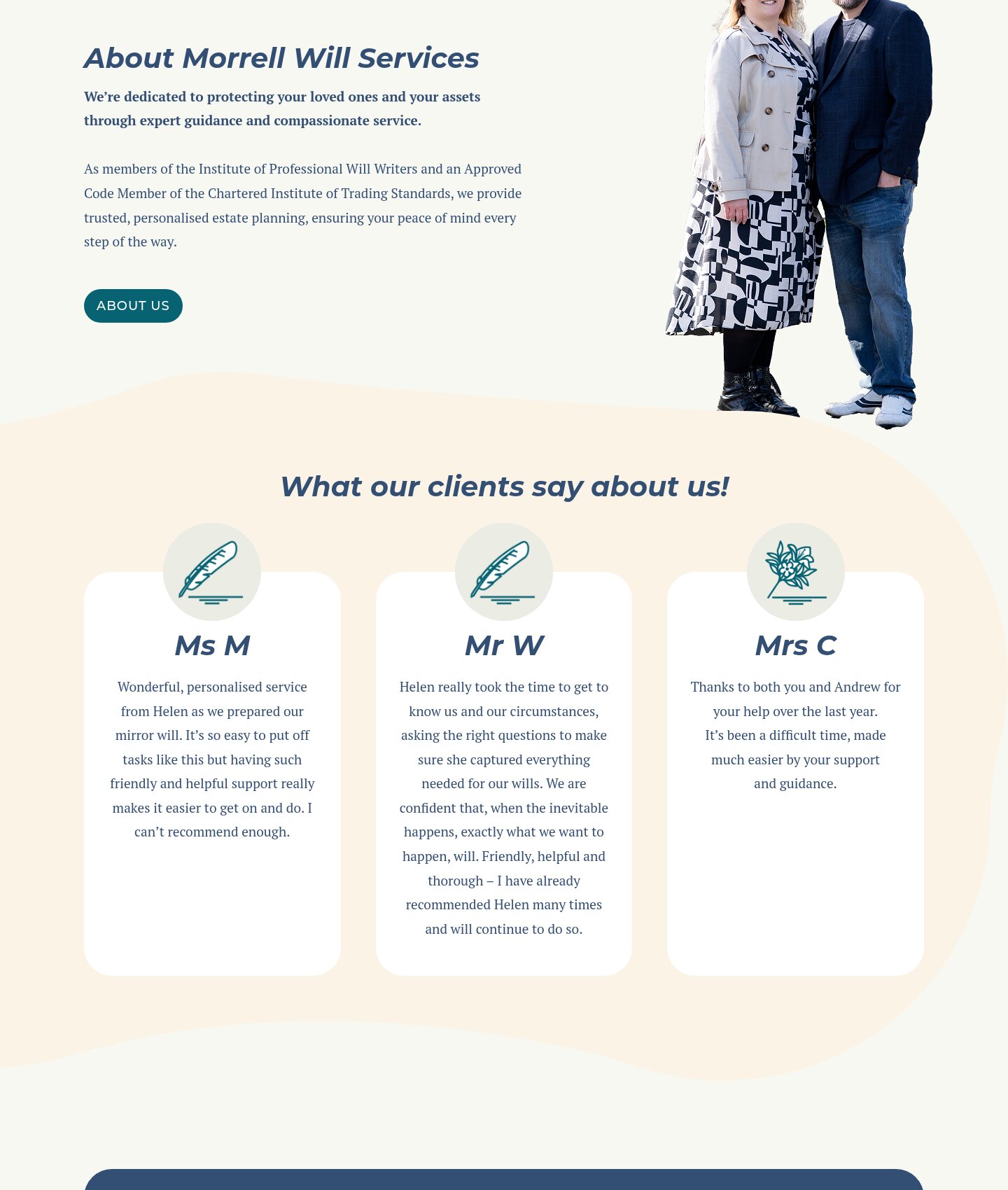
After the second round of feedback we added an FAQ block and a gallery. Then came an About section with Andrew and Helen cut out against the background shapes, a closing line about peace of mind and a footer with a short enquiry form. Every block was designed to be reused on the inner pages.
- Open and close FAQ block
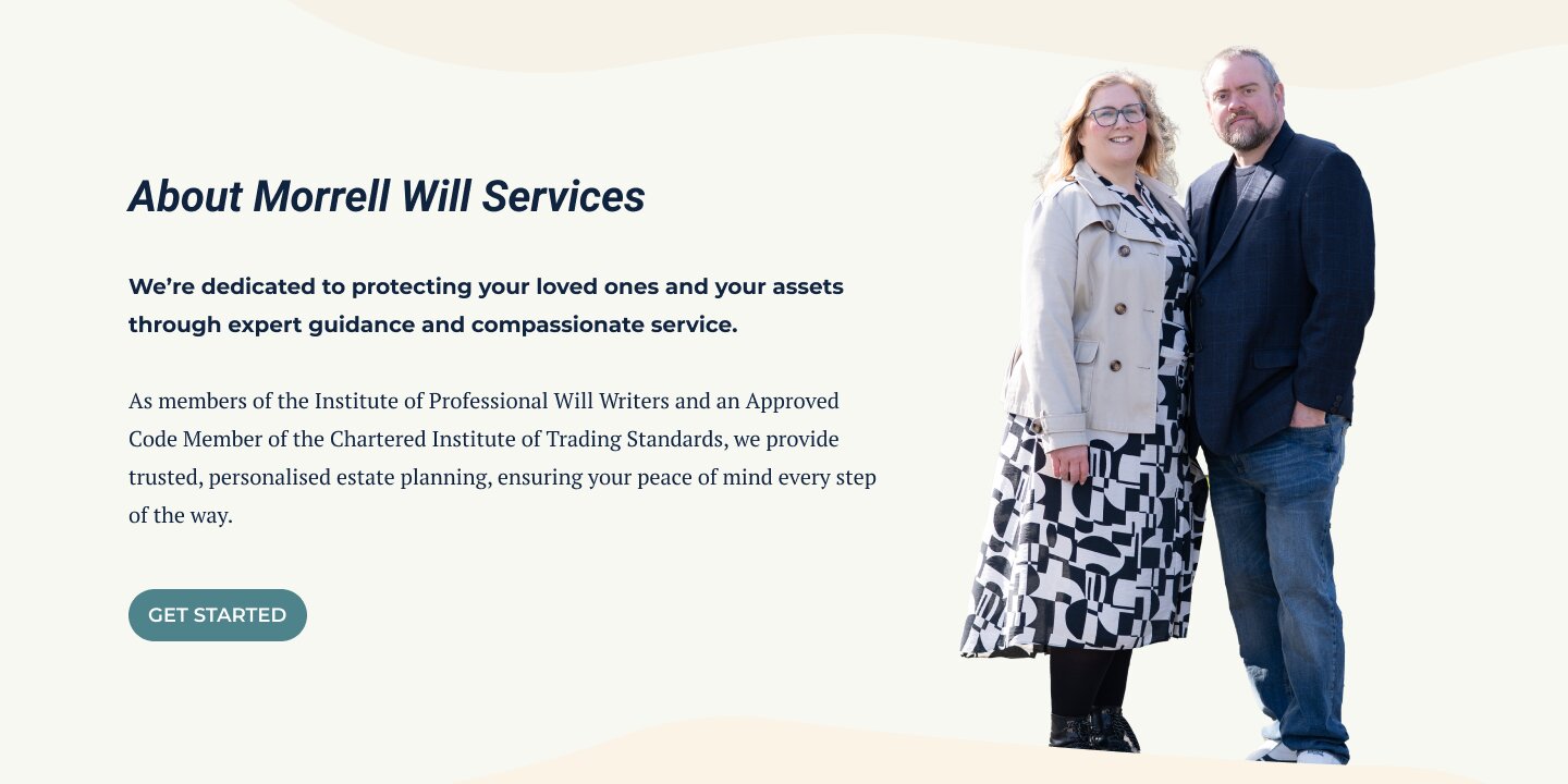
- About section with a cut-out photo of the owners
- Footer with contact details and an enquiry form
Built for
a Phone First.
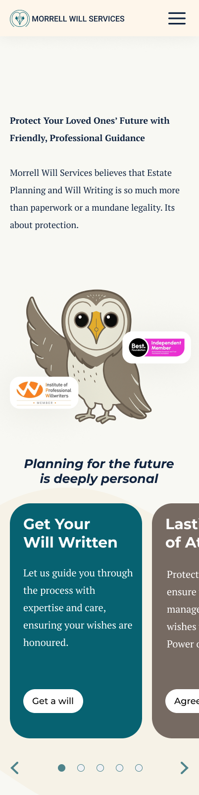
We designed a mobile version of the full homepage too. The hero, service cards, about section, FAQs and form stack into one column with large buttons, so it’s easy to get in touch from a phone.
- Full mobile layout in Figma
- Single column with large tap targets
- Same blocks as desktop, so the build stays simple
From Figma
to the Live Site.
Caroline built the website in WordPress from our design. The live homepage follows it closely: Helen’s photo in the hero, the coloured service cards, the cut-out photo of Andrew and Helen, and the soft wavy shapes. Real client reviews have replaced our placeholder ones.
- Built in WordPress by Caroline Hagan from our Figma file
- Hero, service cards and About section match the design
- Live at morrellwills.co.uk
Morrell Will Services
A homepage that makes a hard conversation easier to start.
Need a design your developer can build from?
Screenshots
& Photography
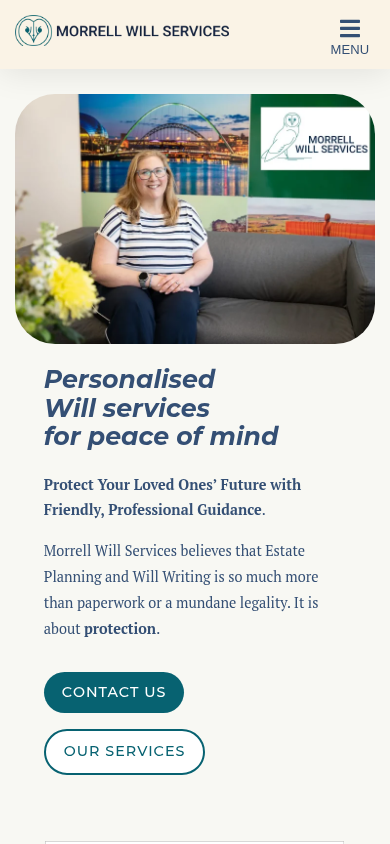
Homepage designs and Figma concepts shown were produced by Northern Digital for Morrell Will Services through Caroline Hagan Consultancy. The Morrell Will Services logo, owl and brand guide were created before this project by another designer. The live website was built by Caroline Hagan. Presented to demonstrate capability.
More from the Northern portfolio.
What clients say about our work
Real reviews from real businesses.
Had a website made from scratch was done within 4 days and turn around was great.
Great service overall. It's been a real pleasure working with Dave and his team. They've helped strengthen our business presence and brand identity through our website and are always on hand to offer support and go the extra mile. We're looking forward to continuing to work with Dave and the Northern Digital team on future projects as our business grows.
Very good experience, very knowledgable and trustworthy. Highly recommend.
What's costing you growth?
Let's find out. For free.
Book a free 30-minute strategy audit with Dave. We'll look at your marketing, find what's not working, and tell you exactly where to focus. No waffle. Just a canny plan you can act on.
Request Your Free Audit
Takes 30 seconds. No jargon, just results.