
Their Client,
Our Craft.
Literally Marketing is a strategic marketing consultancy in Newcastle. In 2025 they brought us in behind the scenes, first to help with marketing automation and then to design a logo for one of their clients, Taylored Ceremonies.
- WHO — Literally Marketing Ltd, for their client Taylored Ceremonies
- WHAT — Logo Design, Colour Palette, Marketing Automation Support
- WHEN — 2025
- WHERE — Newcastle upon Tyne
- HOW — White-label: designed by Northern, delivered through Literally Marketing
A Consultancy,
Extra Hands.
Literally Marketing plans marketing strategy for businesses of all sizes. When a client needs design or technical work, they bring in specialists and keep the client relationship themselves. We started by helping them with marketing automation. Later in 2025 they came back with a logo brief for one of their clients. It is the same way we do white-label work for other agencies.
- Marketing automation support in 2025
- Logo design for their client, Taylored Ceremonies
- Briefs and feedback ran through Literally Marketing
Roots, Leaves,
And Petals.
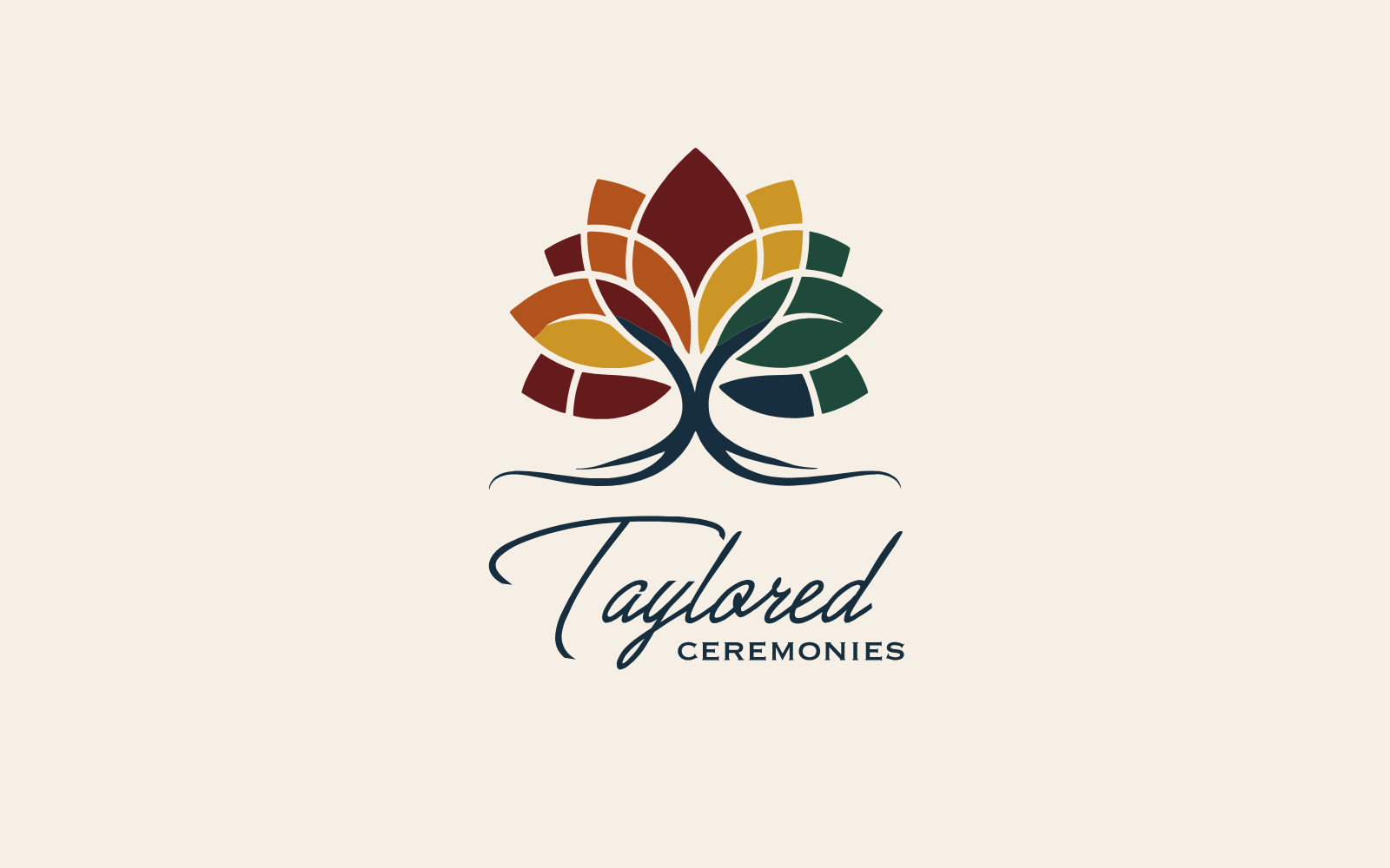
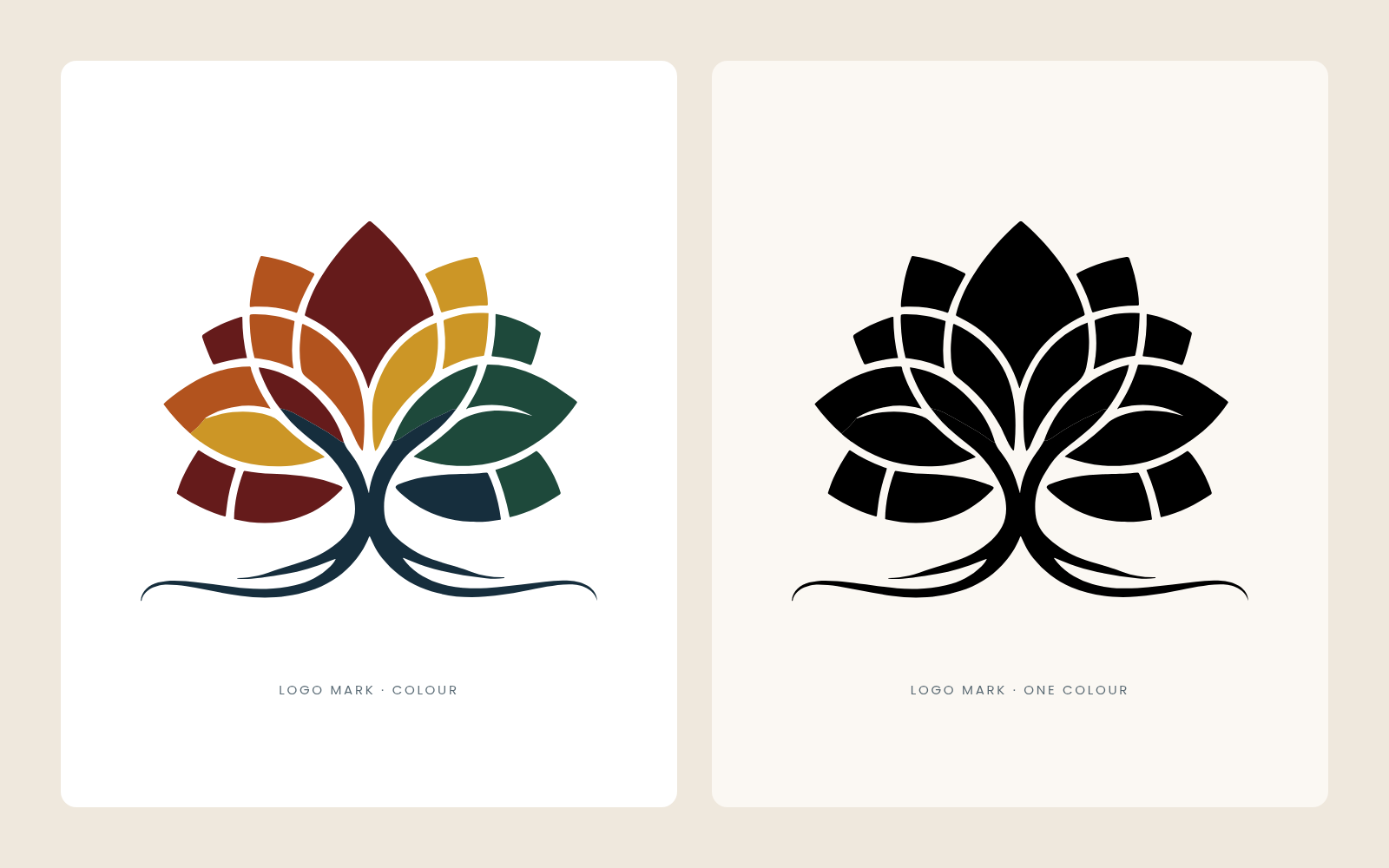
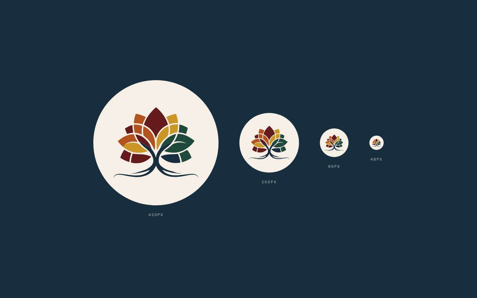
Taylored Ceremonies needed a logo. Our logo design is a tree. Its leaves open out like the petals of a flower and are cut into segments, a little like stained glass. The roots spread out along the bottom in two long, curling lines that give the mark a calm, steady base.
- Tree mark with petal-shaped leaves
- Segmented leaves, each picked out in a palette colour
- Sweeping roots that ground the whole design
- Works in full colour and in one colour
Script First,
Then Capitals.
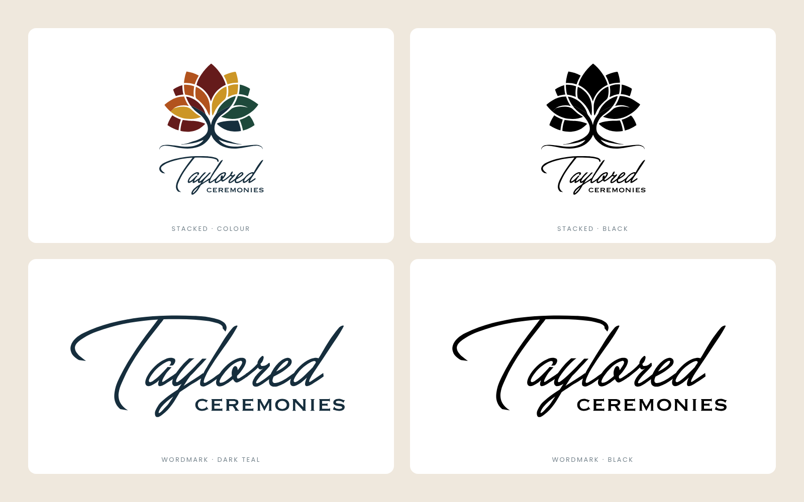
“Taylored” is set in a flowing script. The long top stroke of the T sweeps across the word, echoing the roots of the tree above. “Ceremonies” sits underneath in widely spaced capitals, tucked in beside the tail of the y. The script gives warmth. The capitals keep it clear and easy to read.
- Stacked version with the mark above the name
- Wordmark on its own for tight spaces
- Dark teal and black versions
Five Colours,
One Tree.
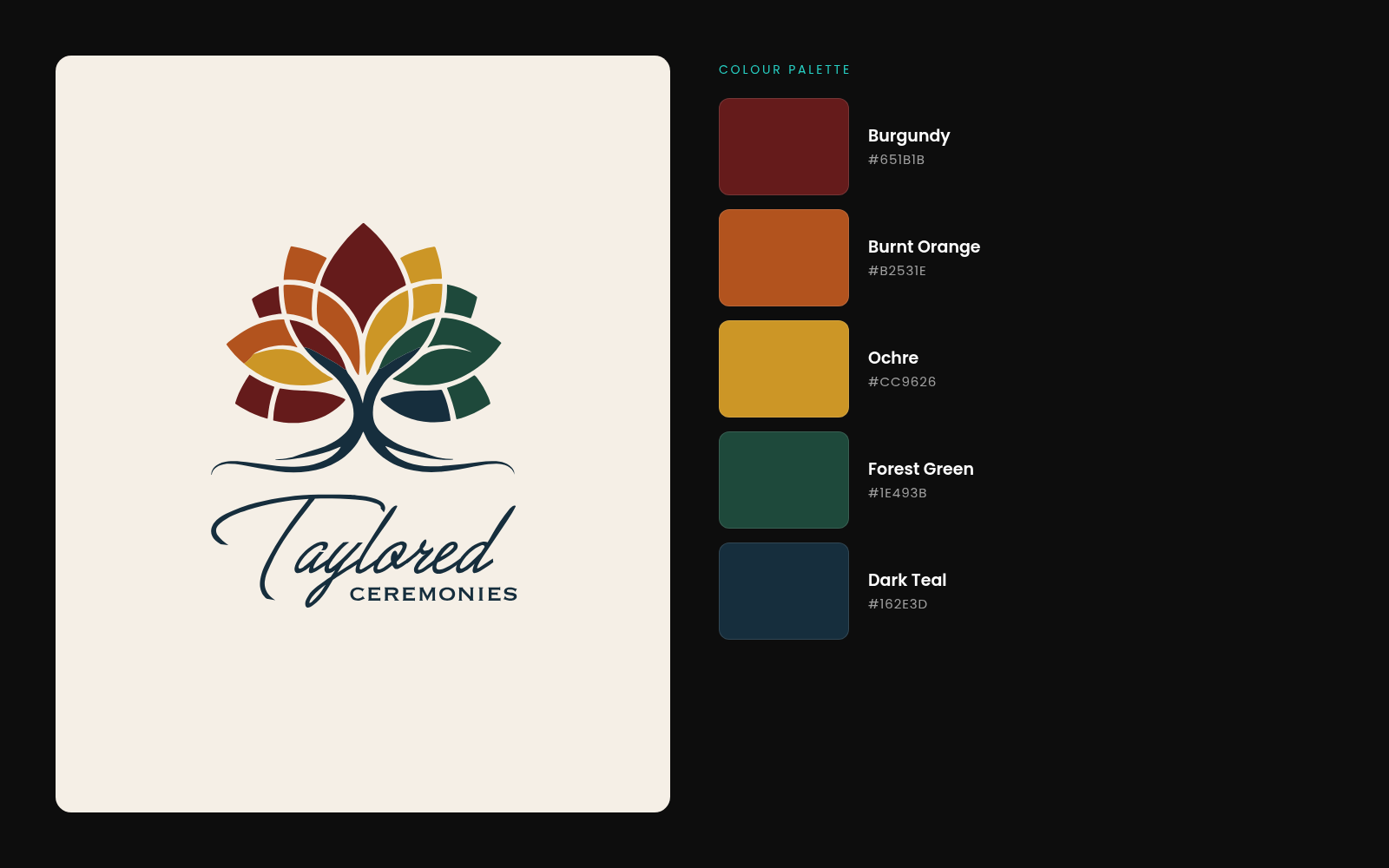
The palette runs from burgundy through burnt orange and ochre to forest green, like leaves turning through the seasons. Dark teal holds it together: it colours the trunk, the roots and the name. We supplied every colour with its exact hex value, so the brand colours match wherever they are used.
- Burgundy #651B1B
- Burnt Orange #B2531E
- Ochre #CC9626
- Forest Green #1E493B
- Dark Teal #162E3D
Every Format,
Ready to Use.
A logo is only useful if the right file is to hand. We delivered the full set in four formats: SVG and PDF for print and sign makers, PNG and JPG for websites and social media. Most versions come on both a transparent and a white background, along with a colour reference sheet. The mark is simple enough to stay clear when it is shrunk down to a profile picture.
- SVG, PDF, PNG and JPG files
- Mark, stacked logo and wordmark versions
- Colour, black and dark teal options
- Transparent and white backgrounds
Literally Marketing
Marketing automation support and a full logo set, delivered through an agency partner.
Need a design partner who stays behind the scenes?
Screenshots
& Photography
Logo design and colour palette shown were produced by Northern Digital in 2025 on a white-label basis for Literally Marketing Ltd, for their client Taylored Ceremonies. Presentation boards were made for this case study from the delivered artwork. Presented with permission to demonstrate capability.
More from the Northern portfolio.
What clients say about our work
Real reviews from real businesses.
Had a website made from scratch was done within 4 days and turn around was great.
Great service overall. It's been a real pleasure working with Dave and his team. They've helped strengthen our business presence and brand identity through our website and are always on hand to offer support and go the extra mile. We're looking forward to continuing to work with Dave and the Northern Digital team on future projects as our business grows.
Very good experience, very knowledgable and trustworthy. Highly recommend.
What's costing you growth?
Let's find out. For free.
Book a free 30-minute strategy audit with Dave. We'll look at your marketing, find what's not working, and tell you exactly where to focus. No waffle. Just a canny plan you can act on.
Request Your Free Audit
Takes 30 seconds. No jargon, just results.