
A Hard Subject,
Set Calmly.
The Suicide Fight is a book by a writer known as The Hermit, published in the UK by Invincicom in 2017. We designed the whole book: the cover, the interior layout, the print-ready files and, later, the ebook.
- WHO — The Hermit (author) and Invincicom (publisher)
- WHAT — Book Cover Design, Book Layout, Print Design, Ebook Design, Web Artwork
- WHEN — 2017 – 2019
- WHERE — United Kingdom
- HOW — Plain type, a lot of space and a strong black and white cover, so the words do the work
A Whole Book,
Start to Finish.
The publisher describes the book as an empowerment tool, with preventative and coping suggestions. It is not a medical guide, and the book says so on its first page. Invincicom asked us for the full book design and print files, and the brief was clear: treat the subject with care and keep the design out of the way of the words. If you’re struggling, Samaritans: 116 123, samaritans.org.
- Front cover, spine and back cover
- Full interior layout
- Print-ready files for the printer
- Fixed-layout ebook and Kindle files

Black and White,
One Torn Edge.
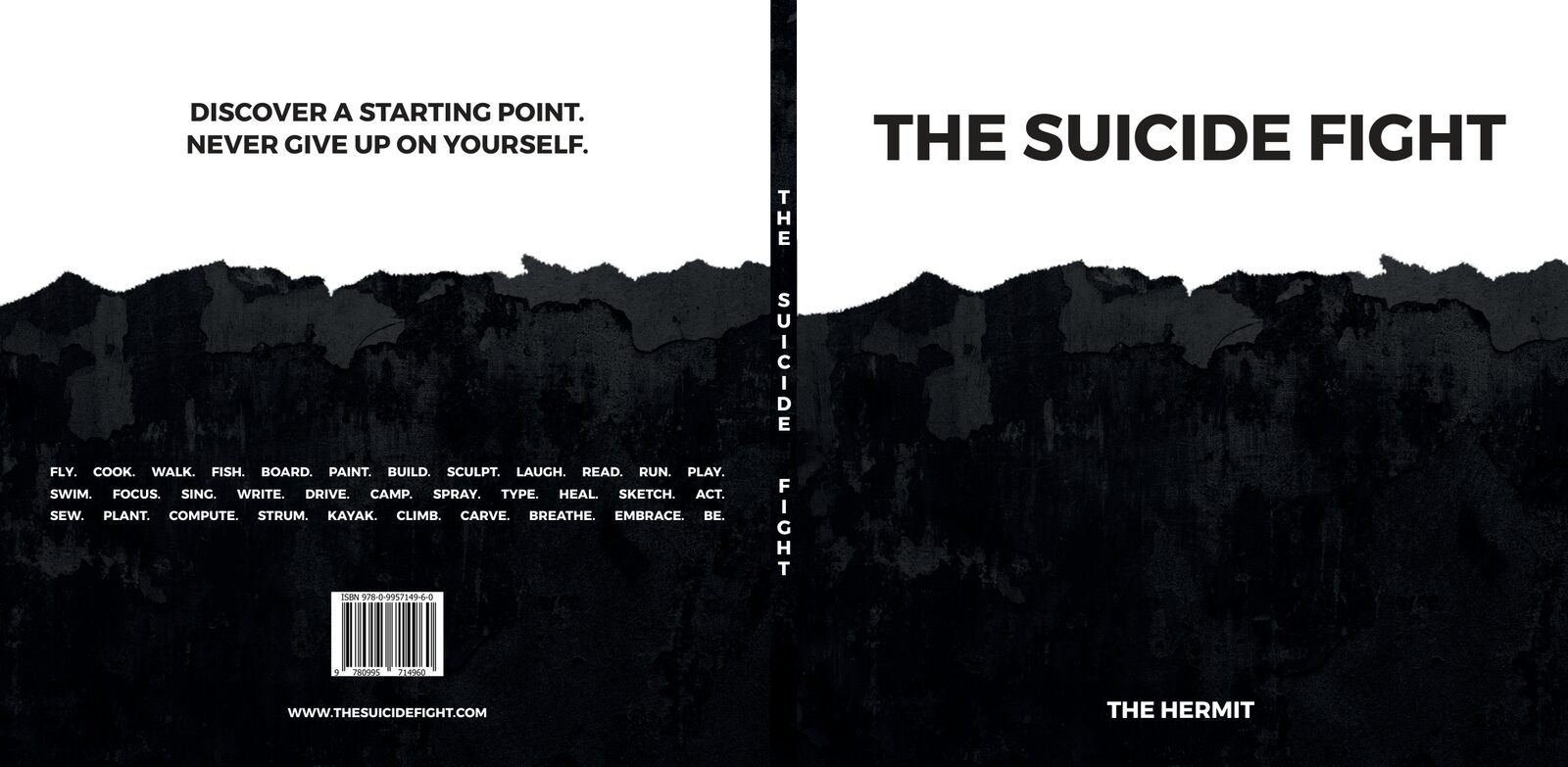
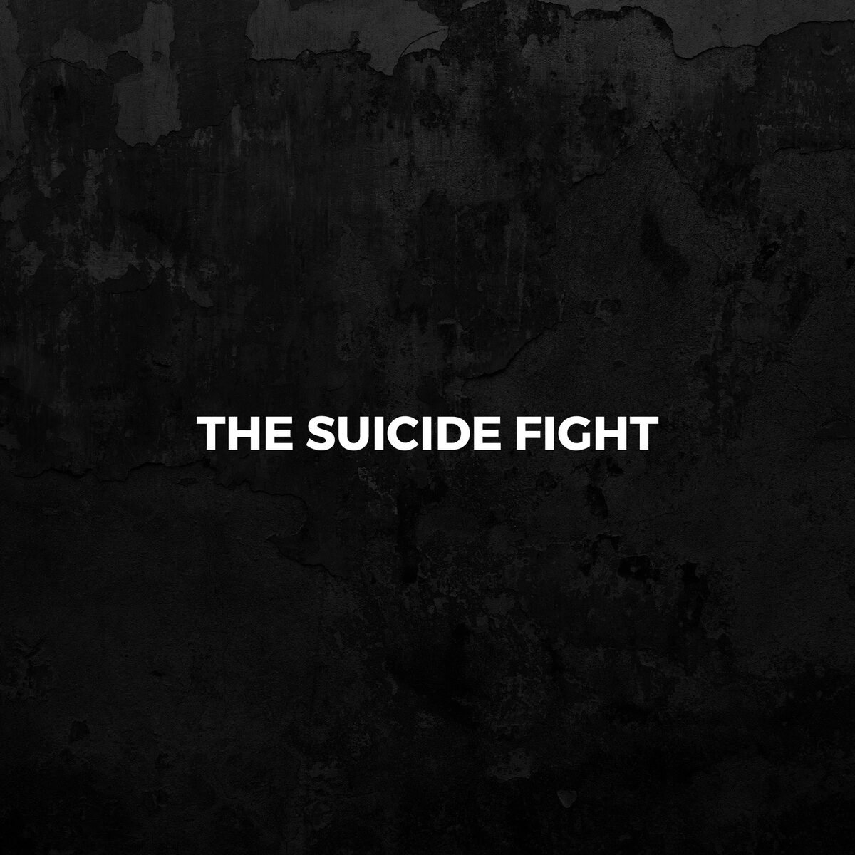
The book is square. The title sits in bold capitals on plain white, and a dark textured wall rises from the bottom of the cover with a rough, torn top edge. The author’s name is reversed out in white at the foot. There are no photos, just type and texture. The same texture wraps round the spine and onto the back.
- Square format, front to back in one spread
- Title in heavy capitals on white
- Dark wall texture with a torn edge
- Spine title set letter by letter
A Starting Point,
Not an Ending.
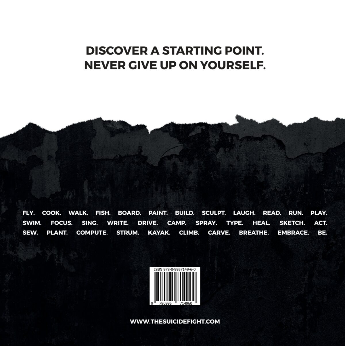
The back cover carries the publisher’s message in two lines: “Discover a starting point. Never give up on yourself.” Lower down, a run of short words in white capitals lists everyday things to do, from fly, cook and walk to breathe, embrace and be. The ISBN barcode and the book’s web address sit at the bottom.
- Publisher’s message at the top
- A list of everyday actions, set in a justified block
- ISBN barcode and web address
Four Stages,
Clear Breaks.
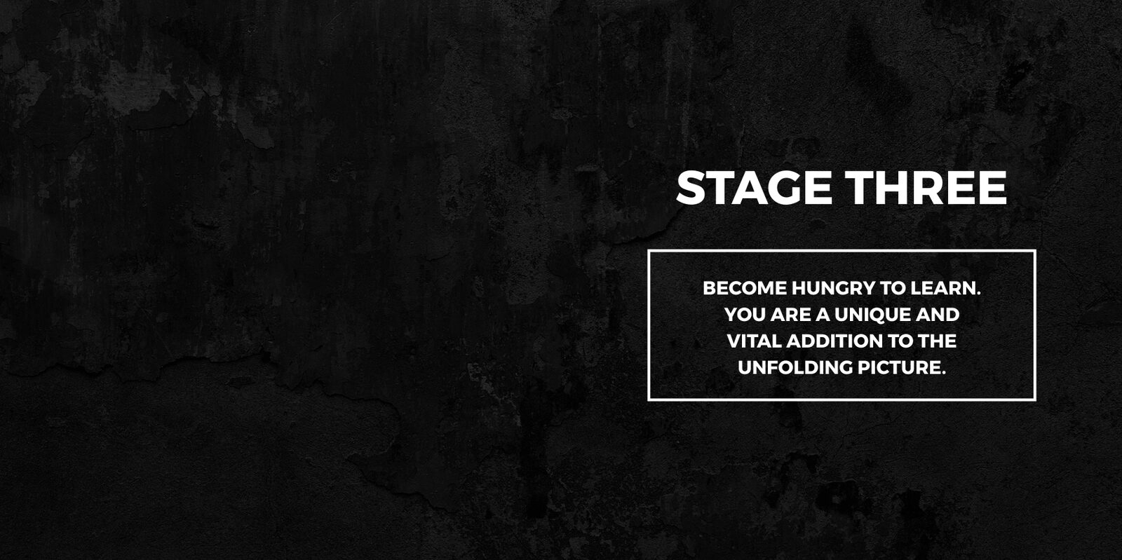
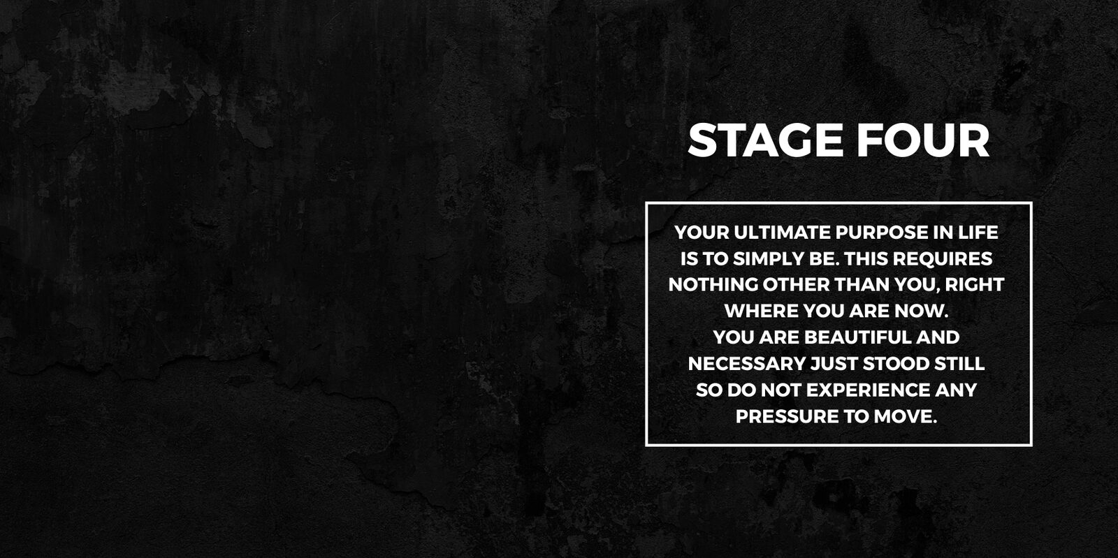
The book is split into four stages. Each one opens on a full dark spread, using the cover texture, with the stage title and a short statement in a white box. Inside each stage are numbered survival strategies, and some short lines are set large on a page of their own. Text pages stay plain, with wide margins and a running footer, so long passages are easy to read.
- Dark opening spread for each stage
- Numbered survival strategies as headings
- Short lines given a page of their own
- Plain, open text pages
One Typeface,
Many Rounds.
We worked on the layout from April 2017 through several rounds of edits. Early drafts used Gotham. In August 2017 we reset the whole book in Montserrat, using regular for the text and bold and extra bold for headings, so the cover and the pages match. The final print files went to the printer in early September 2017.
- Layout and edits from April to September 2017
- Whole book reset in Montserrat
- Cover and interior use the same type
- Packaged files ready for print

Same Book,
On Screen.
In 2019 we made the digital edition. We split every printed spread into single square pages and exported a fixed-layout ebook, so the dark stage pages and the large lines look the same on a tablet as they do in print. We also prepared the cover and page files for the Kindle edition.
- Spreads split into single square pages
- Fixed-layout ebook that keeps the design
- Cover and page files for Kindle
The Cover,
Made Wide.
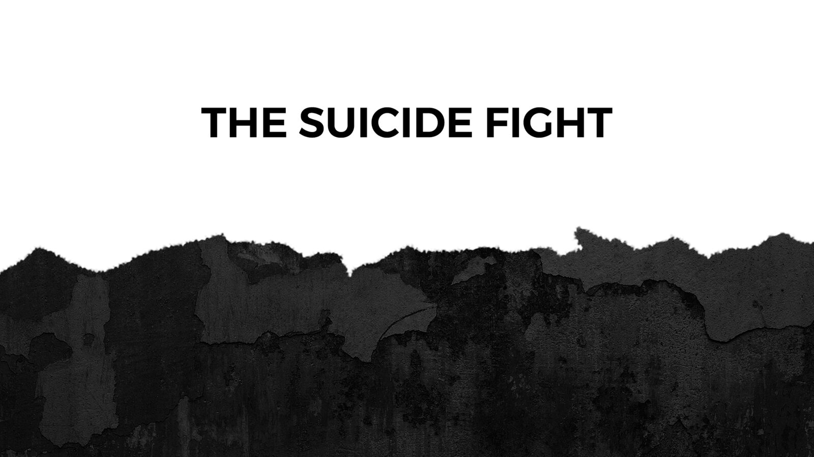
The back cover points readers to the book’s own website. We drew up homepage artwork for the site in the same style: the title in bold capitals over the torn dark edge, stretched to a wide screen, so the book and the website look like they belong together.
- Wide homepage artwork from the cover design
- Same title type and texture as the book
The Suicide Fight
A book designed to be read, not just looked at.
Got a manuscript that needs a cover and a layout?
Screenshots
& Photography
Book cover, interior layout, print files, ebook files and web artwork shown were designed by Northern for Invincicom. The Suicide Fight, its text and its title belong to the author, The Hermit, and the publisher. Presented to demonstrate capability. If you’re struggling, Samaritans: 116 123, samaritans.org.
More from the Northern portfolio.
What clients say about our work
Real reviews from real businesses.
I have really enjoyed working with Dave at NORTHERN Design and Marketing. Dave was quick to understand me and my wish to move away from WordPress and heavy-duty software and systems. I can now manage my own website quickly and easily on HTML5. He has interpreted my wishes - and brand values - to a T. I love my new website and brand.
Working with NORTHERN on the HERMIT UNIVERSE website has been a superb experience. Translating such a complex, visually rich and philosophically driven creative project into an immersive digital layout was no straightforward undertaking. NORTHERN approached it with embracing the concept, steady and extremely efficient work flow, patience and a genuine understanding of the vision. The result is a distinctive website that is receiving excellent, supportive feedback and captures the identity of Hermit Universe. We would very much recommend NORTHERN to anyone looking for a thoughtful, creative and collaborative approach to web design.
Dave has worked with two of my clients so far on projects I've written copy for. One was web design and development and one was a brand ID refresh and web. Design and development have been great in both cases. Simple, effective design, and incredibly fast without losing any quality. Dave cares about the outcome, is fair to clients, and listens to suggestions. All of these things are very reassuring.

What's costing you growth?
Let's find out. For free.
Give Dave your website address. He'll look at your site and marketing, find what's not working, and email you exactly where to focus. No waffle. Just a canny plan you can act on.
Request Your Free Audit
Takes 30 seconds. No jargon, just results.